


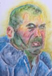
Oh dear. A portrait of Zinedine Zidane in inktense pencils that went horribly wrong. The…
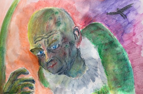
The Vulture
Well, I think I set off with the right intentions. I wanted to do another portrait and wanted to take the easy route with a bald gentleman. I couldn’t think of any good real life subject so settled on a fictional character. The idea was that I’d start from something approximating a comic panel and that my impressionistic colour scheme and face drawing skills would get the subject to look less comicky.
So the starting comic panel is a Steve Ditko panel from Amazing Spider-Man #2. A great portrait of the Vulture, with the humped shoulder and foreground hand adding an extra bit of character. I added the separate Vulture silhoutte in the sky based on another panel in the same comic because the top right corner of this work was looking a bit boring.
And I don’t like the final result. I tried to reflect some green in the skin tones while also making them interesting with reds and blues but it’s all gone wrong. He looks like a gentleman of colour for a start. Then there’s the ear colour that doesn’t fit in, the hand that looks like it’s gloved (which it wasn’t), the poor likeness and the cartooniness of those huge Ditko eyes. The ruff is pretty good though. And the use of red to downplay the garish greens worked in places.
This one’s a flop. If anyone wants it, just let me know but I’m not putting it in the shop window where it would make me look way too amateurish.
Leave a Reply