


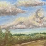
I had another go at a sky painting in soft pastels today but I'm already…
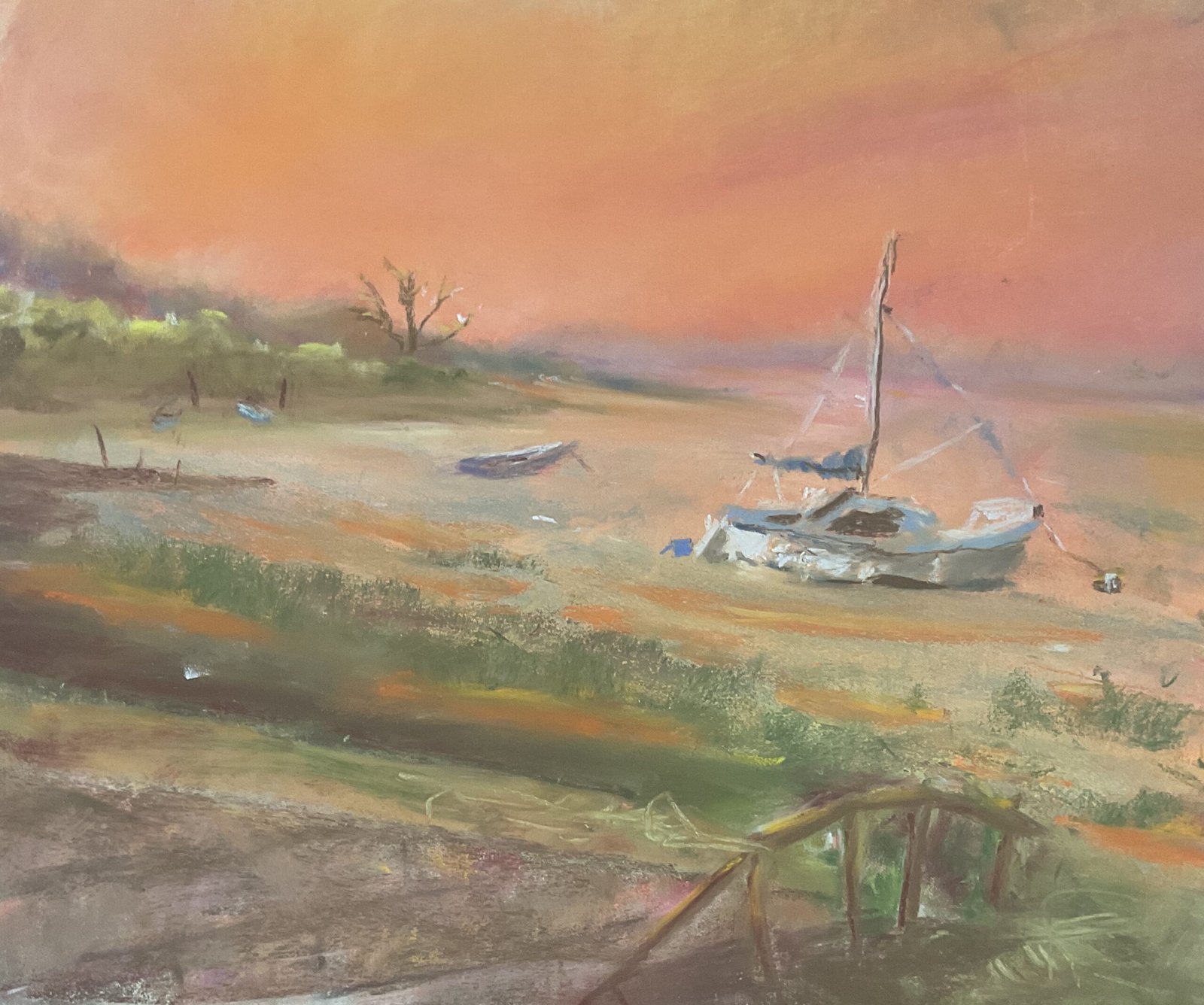
Brickfields, Lower Halstow
It’s another plein air soft pastel painting day today. I took the device of a couple of guys I met on my walk today and headed out to Brickfields in Lower Halstow. It’s only two and a half miles way and there’s a church, the river Medway, loads of boats and piers and free parking. It’s looking like a pretty good place to go painting and I’ve barely explored the place today.
I picked a view where I could have two headlands on the left, some land in the distance on the horizon and a sloping concrete all in the foreground. There were loads of boats anchored out there but I settled on one as the star, with another behind it and two benched up on the nearest headland. My main two objectives today (apart from coming up with a decent painting and impressing the LAOTY judges) were (i) to get back to my warm signature style with lots of oranges, yellows, reds, pinks and purples, and (ii) to give the impression of depth. So I worked from back to front, using whatever colours felt right at the time, although I was more literal when it came to the boat. The boat itself looks very impressionistic in a Van Gogh way. And you know why this is? It’s because I added too many layers of colours to the water and came close to filling the tooth of the paper. It meant I had to paint the boat with some quite hard strokes. Another lesson worth me noting is that I should leave the ropes on boats to the very end so that I can still make changes to the water behind them.
For a long time I wasn’t happy with the wall. The top and the side of the wall didn’t seem to belong with each other or with the rest of the painting. I had an interesting look to the wall, made up of random strokes with random colours parallel to the vertical and horizontal brick lines you can see in the final painting. But this didn’t fit with everything so I overlaid a grey as the main colour and added hints of a few other colours. I then used the same grey on the top of the wall with hints of some of the sky colours. I eventually got to something that was much better. A decent rescue job.
My other foreground problem was the seaweed. It was all looking a mess, so I tried adding sky colours to suggest empty water patches but didn’t get to a happy place. It didn’t help that I couldn’t smooth out the colours because the tooth of the paper was pretty full and the sky colours would just disappear if I tried to speed them out.
There are also some foreground posts. I’ve been too literal here, including the horizontal bars. Just a few off vertical posts would have been better.
Eventually I got to something that, if I stood back far enough, was just about there. Because the big boat was looking like the main subject, I dabbed at the background and foreground in places to blur things out of focus. And that was me done.
Back in the studio and looking at this one again, I don’t like the final result and won’t be putting it up for sale. The tree on the headland is too much in focus and competing with the boat for the viewers’ attention. And the foreground is horrible with ll those parallel diagonal stripes. It’s not clear what’s supposed to be the top of the wall, seaweed, sky reflections, mud and sand. Today would be a bad day for the LAOTY judges to come calling.


Leave a Reply