


So I now have a Facebook page. If you'd like to see my artwork popping…
I Guess I Need That City Life, It Sure Has Lots Of Style
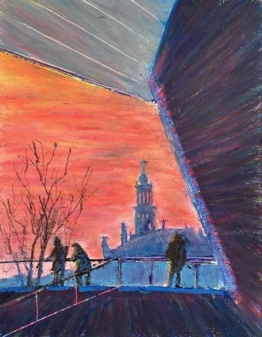
Today’s painting, needless to say, is inspired by another photo by Olly Crook. All those dark areas including human silhouettes, the interesting shoes, the orange sky. It was a brilliantly composed photo that was just begging to be painted. This is a scene at The Eye in Amsterdam.
I thought for a long time about what medium to use. The orange sky, the distant blue buildings and the silhouetted people would all be well suited to watercolour, with the oranges and purples suggesting that I use my MGrahampalette . But I found myself reaching for the oil pastels for three reasons: (i) the days are getting warmer and the oil pastels will soon be in their summer hiatus, (ii) my two oil pastels earlier this month, an abstract and an eye, have both been great, and (iii) there were some big dark areas that I wanted to make interesting with lots of colours and I thought this would be easier to achieve with oil pastels than with watercolours.
So I put down some pencil outlines using a grid, being careful tidy to rub out my original grid lines. And then I filled the paper with colours, either colours I could see in the original photo (for the sky and, at least to begin with, the buildings) or colours that I thought would work (later for the buildings and for highlights in the people) or whichever random colours looked interesting (for the people and for the shapes around the outside. I blended most of the colours with polystyrene chips, deliberately using horizontal swipes in the sky and appropriate swipes in the outside shapes. In a few places I used colour shapers to blend and to add detail. I used a paper mask to get my straight lines working everywhere when adding colour and when blending. And I used an old credit card it scratch off colour for windows and for some of the detail round the outside.
I did a lot of tinkering. It was the buildings that gave me most trouble, with it proving difficult to get colours above and below the handrail that were both similar enough and different enough to work. I got there eventually, adding some light blue to both areas and blending it in. This included some negative painting as I wanted to keep the vertical posts supporting the handrail. My tinkering with the person on the left was less successful, slightly greying the sky around him but I’m going to say no more about that.
I’m pretty happy with this one. Most of that happiness comes from Olly’s brilliant compositional shills but I also like the colours in the sky, the people and the outer shapes. A decent day’s work. This one’s up for sale, with the price to be found here.
Olly called his photo “Somewhere” but I’m taking the opportunity to name this after one line (or is it two?) from Country Home by Neil Young.
Leave a Reply