


Welcome to The Artistic Actuary. I am The Artistic Actuary. An actuary who paints a…
I Don’t Like To Go Down To The Flats
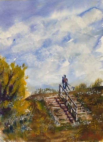
Back on the road again. But now that my pastel-based application to Landscape Artist Of The Year has been rejected I’m not feeling obliged to paint en plein air with soft pastels. Instead I packed my watercolours and headed off to Brickfields Nature Reserve in Lower Halstow. I wandered around for a bit but stopped when I found this set of steps leading upwards to something hidden behind the ridge. It’s the sense mystery that attracted me to this view.
Studying the scene and flicking through my book of swatches, I decided that French ultramarine, raw sienna and quinacrinone magenta should work for this scene, giving me a hint or purple in the sky and a green close to the one I could see. So that would have put this painting into the key of purple cool. But with a warm yellow later playing an important part, I drifted away from this colour key.
I started with the sky, mainly in French ultramarine with a bit of the magenta near the top. It looked great, and still does. Then I extended it downwards into an underpainting covering the rest of the page. This was all fine; it was only when adding later layers that I started to get into a mess. I couldn’t get the right colours for the steps or for the greenery and I couldn’t get the value contrasts that I needed for the handrail to be clear.
It took a lot of tinkering to rescue this one. People kept coming up and telling me the painting looked brilliant. Nice to hear but only really when I have a good painting in front of me. It was a bit embarrassing to be complimented today. And I was starting to get frustrated at how the wind kept blowing my easel over. Anyway, let’s list what tinkering I tried:
- Obviously I tried matching the neutral colour of the steps and the green in the foliage with my three starting colours. No luck there.
- I tried making the foliage greener by introducing transparent yellow, more saturated than aw sienna but still cool, keeping me in the key of purple cool. No luck.
- The greens were starting to look muddy, so I tried covering them with cadmium yellow, an opaque colour. With this being a warm yellow, I could no longer claim this painting to be in a single colour key. No luck.
And then I finally twigged that I should be trying to sort out my values rather than trying to match colours. So, more tinkering:
- I tried the titanium white trick on the steps, painting over watery titanium white and dabbing it off. It made things a bit lighter I guess.
- I added purple shadows on the steps, rather than trying to match what I could see
- I mixed up a dark, brown/greenish neutral from my three starting primaries and used this to darken my green areas both around the steps and where the grass was invading the steps. Starting to look better now.
- And I highlighted the best lit bits of the steps and the hand rail, first with titanium white and then with white gouache. Oh yes, getting there now.
Finally, I added some finishing touches. Lots of textural dibdabbing and grassy strokes with white gouache, cadmium red and cadmium yellow. No random spattering for a change. And, for the first time in years, I added a couple of people walking a dog. And that was me done.
Any good? I guess it’s OK and worth putting up for sale; you can see the price here. I like the sky and the more abstracted bits of foliage. I also like how I’ve (accidentally rather than deliberately) been quite expressive with the steps rather than literal. At one point I was wondering whether I should have put down the steps with a fineliner at the start but I’m very happy now that I didn’t: this looks better with just the impression of steps. On the other hand there’s something this one that doesn’t sit right with me. Whatever it is, it’s something to do with being away from the studio because I can tell instantly that this is one of my plein air jobs.
You’re probably wondering what’s on the other side of the ridge. Well, I can tell you it’s mud flats all the way to the horizon, with yachts and barges marooned all over the place. All of which gives me the opportunity to tick off what might otherwise have been a problematic line from the lyrics to Country Home by Neil Young. Which was nice.

Leave a Reply