


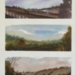
I’m taking a break from portraits for a while (which could be anything between a…
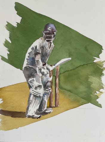
I Don’t Like Cricket, I Love It
After too long a break, I was finally back to painting today. I thought I’d have a go at coming up with something in the style of Trevor Waugh while his book was still in my head. The most interesting examples in his book, at least for me, were sporty ones in which he injected some movement and energy, so I went for a generic cricketer at the crease. The photo I used was of David Warner but this isn’t intended to be a portrait of him.
I started by putting down a pencil outline using a grid. My intention was always to leave the pencil outlines showing and I even included a horizon line and the bowling crease when I had no intention to use them as boundaries between painted shapes. I didn’t mask out any areas but went straight on to painting.
I used the MGraham paints today because the particular colours in that set suited me. In particular I wanted to start on the figure with a cerulean blue and to include a green band in the background. My first layer was of blue and violet in the helmet, orange and brown on the arm and blue in all the darkest bits of the cricket whites. I left white highlights in lots of places. Before it could dry, I dropped some random colours into the blue areas, some purple into the dark side of the helmet and some brown and purple into the darkest shadows.
For the second layer, I tinkered a bit, darkening the darkest places, adding a new glaze of cerulean blue, adding the shadow on the ground and making sure all shadowed areas on the whites had some colour on them. After this step, I decided there was nothing more I could do to the figure.
So for the third step, all I did was to add the background stripes. These, as Trevor points out in his book, add dynamism and movement. I started with the green band, choosing the width and angle to maximise the number of highlights it negatively painted. The angle was also similar to the angle of the bat but tilted in the opposite direction. Once this was down, I quickly decided that the painting would benefit from a second, yellow band, ringing out the rest of the figure. I angled this one parallel to the bat and overlapped the green band, creating a different shade of green on the right. The overlapping bands give the impression of the batsman being caught in cross hairs; this is entirely deliberate.
As an exercise, this was great fun and a success. The painting is up for sale, with the price to be found here. I like the cross hair effect and the colours in the shadows on the whites, although they were better earlier. Maybe next time I should just go with the one layer. Or maybe make the first layer more random and only start identifying shadow areas in the second layer.
Leave a Reply