


No time to do any painting today but with an empty thirty minute window going…
And Leave Myself Behind
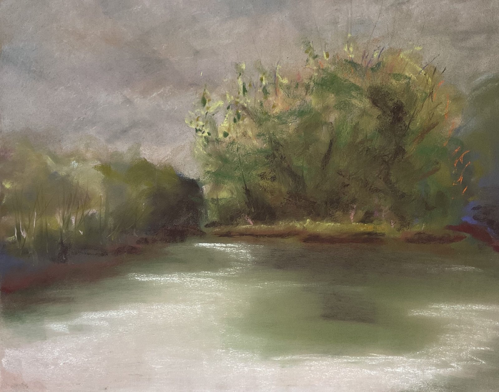
The wether was right for plein air painting today so I was up and out the door at first light with my soft pastels. I drove over to Oare Gunpowder Works Country Park near Faversham. I soon found an interesting view with what looked like an island. And, also importantly, a great spot for painting, out of everybody’s way on flat ground under a tree.
I started with the sky, laying down cool greys, a bit of blue and a bit of purple grey and raw sienna and blending them all together with a polystyrene chip. It was nigh on perfect, accurately matching the sky on the day.
Next was the background trees on both sides of the island. And I just stroked on whatever colours felt right at the time and blended them with a polystyrene chip. There were blues there in the distance and lots of dark colours towards the bottom of the tree shapes. Because it has always worked out well for me, I tried adding highlights to the tops of the trees. But pinks and light violets were too indistinguishable from the sky and when I tried yellows, the trees looked like they belonged in a different painting to the sky. I moved on.
Next was the water. I stroked in all the colours I’d used in the sky and the dark greens I could see reflected in front of my eyes. I blended them gently from left to right with a brush. Towards the end of the painting when everything was looking dark, I added white highlights to the water and brushed them in. The water was working.
Next was the tree island itself, which I developed in parallel with continuing to work on the background trees. I started the island with the colours that felt right and tinkered for a long time trying to get it to stand out against the background but to not stand out out. I tried using reds, yellow highlights, pink and light violet highlights,…. But the island always looked as if it had been cut out and stuck on. Eventually I started tinkering with the background trees at the same time, trying if anything to make the island stand out by anonymising the background. It was while doing all this tinkering that I suggested detail in all the sets of trees with some vertical strokes of colour shapers and using dark pastels to negatively paint the odd treetrunk. And then something happened. Just in the nick of time as the tooth of the paper was filling up, I went for the dark umber pastel and tried darkening the bottom of the tree island area. And it seemed to work. Encouraged by this, I added more layers above it of gradually lightening greens. And I used some of the dark umber in the background trees to contrast against the tree island. And it kind of worked, and that felt like a good place to stop.
It was an enjoyable day. The park was busy and loads of people stopped by with their kids and dogs for a chat. That always makes for a great plein air day.
The final result is good enough to go up for sale, with the price to be found here. Weirdly though, this doesn’t look like my artwork. The colours are all very neutral and unsaturated and there are no warm highlights screaming from the peanut gallery. While I’m a bit down about seeing my natural style stymied, maybe it’s a good sign that I can adapt to conditions. The sky definitely matched the conditions and my trees matched the sky, so I guess, wait, what was the question again?
Leave a Reply