


Oil pastel paintings are (for me, for now) faster than watercolours, so are the ideal…

Ancient Sorceries
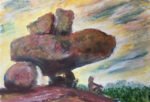
I fancied giving the oil pastels another go today. It feels like too long since I came up with a decent oil pastel painting. I looked through my collection of potential subject matter photos and found one of some rocks sticking out into the sea. I tried image searching but without any luck, so I don’t know where this is. I suspect it may be in the Scilly Isles but I’m taking no chances and will just name this one after an Algernon Blackwood short story.
I started by putting down some very rough outlines in pencil. I then went over all the shadowy cracks in the rocks with raw umber to give me something to paint around. If I were to do this painting again, I’d probably sharpen my raw umber pastel with a knife before using it: I’ve not done a great job on the narrowest cracks.
Then I started with the sky. Lots of dib dabs and dashes with all the blues, a neutral purple, a little bit of raw sienna, maybe some red and finally white. My oil pastel paintings are all about putting in dib dabs and dashes and later smoothing it all out. For smoothing, I have three main tools: my fingers, those rubber things on the end of sticks and the white oil pastel. I smoothed most of the blue in the sky first with the white pastel and the clouds with my fingers, then oversmoothed all the blue with my fingers. I deliberately made swirly Van Goghy marks to give the impression of a windy day.
For the rocks, I started by dabbing and dashing with impressionistic colours wherever I could see them, so this was blues, reds, yellows, a bright green, deep red and a neutral green. I then filled in most of the gaps with raw sienna, then all the remaining gaps with white. Then I tried adding a layer of white dashes. It was like a half hearted smoothing because I knew there was more smoothing to come later. So once the white was all on and everything was half smoothed, I smoothed the colours out properly with the rubber tool on a stick. In some places I added more raw umber to the shadows and tried to smooth it upwards, leaving hard edges along the bottom and soft along the top.
Finally there was the sea. For the sea in the background, some of the colour from the rocks on the right sneaked into the blue and actually looks great. For the water in the foreground I made several attempts before settling on what I’ve ended up with here. As well as white and the blues there’s a little bit of deep red and some of that earthy purple in there.
After taking a break for tea and cake at the local church (first Sunday of the month throughout the summer) I came home and looked at the painting through fresh eyes. Some of the individual rocks looked a little out of harmony with their neighbours, so I added a little extra colour (and white to keep things from getting too saturated) and smoothed it in with the rubber tool. And that was me done.
I’m liking this one. The impressionistic pinks, blues, greens and yellows in the rocks are very me. So is the ambiguity over whether the top of the promontory on the left is rock or grass. And the mark making has a real three-dimensional, textured feel to it. This one’s up for sale. To see the price, click here.
Leave a Reply