


The second of my six YouTube subject areas is maths. This is Michael Penn…
My Name Is Michael Caine
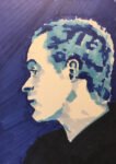
Today’s portrait subject is Sir Michael Caine. I saw a few minutes of him the other night in a film called The Great Escaper, a film he starred in at the grand age of 90! If I’d not joined the film part way through I’d probably have watched it to the end but in the few minutes I saw I was transfixed. This guy is a national icon and treasure. I had to paint him.
I searched around for a good source photo of Sir Michael in his later years and found one with a lot of shadow in it, which I like. Playing around with the photo in the Notanizer app suggested that a two or three value plan would work best. That gave me a choice between a posterised portrait using the trippy colour scheme or a patchwork portrait. Of the two, I felt more in the mood for a patchwork portrait, so that’s what went for.
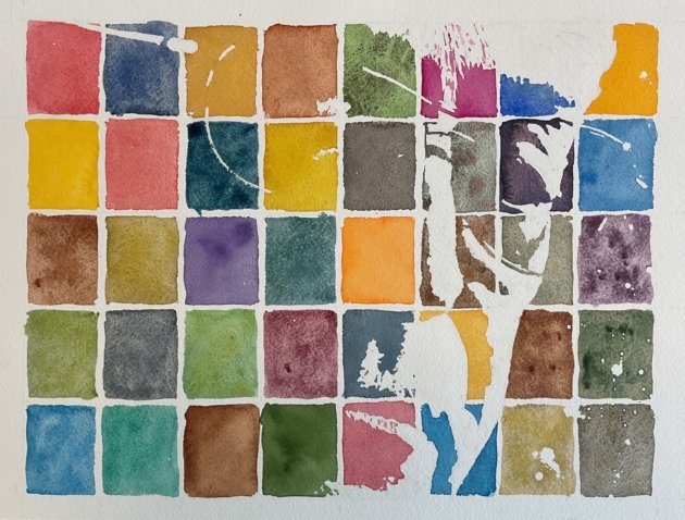
I marked out a 5×8 grid for my 40 colours and used this to help me pencil in the outlines of the shapes for a two value painting. I masked out all the highlights with making fluid, trying to get rough and smooth edges in different places. And I spattered on some random starry marks in the background to the right of the face. Then I painted on the 40 tiles in different colours, left it to dry, removed the making fluid and that was me done.
I’ve ended up homing in over time on a standard 40-colour layout for these paintings that I’ve swatched out and laminated for reference. But before starting to paint, I looked at my swatches and my grid and could see that some of the more complicated/important cells in my grid would end up as light yellows or greens if I followed the standard plan. I worked out that if I took the top two rows from the plan and moved them to the bottom, I could have dark colours in those important cells, making the portrait easier to read. So that’s the direction I went in.
CAnd obviously I messed up in places. Bound to happen when I deviate from my notes. I got tundra green and desert green the wrong way round. And tundra pink and potters’ pink. And burnt sienna and raw sienna. None of these errors were that serious, only being exchanges of position between pairs of colours within the same families. The more serious were the the swapping of cadmium yellow with Shire olive and desert yellow with viridian, both relating to pairs of colours in different families, the yellows and greens. The result of these two errors was that I ended up with a slight overconcentrtion of yellows in the top left and of greens in the bottom left. Not that it’s especially noticeable.
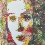
Final verdict? It’s an interesting painting. Not instantly recognisable as Sir Michael unless you already know who it is. In fact, it’s not immediately obvious that this is a portrait at all. It reads more as a portrait area distance of 12-20 feet: any closer or further away and it looks like an abstract. There’s a painting by Dali of his wife staring out of a window that turns into a portrait of Abraham Lincoln at a distance but that was all deliberate. This aspect of my painting was an accident. Happy accident or nasty accident? You can decide yourselves. This one was bought up pretty quickly by another actuary.
Leave a Reply