


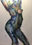
And here's today's second painting. It's Candle as the model again and this is her…
Artgraf Swatching
It’s a new year and I want to be out painting as soon as possible so that I can get a set of paintings worth including in an entry to Landscape Artist Of The Year. It’s still too cold outside to paint properly but, with no rain expected this morning, I was able to wrap up and head outside the garden to swatch out my new gear. The first time I pick up a paintbrush in the new year has to be swatch-related: it’s the law.
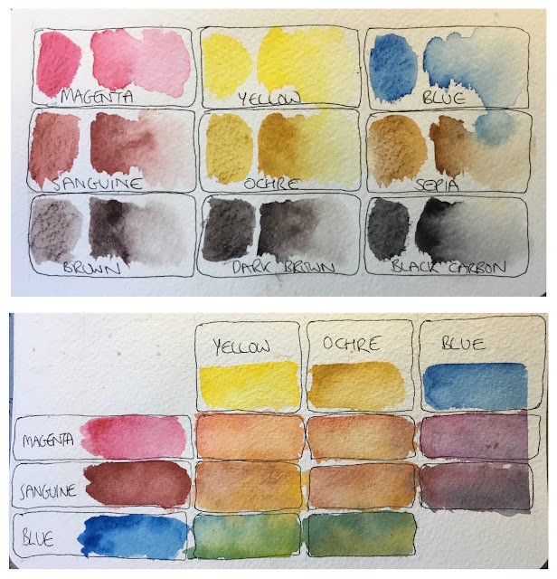
First up is my Artgraf gear. Nine chunky pans packed full of pigment, possibly involving graphite and shaped like tailors’ chalks. I tested these out on rough watercolour paper, cut to a size that would slip into the case for my six earthy Artgrafs.
First I swatched out all nine colours separately on one side of the paper. For each colour, I marked the left third of the box with the chalk and then wet it. Then in the middle thirds, I used the chalks like watercolour pans and painted in a strip. Then for the right third I painted on water and tried to coax the colour over from the middle third.
And what did I learn from this? Well:
– applying the chalks to the paper then wetting the marks gives the most intense colour
– it also makes the tooth of the paper show
– although I believe these are opaque colours, they can shine like transparents when diluted down
– the magenta colour is less intense than the others, so it takes a bit of work to build up some thickness.
– sanguine is more earthy than I thought it would be. At times it also has some weird purple tones.
– sepia is more like burnt umber
– brown looks more like sepia. Maybe sepia and brown are being packed the wrong way round?
– the dark brown is close to black
Then on the other side of the paper, I did a mixing chart using the three primaries and adding in sanguine and ochre, which felt like alternatives to the magenta and the yellow.
And these were the conclusions from the mixing chart:
– good to see that the magenta and blue could get to a violet. I’ve seen artists on YouTube only being able to reach a neutral colour: their sets may have had a warmer red than magenta in them
– the greens look interesting: bright ones with yellow and earthier ones with ochre. Definite promise there.
– the four oranges all look fleshy.
It’s the fleshiness of the oranges that I found most interesting. I’m partway through reading The Natural Way To Paint by Charles Reid and he mixes colours like this from cadmium red and either cadmium yellow or raw sienna. And then he throws in cerulean blue, a cool blue, to cool things down in places. I’m already starting to think that these colours could be used for figure drawing. The sepia, sanguine and maybe the brown could all darken down skin tones. I could end up with a more realistic palette for figures than in my inktense paintings but everything’s relative and Charles Reid style figures are still at the impressionistic end of the spectrum, just not as extreme as my inktense figures. If I do try figure drawing with the Artgrafs, though, I should learn from my earlier attempts and use them more like watercolour pans and less like inktense blocks.
Leave a Reply