


And here they are, all together. As I expected, their positives as a set are…
Confession
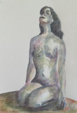
It’s been a whole since my last painting so with a rare couple of hours to spare, I’ve been keeping my creative plates spinning with a painting today. Being so short of time, this was always going to be a figure in inktense pencils. Today’s model is Mandy, someone I’ve painted once before.
After putting down a pencil outline using a grid, including some shadowy areas suggested by the Notanizer app, I started with my three favourite colours: Persian red, iris blue and sun yellow. I started with the red and the blue in the darkest areas, then some fairly random reds and blues in the midtones and the yellow around the border between the midtones and the highlights. And then I felt like pushing things, so I added some fuchsia, deep indigo, leaf green and a tiny bit of willow. Most of these were used to make the shadowy areas darker. I found myself jamming a bit with the green, though, so did the same with the original red and blue too while I was in the zone.
After wetting all the pigment, the result seemed pretty reasonable except that Mandy looked like she was floating in mid air. So I added in the mat and some shadows using all the colours I’d used so far and then wet that.
After wetting the mat, I wasn’t happy with the lack of connection between Mandy and the mat. I needed shadows on Mandy and in the mat to run into each other to connect them. So I went over all the darkest areas in the painting with all seven colours. After wetting these, things looked much better, so that’s where I stopped.
There are a few areas where I think I could have done better: the facial features, the red shadow under the chin, the right breast, the left hand, the overly sharp and defined top edges of the thighs against the body behind them. And that’s enough for Mandy to not make it into the shop window. But I had fun and I blew way some cobwebs, so managed to tick off the two most important objectives.

Leave a Reply