


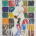
Today's subject is The Duchess, vocalist in the band Space Elevator. I picked a source…
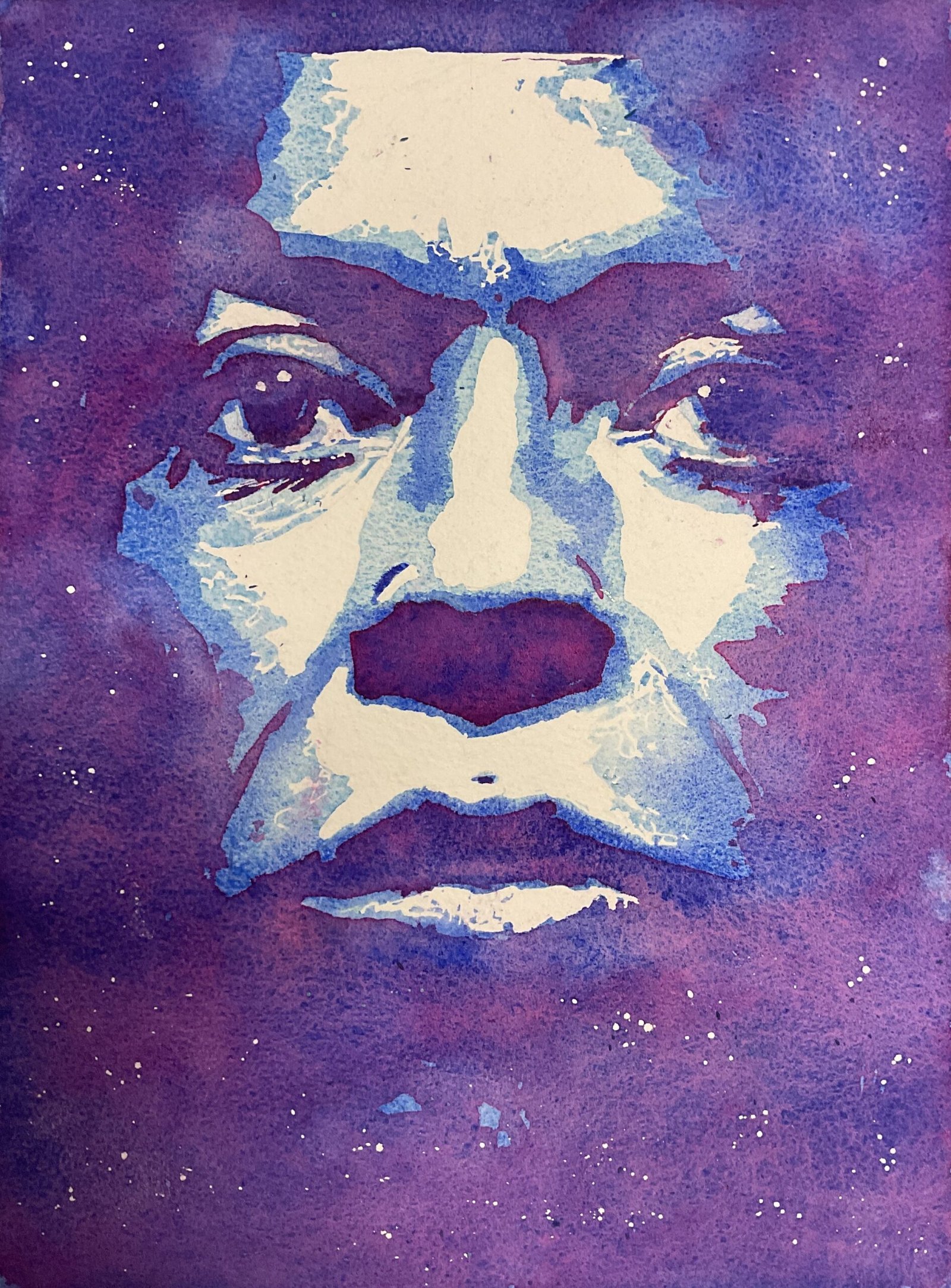
Miles Davis
Back to watercolour portraits again. I’m more optimistic about my PAOTY chances than my LAOTY chances but I have to keep going at both. I saw someone on a YouTube video today wearing a t-shirt with a two tone notanized portrait of Miles Davis that I thought would make a good painting. I had no luck searching the internet for the image in which the t-shirt was based but did find the cover from Miles’ Tutu album and went for that instead. I knew very little about Miles Davis before doing this portrait, not being into his music.
Blue seemed an appropriate colour for someone whose most famous album has blue in the name and who I imagine performing on stage in dark, smoky underground bars. So I went for a posterised painting using the blue scheme. Three separate layers in cerulean blue, French ultramarine and quinacrinine magenta. Because my source image was quite claustrophobic, I included a margin around it but, rather than leaving it white, treated it as a dark area, going over it with ll three colours. I also included starry spatters around the outside. And I tried to soften the edges of the second and third washes by wetting them with a bit of water.
So how is the final result? Is the level of humanity I brought out in The Forgotten Twelve indicative of an upward step in the quality of my portraiture generally? Well, I see nothing here to suggest it isn’t. It’s so…human. This would be a very good time for the PAOTY judges to come calling. This one’s up for sale, with the price to be found here.
Leave a Reply