


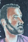
This week's model on Portrait Artist Of The Week was Will Young. Look, I'll keep…
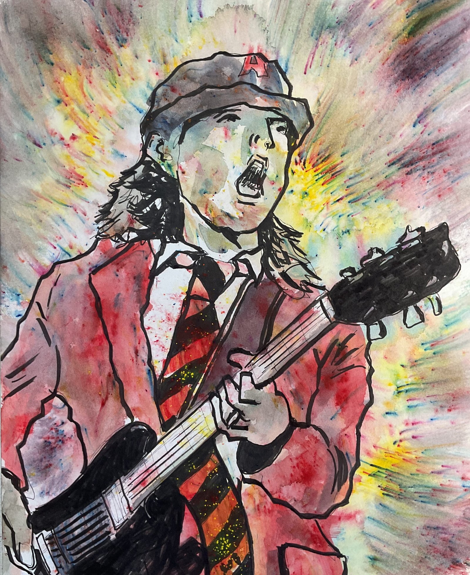
Angus Young
Oh dear, this hasn’t been a great start to September.
I wanted to give the fineliners another runout. To encourage myself to be looser with the linework, I went for a portrait. And to encourage myself to be looser with the colour, I went for the crystallised watercolour. This is a portrait of Angus Young, a guitarist with AC/DC.
I started by getting down a pencil drawing with the NeoLucida XL. I’m getting slowly better at this. The image is a bit closer in and nearer the left than I was aiming for but what I ended up with worked well. Except that I struggled pencilling the left and bottom of the painting, meaning the guitar body was never right. More on that later. Then I inked in the lines with fineliners, not too thick but not too thin either. I also blacked out some areas with the brush pen: the mouth, the black stripes on the tie and some shadows on the face and hair. I was pleased with the tie: it was always my plan to have blacks in there and to make it less loose than the rest of the painting.
Then I added colour, starting by sprinkling a grey on the cap and the guitar body and head and the red on the jacket and tie. I wet these sprinkles with a brush and filled out the colour pretty loosely, not sticking to colouring within boundaries. Then I sprinkled on colour in the background, sprayed outwards from Angus and dried it off outwards with a paper towel, creating streaks. Some crystals inevitably ended up on Angus’ face and hands and on the guitar neck. I didn’t mind this but removed most of it from Angus and used a small brush to use what paint was on him to colour in shadows.
As the first of three finishing touches, I put some crystals on a separate piece of paper, dipped in a wet brush and used the resulting colour to improve my shadow work, mainly on Angus’ face and hands. That was OK. But then I decided the guitar was wrong and tried correcting this with the fineliners brush pen, blackening all of it out,. The shape ended up even worse than before and I’m going to crop out as much of it as I can if I ever frame this one. At the same time I also blacked out the head of the guitar to create some balance but I think I pushed it too far and it’s now unbalanced to the right rather than to the left. And I think I’ve written off my brush pen. My third and final finishing touch was to go over all the main lines with the brush pen, making them thicker, in an attempt to make that black guitar head less prominent. Things improved marginally.
The final results something that’s well short of my best. Maybe I should just save the fineliners for dash and splash paintings as I’m struggling to use them in the studio. It’s definitely fineliners that aren’t working here. The linework feels cartoony and the black guitar head is unbalancing things. The big plus, though, is the background. There’s so much energy there and it’s ll down to the mark making with the paper towel. Definitely something to try another time. But not with the fineliners though.
Still, I’m going to put Angus in the shop window for a while, just because of the energy in the background. To see the price, click here.
Świetny artykuł, masa cennej wiedzy. Dziękuję za lekturę.