




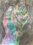
I'm taking it a bit easy today, just going for a quick figure painting with…
Electric Ladyland
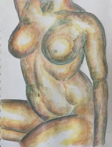
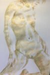
It’s a figure painting today. My third of the month, so I thought I’d better try something vaguely experimental. I thought I’d have another go at a painting using sculptural light. This is something I learned about in a Burne Hogarth book and have tried once before. The idea is that rather than having light and dark values that suggest the subject being lit from one side, the light and dark values should depend only upon the angles between planes and my line of sight. The bits of any 3D shapes that are closest to me will be white because their planes are perpendicular to my line of sight. And the more a plane slopes away, the darker the value I should be using. Figure paintings in this lighting scheme can look muscular or metallic or both, so that sounded interesting.
For a modelling pose, I picked this one by LaneyR. This is her first appearance in this blog, so give her a big hand. I deliberately picked a pose that would work well in sculptural light. There are lots of 3D shapes including some interesting muscular partitions in the lower torso. And, importantly, there’s a left thigh conveniently blocking out what I might have censored using shadows in a more conventional lighting scheme.
For colours, I went for sun yellow, Persian red and sea blue, three colours that worked well together twice earlier this month with conventional lighting schemes. I thought they deserved a go at sculptural lighting. Most of the dark areas have the red and yellow in them as well as the blue and most of the midtones have yellow in there as well as red.
Here are the pencil marks I originally put down.
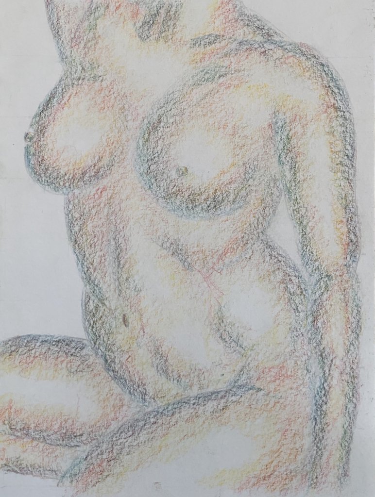
I think this was already looking pretty good. If you’re wondering whether this lighting scheme would work well in a coloured pencil figure painting, I think you’re right to wonder. I’ll have to give that a go at some point.
Anyway, I carried on to the next step and wet all the marks to get this:
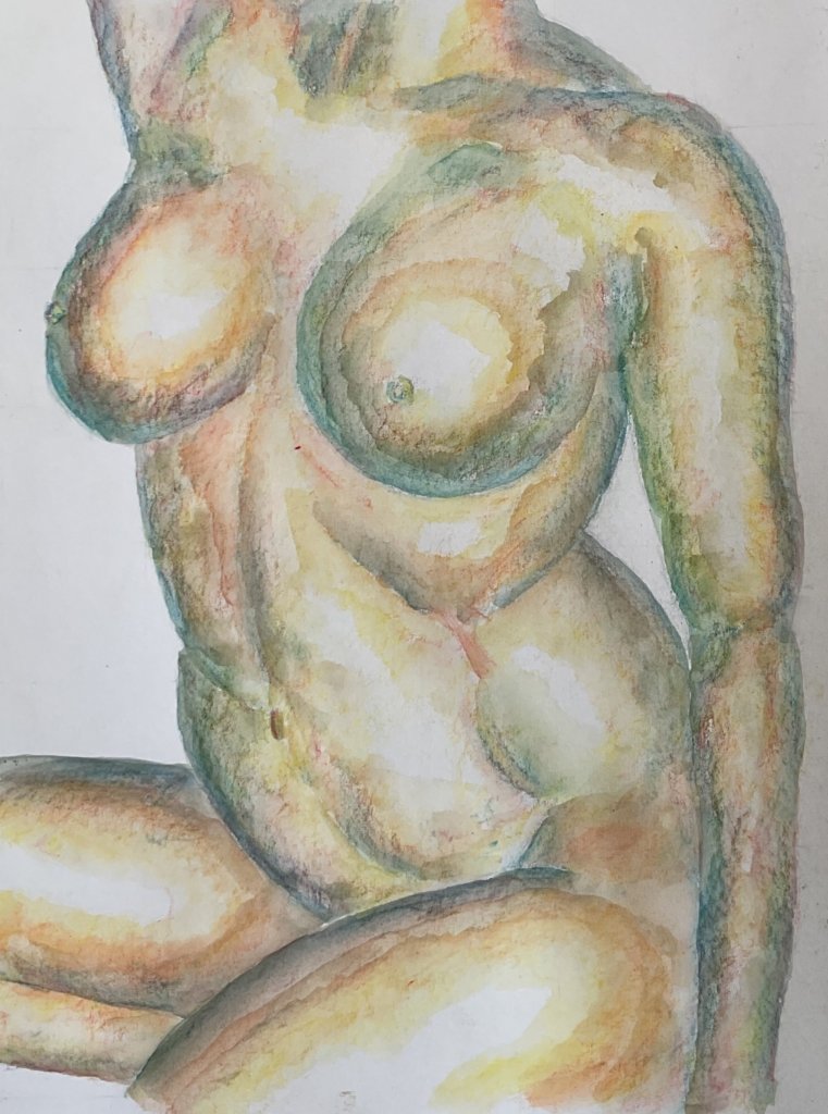
It’s not bad and I could have stopped there. But I decided the darks were too blue and that some of the colour transitions weren’t smooth enough. So I put down more of the red and of the yellow, wet the new marks and got to the painting you see at the top of the post.
The final evaluation? Well it’s definitely muscular and metallic, just as I was hoping for. It suffers in a few places from colour transitions that aren’t smooth and there are some wood grain effects in places (a good thing or a bad thing? You decide). Both of these were probably caused by the water drying a bit more quickly than usual today. It’s different, it’s interesting and it’s up for sale, with the price to be found here.
Leave a Reply