




Welcome to The Artistic Actuary. I am The Artistic Actuary. An actuary who paints a…
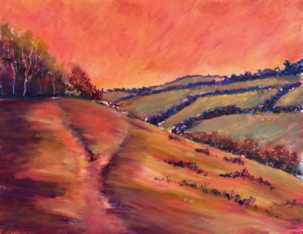
I Still Don’t Know Which Way To Go To Lose Those Old Spud Blues
Despite the heat I was in the mood for oil pastels today. My oil pastels are in a box too big to fit in a drawer so they live in a shady spot under my desk. The combination of the shade and some icy air conditioning makes them easier to use in the summer than they have been in previous years, although not as easy to use as in in the winter.
I went for my favourite view in Queendown Warren as my subject matter but only after deciding that today’s painting would be a bit different. I wanted to head towards abstraction with an orange sky, purple trees and red hills. A worthy ambition I thought.
But somehow I found myself dragged back towards reality. The sky went exactly as planned with lots of reds, oranges and yellows. Next come the background trees in purples and blues with the odd little spot of yellow or red. And then the fields, where I started with reds, yellows and oranges. But when I came to blend them, I dragged in some of the blue from the trees and created greens. No matter how much I tinkered with those fields, I couldn’t lose the green. I eventually stopped just as everything was about turn into mud.
The foreground trees, in the top left and halfway down on the right, worked well with reds and then blues, violets and a black in the shadows and some yellows and oranges for highlights. I even scored out some colourful tree trunks with a scalpel. The foreground hill was more tricky. I started with lots of reds and the odd orange, purple or pink and blended these together. But what I got looked too unnatural against the green fields in the background. So I was forced to greenify things slightly with a couple of greenish yellows. A yellow with a green name and a green with a yellow name. I tinkered a lot, looking for that ideal mix of greens and warm colours and got there the end. I started with the path painted in explicitly with different colours but ended up blending these colours into the surrounding land and adding dark blues alongside the path in places to end up with just a suggestion of a path, which I think works. As a finishing touch I added some clumps of foliage and scraped our some grassy stems and that was me done.
I’ve ended up with something with interesting colours but not as weird a colour scheme as I’d set out to create. It reminds me a lot of the cover of that Stephen Quiller book, which can’t be a bad thing. And if I screw up my eye, there are some interesting shapes there: big green triangles on the left and right with big orange areas above and below them. And the paths forming a Y shape in the foreground, with one arm pointing towards the top left trees and the other taking the viewer on a journey into the background that loops back into the foreground. It’s a well composed painting, this one. It’s up for sale, with the price to be found here.


Leave a Reply