


I was approached a week or two ago by a guy on the village who…
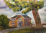
Holly Lodge
I was asked to do a painting of this bungalow in Hartlip. It’s recently been sold and the former neighbours wanted to give them a painting as a leaving present. The gifters were keen that the house was shown as big as possible and that the painting included the brick pillar with the name of the house and some peach coloured flowers with yellow centres to the left of the front door. And they liked Number Two from a few years ago. Everything else was up to me.
I checked out the colours for Number Two and also the colours for Number Eighteen, another local house portrait that had worked out well. I decided to go for a colour scheme somewhere between the two. It’s in the key of orange cool. The cool blue is Mayan blue genuine. The warm red is rose dore, with Winsor red used in the foreground and, later, in the sky. The warm yellow is Indian yellow, with the more opaque cadmium yellow being used for the foreground wall and some bright spots in the greenery. I also used white gouache to go over highlights, titanium white to add some texture to the house bricks via the titanium white trick and a little cadmium red in the flowers near the door.
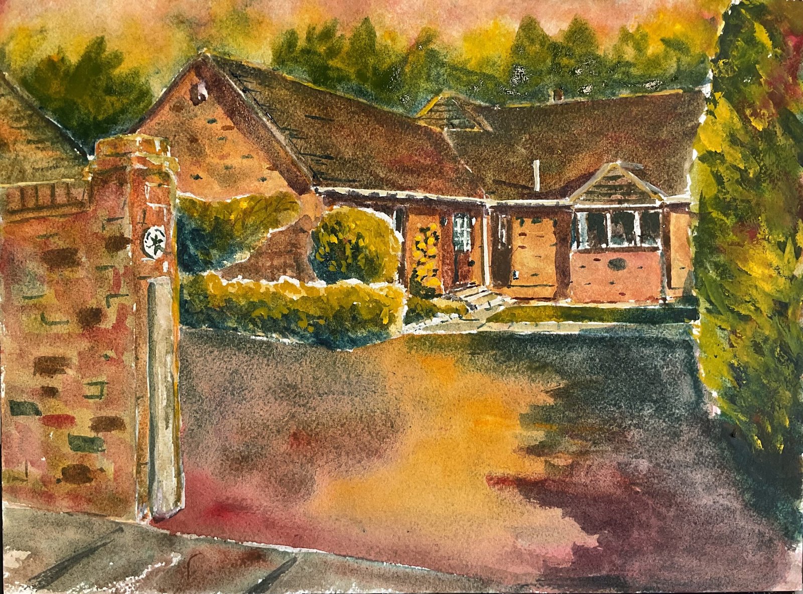
Composition-wise, the need to include the brick pillar meant this was always going to have a small sky and large foreground. I picked a view in which the garage was partly blocked off by the wall – who needs a garage in a painting? I included the coniferous hedge as a stop, to prevent the viewer’s eyes from leaving the painting. And I covered part of the house with the hedge: it felt cozier to have both ends of the house hidden. And I used a photo of the house taken in an afternoon when a few shadows were visible on the house from various outcroppings – the sort of shadows that made Number Eighteen look so sunny.
I started by using a grid to get down outlines, then masked out a few highlights. Along the top of the greenery I wet the paper first and stabbed masking fluid into it in an attempt to make the edges more interesting. I’m not that sure this was successful. After that, I worked from the back to the front, in a cycle, one layer at a time, starting with fairly random underpaintings and gradually inching towards the colours I wanted, making use of the titanium white trick a couple of times: this is where I add a watery glaze of titanium white and quickly dab it off with kitchen paper, leaving a lighter colour and a bit of texture.
But things went wrong. I wasn’t sure how much shadow to put on the drive and kept making the shadow bigger. Every time I did this, I added another glaze to the existing shadow. And, as you see from the image below, I ended up with a flop where 40% of the paper was covered by a boring black shape.
It’s a great shame because the colours of the bricks in the house are close to perfect. I also like the greenish colour of the foreground wall – this was actually the result of an error, putting the wall in shadow for no reason, then dabbing off most of the shadow. Still, looking at the final result I decided that it wasn’t worthy of a commission, so I’ve had another go today, as you can see.
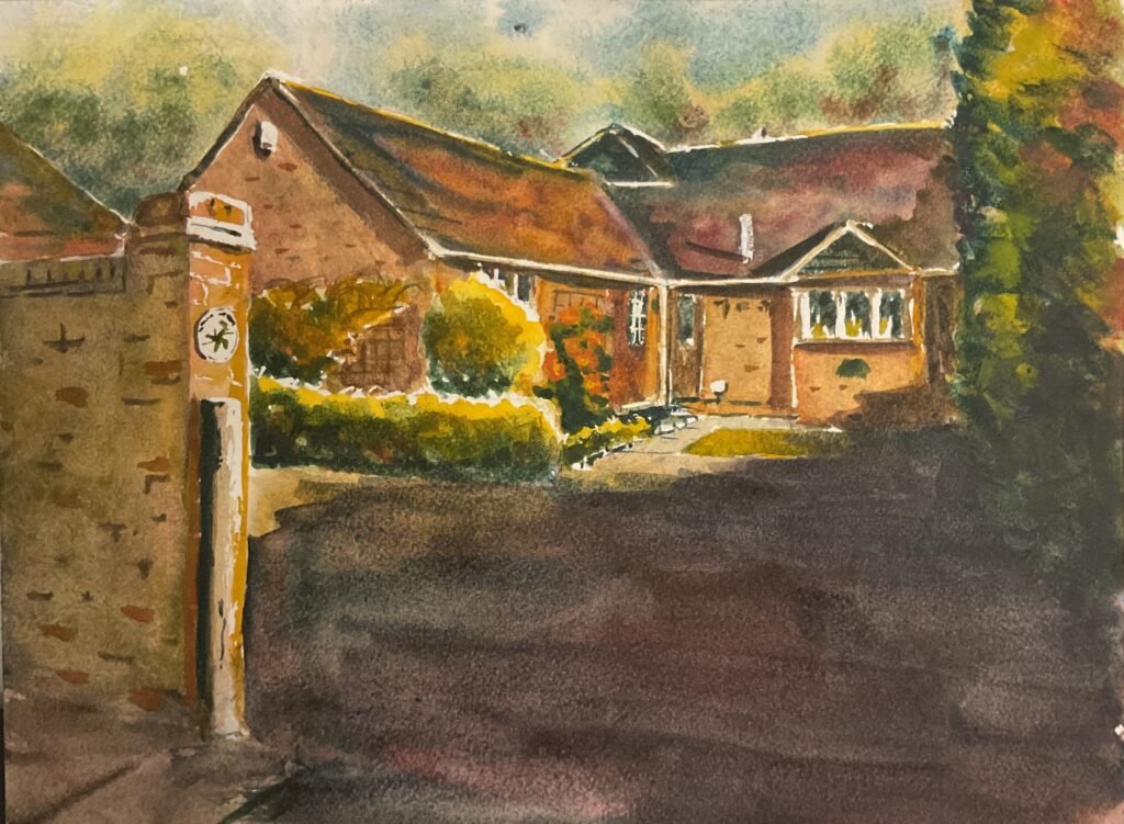
The main thing I changed today was the drive. Rather than trying to replicate the colour that I could see, I dropped in all my main primaries and allowed them to mix. I tried to get some atmospheric perspective by having more red closer to the viewer and more blue further away. And I tried to suggest a pathway into the painting with all that yellow down the middle. I added a shadow on the driveway, much smaller this time, and more variegated in colour from blue to purple.
And there was still one more step. The colours on he drive were evocative of a sunset and didn’t match the blue and white colours in the sky. So, after testing out the idea by changing the sky in the first version of the painting, I went over the sky and background trees. Almost all the yellow in there is cadmium yellow as I needed its opacity to mask out the existing sky. And that was me done.
This is a much better attempt and was indeed sold and gifted. It wasn’t intended to be a sunset painting but ended up working out that way.

Leave a Reply