


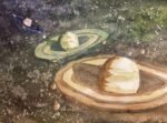
I really do need to finish my collection of planet paintings at some point so…
Miss Magnolia Muse
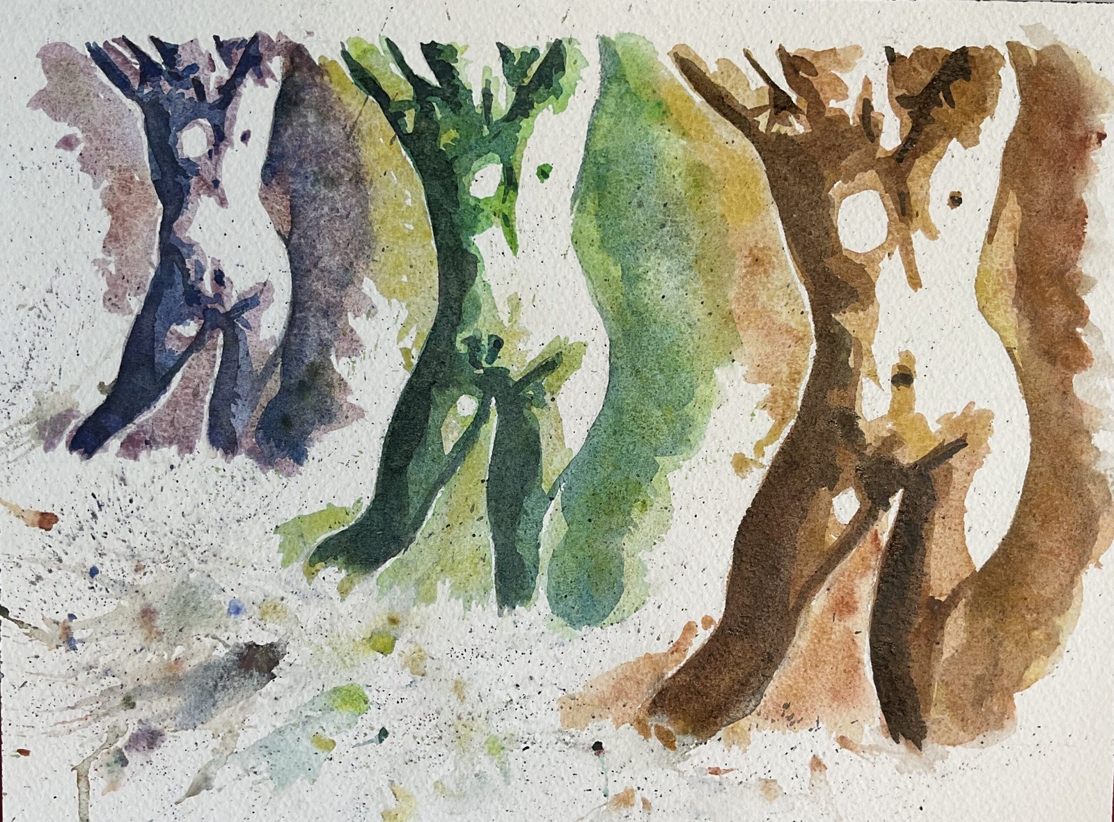
OK then, I’ve built up a decent reserve of paintings for when any are sold at the Rose & Crown and need replacing. I can get back to painting whatever I feel like painting in the day. There might be a few portraits coming up over the next couple of weeks but I thought I’d kick off with a figure painting. It struck me thst I’d never done a posterised figure or painted a figure using the supergranulators. So I thought I’d achieve two firsts in one day. I couldn’t decide which of the three sets of supergranulators to use, so went for a posterised climate change painting, using all three sets. Today’s model is Miss Magnolia Muse. She’s making her debut but her poses all seem energetic, so she’ll be back a few times. You’d best get used to her. I picked out this pose not just for the energy but also for how well lit it looked in the Notanizer app, with a huge white area on the body.
I used all fifteen colours today and didn’t use any other colours. So:
- the tundra subpainting in the left had the pink in the first layer, the blue in the second with bits of the orange and green dropped in and the violet in the third.
- the Shire subpainting in the middle had a first layer of the yellow/green/olive, a second layered the blue and the grey in the third.
- the desert subpainting in the right had a first layer of the yellow/orange, the brown in the second and the grey and the green in the third.
As a finishing touch, I filled the bottom left area with spatters from all fifteen colours, letting the odd colour here and there go over the figures. To get some bigger marks I spattered on some water drops, dropped in colour and blew onto them sharply. I did have some good tubes for blowing through but couldn’t find them today. Anyway, once I’d done all this, that was me finis.
I like this one. The choice of source photo with the big white areas was 100% justified by the final result. The slight differences in the shadow shapes on the bodies in the three subpaintings actually give an impression of movement, giving this one a Roald Dahl’s Tales Of The Unexpected closing credits vibe. And do some of the spatters look like one point perspective lines with a vanishing point somewhere in the middle of the painting? That gives it an extra three dimensionality. If I wanted to be really picky, I’d say that three paintings look OK together but feel a bit like three separate paintings: triple portraits in the climate change colour scheme don’t bond together as well as triple portraits in the traffic light scheme, probably because the green scheme has two layers in common with the amber and the amber two in common on with the red.
This one is up for sale and you can see the price here.

Leave a Reply