


I'm normally pretty good at restricting the number of colours in my paintings but sometimes…
The Terror Of The Twins
This one’s taken a few days. On Friday, I prepared an underpainting. I wet the paper and covered it in all five Shire colours plus green apatite genuine and forest brown. I was careful to keep the yellow in the middle and the two dark greens on the outside as I wanted my final painting to be lit up in the middle. While the paint was still wet, I covered it with bubble wrap, netting bags, ridged cardboard, plain but torn cardboard, some leaf things for printing with, some circular leather tags and salt. And then I covered it up and weighed it down. It was 42 hours later when I removed the weights and found this underpainting:
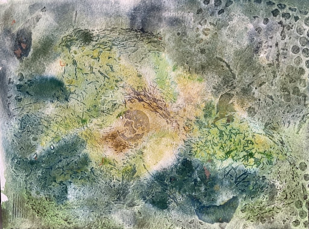
I think it came out pretty well, especially bearing in mind that the props I used had all sorts of different thicknesses.
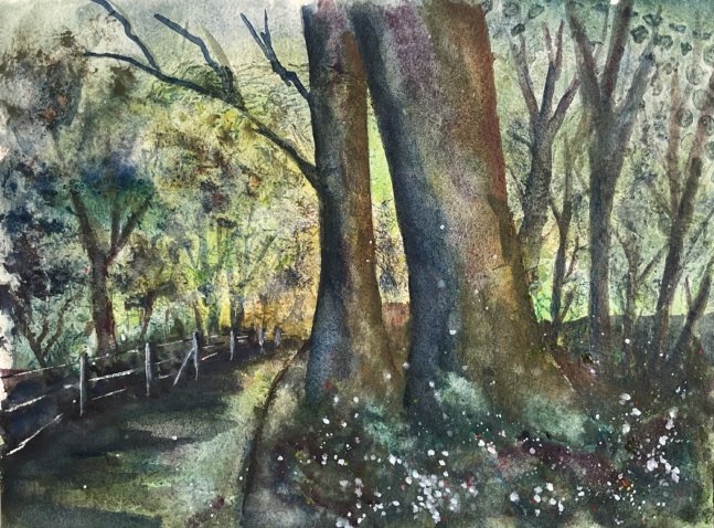
This wasn’t one of those crazy underpinnings where the plan was to look at it afterwards, think about what it looked like and then move it in that direction. It was always going to be a landscape with trees and a bright spot in the background somewhere. So on my Queendown Warren walk this morning I took about twenty photos of potential painting scenes. I was looking ideally for scenes framed by tall trees on the left and right, overhead greenery and a foreground with quite a low horizon. When I got home, I cropped all the photos into potential candidates, eliminated most of them, looked through the rest again and picked out this one. It was those two main trees that attracted me but I’m not sure why I placed them so centrally.
Anyway, on to the top layer of the painting. This all used tundra colours. I started with the two trees, wetting them and then dropping in random colours. Somehow I stumbled into using the blue and purple on the left side of each tree, the orange and green on the right and the green and pink in the middle. It turned out to be a great combination. I dragged the tree colours into the ground surrounding them, not wanting the bases of the trees to be clearly defined.
And then I just enjoyed myself, filling out the rest of the page with random colours and generally tinkering. At one point, there was too sharp a contrast between the dark background tree trunks and the lighter underpainting surrounding them, so I made some stabby splayed marks around them with random colours. To make things look less flat, I sprayed water on the most distant trees and lifted some paint off with kitchen paper. And I kept adding more layers to the two main trees, which made them stand out as the stars.
For finishing touches, I went for my favourite opaque colours: cadmium red, cadmium yellow and white gouache. I spattered them mainly around the bases of the trees to draw the viewer’s eye to the main attraction, but also in some other places. When some of the white spatters threatened to fade away, I added more white paint into their centres. I also used the white to bring out the roadside fence. And I created some lichen textures on the trees by painting on water and lifting paint off with kitchen paper. And that was me done.
There aren’t as many underpainting marks showing through as I intended and the light area in the middle isn’t as bright as I wanted it to be but there are still some marks and, more importantly, the green background provides something that I couldn’t have achieved without an underpainting. The textures and colours on the trees are superb and the hard edged slither of light between them is a great touch that wasn’t in my source photo. It’s everything to the left of the road that keeps this one from making the high table. The trees and fence are all looking a bit, well, flat. And I’m wondering whether I should have exaggerated the one point perspective by making the closest fence posts even taller. But this is still good enough to go up for sale. You can see the price here.

Leave a Reply