I wasn’t very good at painting and not that committed to improving. I would have…

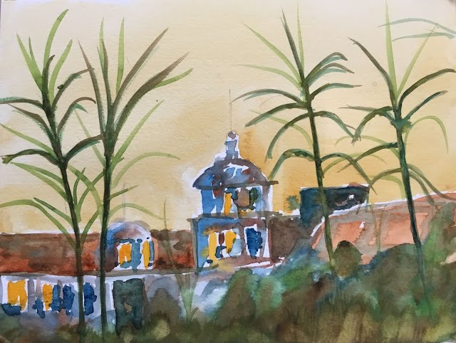
Hotel California
After Free Bird and Comfortably Numb, I thought I’d have a go at another concert closer.
Believe it or not, I was wanting to make this a realistic abstract (after reading the Keest Van Aalst book) and to go for lots of simple, overlapping transparent layers, leaving them to dry between each layer (kind of in line with the Tom Hoffmann book). I think it’s safe to say I failed in both counts. Too much planning for a Van Aalst, not enough planning for a Hoffmann.
Colours today were transparent yellow (in the greens), Indian yellow (in the lit up windows), Prussian blue, light red, raw sienna, burnt sienna and burnt umber.
I rate this one as a failure overall. The sky’s a bit too monotone and the greenery is overworked. The building may be just about passable. And those things that are palm trees on the album cover don’t look like palm trees here. Whatever it is they look like, they give the painting a druggy feel. The best bit thing about the painting is the looseness. The loose bits might look ugly but they’re a step in the right direction.
The painting has been cut up to be used as collage material.
The painting has been cut up to be used as collage material.


Leave a Reply