


Now then my friends, I am in the Kent village of Hartlip and I'm here…
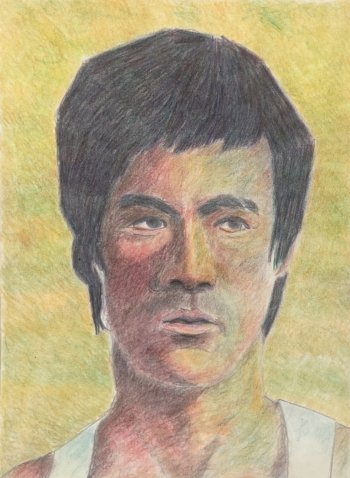
Bruce Lee
I caught about fifteen minutes of Enter The Dragon a couple of nights ago and was transfixed. All artists should watch films late at night. Not only are they a great source of painting ideas but there’s a lot to learn from them. I learned a lot about composition just by watching Sergio Leone and Quentin Tarantino films and concentrating on how they assemble scenes. But there’s also a lot to learn from studying faces, looking at all the colours and values in them and thinking about how they could be painted. And while I was watching Enter The Dragon, there was a brief shot of Bruce Lee in which the right side of his face was made up of warm reds and purples while the left side was made up of cool blues and greens. I don’t know whether this was the effect of the sunlight or of light reflected from colourful shop fronts but it was something I wanted to have a go at reproducing in coloured pencil. The photo I used as a source wasn’t the shot in the film that gave me the idea but I’d committed the colours to memory so any photo half in shadow would have worked for me.
I started by putting down a pencil outline. I used a grid and decided to go with straight edges to all the shapes, although there’s not much evidence if that in the final painting. I marked on, very roughly, the shadow areas that I could see. I had a little help from the Notanizer app in doing this but didn’t use the grid to put down an accurate value plan.
For the first couple of layers, I put down large flat shapes using the sides of the pencils rather than the points. This turned out to be quite a smart move, getting down the big shadow shapes right from the start and giving me something off which to hang everything else. But after that, I got down to the usual business of adding multiple layers of colour using the points of the pencils and applying the lowest pressure that would leave marks. I used a mixture of colours that I could remember and colours that came up when I edited my source photo, racking up the saturation, changing the temperature, etc. Most mark making was in small circles but for the hair I worked in fast straight lines, backwards and forwards to create a bit of texture.
This took two days to finish. After stopping on day one, I watched the whole film. And when I came back to the portrait today, I worked on darkening the hair and shadows and adding a variegated green/yellow/orange background to push the face forwards. Once I thought everything was dark enough to work, I blended everything with paper stumps and that was me done.
And the final painting works so well. It might look like a mess close up but step back a bit and it looks realistic, like a human being with a mind of his own. All those reds, purples, oranges, greens, blues somehow give the impression of flesh colours and I don’t know how. Oh, and the directional marks in the hair work really well too. This one’s up for sale, with the price to be found here. My coloured pencil portraits are so much better when I’m in no hurry to complete them in a day.
Leave a Reply