After three days off watching the chess at the FIDE Candidates, I was back in…

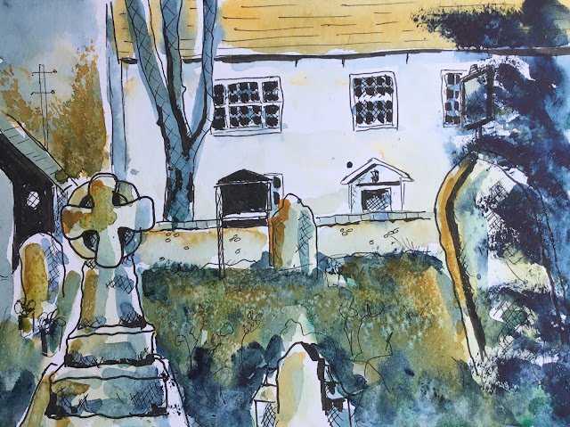
Looking Towards Hartlip House
And here’s today’s third effort, a different view from the same bench.
The drawing feels like a step down from the first two. There are various bunches of flowers that feel a bit half hearted and it probably wasn’t a great idea to use such dark blocks of black in what are background shapes. The windows on the house would have been fine, for example, cross hatched or even just outlines. The detail in the background is fine: it’s just the big contrasts between light and dark that should only be used around the centre of interest (in this case the foreground gravestones).
Anyway, what does the iPad have to say about colours?
I didn’t mind the sound of this choice at first. I thought the Winsor orange might be able to neutralise the viridian or indigo and produce an interesting dark neutral that could give me a grim looking graveyard contrasting against a bright white house behind it. But some test swatches revealed this to only be a pipe dream: the orange behaved like a yellow when mixed with either of the other two colours, only ‘extending the range of possible greens.
So I was left having to paint the red roof orange and then, over the rest of the painting, to try to use orange for the brightest bits and indigo for the darkest, fighting hard to not turn everything green. The iPad had given me a hospital pass and no mistake. I did have a couple of minor successes, though, with some faint blues and oranges bringing the house to life and some orange trees at the back on the left. There’s also some random dabbing on those gravestones that falls a long way short of colouring in and looks good.
So, yeah, looks like a 33% success rate so far for the dash and splashing. It will revert towards the mean at some point once that iPad remembers that it’s allowed to pick reds.
This one’s not going up for sale.


Leave a Reply