1 August 2018 Looking at feedback so far, people seemed to like paintings of outer…

Tombstone
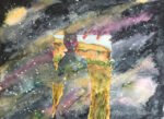
The three primaries in the silhouettes are quinacridone magenta, Prussian blue and cadmium yellow. It probably comes as a surprise to people that I’m using the opaque yellow here. My problem was that, looking at my colour charts, Indian yellow doesn’t make great greens and transparent yellow doesn’t make great oranges. Cadmium yellow can do both, so I went with the marginally lesser of two evils: one opaque yellow rather than two transparent ones. All three primaries also feature in the foreground and the building, along with burnt umber, burnt sienna and raw sienna. The sky is Payne’s grey with spatters of titanium white, cadmium yellow and cadmium red. So that’s nine colours in total. I also used some salt on the figures as they were drying.
I had so many problems doing this painting. I fiddled, fiddled and fiddled with the building and foreground until I finally reached something acceptable. And the figures were really badly behaved. The paints were refusing to work together wet into wet but were quite happy to keep leaking into the sky. At first I tried dabbing the sky clean with tissue paper, but that still left some residual primary colour leakage. Then I tried spraying the whole painting and letting the figures leak into the sky. I didn’t like the resulting effect. Finally, I went for dabbing the while painting dry (both sky and figures) and was amazed that it worked out so well. The figures look even better dabbed dry and looking pale like ghosts.
I think this one definitely worked. Best bits? The pale values on the figures that add to their ghostliness, the complimentary contrast between orange heads and blue sky, the red outline along the right of the guy on the right and the loose painting of the building with random light bits showing through. Worst bit? Maybe the blue on Doc Holliday (on the left) is a bit too dark. If anybody asks, I put this down to the alcohol in his system – if you’ve seen the film you’ll understand. Or maybe it’s the sky showing through a a bullet hole?
It sold on the day it was put up for sale, along with two other Western paintings.
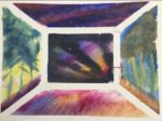
And, finally, as a special bonus, here’s the half way painting before the “colouring in”. I always think these look good.


Leave a Reply