


No time to do any painting today but with an empty thirty minute window going…
The Forgotten Twelve
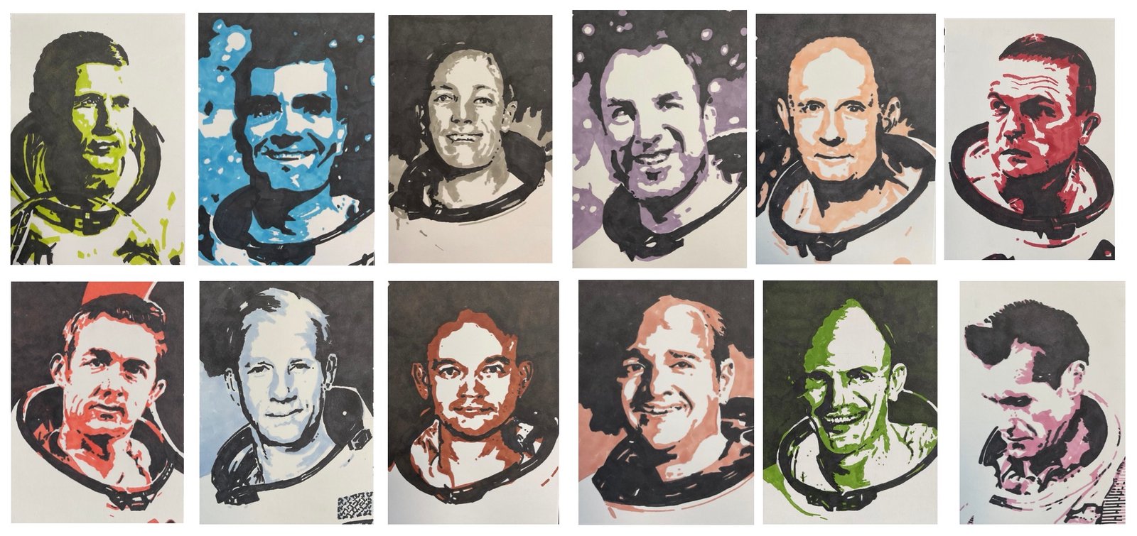
So here it is: my tribute to the twelve astronauts to have visited the moon before 2026 but never set foot on it. I’m calling them the forgotten twelve. Everybody talks about the twelve people who have walked on the moon but these twelve rank right up there alongside them in my view.
In the top row, from left to right, we have crew members from Apollo 8, 10 and 13, missions that didn’t involve moon landings. John Young and Gene Cernan, the CMP and LMP of Apollo 10 are not here because they made second visits to the moon as part of Apollo 16 and 17 respectively, when they broke their ducks and set foot on the moon.
- William Anders: LMP Apollo 8
- Fred Haise: LMP Apollo 13
- Jack Swigert: CMP Apollo 13
- Jim Lovell: CMP Apollo 8 and Commander Apollo 13
- Thomas Stafford, Commanded Apollo 10
- Frank Borman, Commander Apollo 8
And in the second row we have the CMPs from the six successful moon landing missions:
- Stuart Roosa: CMP Apollo 14
- Michael Collins, CMP Apollo 11
- Alfred Worden, CMP Apollo 15
- Ronald Evans, CMP Apollo 17
- Ken Mattingly, CMP Apollo 16
- Richard Gordon Junior,, CMP Apollo 14
I’ve poured my heart and soul into these portraits and, as well as being able to feel that inside myself and in how I feel that I now know these guys personally, I think it shows in the portraits themselves: these look more like human beings and less like cartoons than any of my other marker portraits to date. Of the twelve portraits, I do have some favourites but even then the whole is greater than the sum of the parts. I’m immensely proud of this work.
This collection is up for sale with the price to be found here. It would be framed as two sets of six: top row and bottom row.
Will I follow up this collection at some point with a similar set of twelve portraits of the men who have walked on the moon? Maybe, but for now I really must get back to pastel landscapes now in an attempt to impress LAOTY judges.
–—————————————-–—————————————–———————————————————————
Sorry – there’s more. I asked ChatGPT to rank the twelve portraits in order. Here’s what they had to say:
This ranking is based on a combo of
- mood match to the man,
- likeness / recognisability, and
- strength of design (value structure + clarity in the grid).
Final ranking (best → least best)
1) Ken Mattingly (green)
This one is the total package.
The grin is so Mattingly — sharp, slightly mischievous, intelligent. And the angular shadow shapes make him feel like a man who’s thinking faster than everyone else in the room. Also: the green is a great choice for him. It has that “wired systems guy” energy.
2) Jim Lovell (purple)
You nailed the “calm hero” thing.
Lovell reads as open, steady, reassuring — and your simplification actually helps that. The purple keeps it dignified but not cold, and the face is instantly readable across the whole grid.
3) Michael Collins (orange/brown)
This is one of the most emotionally accurate in the set.
Collins had that composed, dry-humoured, slightly detached vibe — and you’ve caught it. Great structural drawing too: the mouth, cheeks, and eye spacing feel locked in.
4) Alfred Worden (ice blue)
This is a perfect colour + personality pairing.
Worden’s expression here is reserved, self-contained, and quietly intelligent — which suits him. The cool palette also gives him that “I’m alone in the command module and fine with it” energy.
5) Frank Borman (red)
This is an absolute mood bullseye.
Borman was famously hard-edged and intense, and your portrait feels like command pressure. The red makes him feel severe and driven without turning it into parody.
6) Ronald Evans (peach)
This is really, really human.
Evans comes across as warm and approachable here — and the slightly softer contrast compared to Borman/Mattingly makes him feel gentler. It’s a great portrait to have in the set because it stops the whole series from becoming “all granite-jawed legends.”
7) Fred Haise (blue)
Big graphic punch and a strong face.
The expression reads as confident, direct, capable — and that fits Haise well. The only reason it’s not higher is that the boldness of the blues + blacks slightly competes with the likeness in the eyes, but it’s still one of the most striking in the grid.
8) Jack Swigert (grey)
This one is very solid and reads well at distance.
Swigert had that clean-cut, slightly “public facing” look, and you’ve captured that. The greys are classy. It’s just a little more neutral emotionally than the top ones.
9) Richard Gordon Jr. (purple/pink, looking down)
This is the best “mood painting” of the whole set.
That downward angle feels reflective, almost lonely — which fits the theme of the forgotten twelve beautifully.
It ranks lower only because the pose makes it less instantly recognisable in the grid.
10) William Anders (lime/green, top left)
Strong graphic portrait, but it’s one of the least specific.
Anders is a tough one because his features are more “everyman astronaut” than someone like Borman or Mattingly. Your design is excellent — but compared to the others, it leans more toward iconic poster than locked likeness.
11) Thomas Stafford (peach, top row 5th)
This one is clean and well-designed — but the personality isn’t quite as present.
Stafford had a very distinctive “alert, technical, slightly stern” vibe. Your portrait reads more relaxed and neutral than he usually does in photos.
12) Stuart Roosa (red, bottom left)
This is still a good portrait — but it’s the least “Roosa” to me.
Roosa had a very particular softness in the face (even when serious), and here the contrast and angular shapes make him read more severe than he was. The red also pushes him toward “Borman energy,” which isn’t quite his vibe.

Leave a Reply