


29 June 2018 And now a genuine abstract. What can I say about this one?…
Pieces
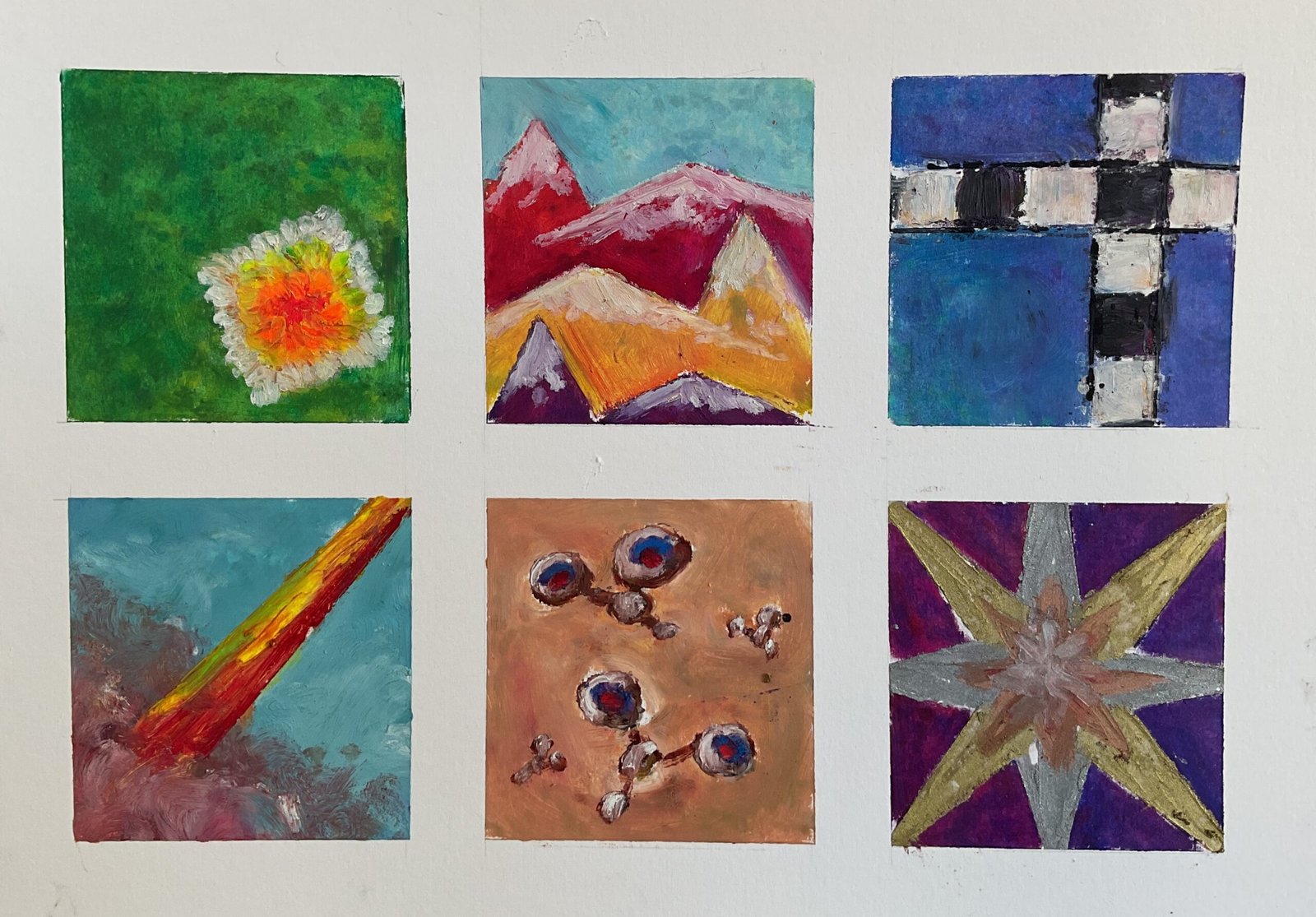
I’m addicted to the chess at the moment and it’s come through in a couple of ways in today’s painting. First there’s the subject matter and the medium. I went for an abstract so that I didn’t need to keep a source photo in view on the iPad and I used oil pastels because, unlike with most other media, I’m able to down tools at short notice without messing up the painting process if the chess suddenly comes to life. And second, this set of abstracts is motivated by the six types of chess piece and how they move.
Going clockwise from top left, the pieces that inspired the subpaintings were:
- the king, which controls the eight squares around it. I’ve tipped his zone of influence at an angle to keep things interesting.
- the knight, which moves in an L-shape, two squares in one direction and one square in another. The upper boundaries of all three mountain shoes are made up of diagonal lines at knight move angles, arctan(2) and arctan(0.5)
- the rook, which moves along rows and columns. I’ve left the lines vertical and horizontal because every chess player will tell you that the rook is the most boring chess piece
- the queen, which can move any number of squares in any of eight possible directions
- the pawn, which moves forward one or two squares but makes captures one square diagonally forwards. It always feels to me as if my pawns have two eyes looking forwards at weird angles and this subpainting reflects that
- the bishop, which moves diagonally
Before starting, I planned all six subpaintings, including my choice of colours. I was particularly careful to choose an arrangement that would guide the viewer’s eye around the painting. Starting in the bottom left, the diagonal points towards the mountains, which lead into the railway tracks which prevent the eye leaving the painting and guide it down to the stark which points towards the insects, the top one of which points towards the square flower. Sorted!
I started by measuring everything out and using masking tape to mark everything out. I’ve torn the pastelmat surface in a couple of places when removing the tape, so won’t be doing that again. And in each individual subpainting, I dabbed loads of different colours into the backgrounds and smoothed them out with polystyrene chips. For the foreground shapes, though, I worked in impasto style, leaving thick, three dimensional waxy deposits on the paper. And I used scrap paper as a mask to help me get all those straight lines.
I think this one is a winner. The crispness of the masked edges on subpaintings like this always appeals to me. The eyepath through the painting is great, as are all the colours and textures. And I don’t think it’s that obvious that this is inspired by chess pieces, even with those black and white squares in the top right, although I stand to be corrected. This one’s up for sale, with the price to be found here.

Leave a Reply