


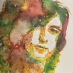
Looks like I'm taking a break from LAOTY and PAOTY prep this week then because…
It Gives Me Peace Of Mind
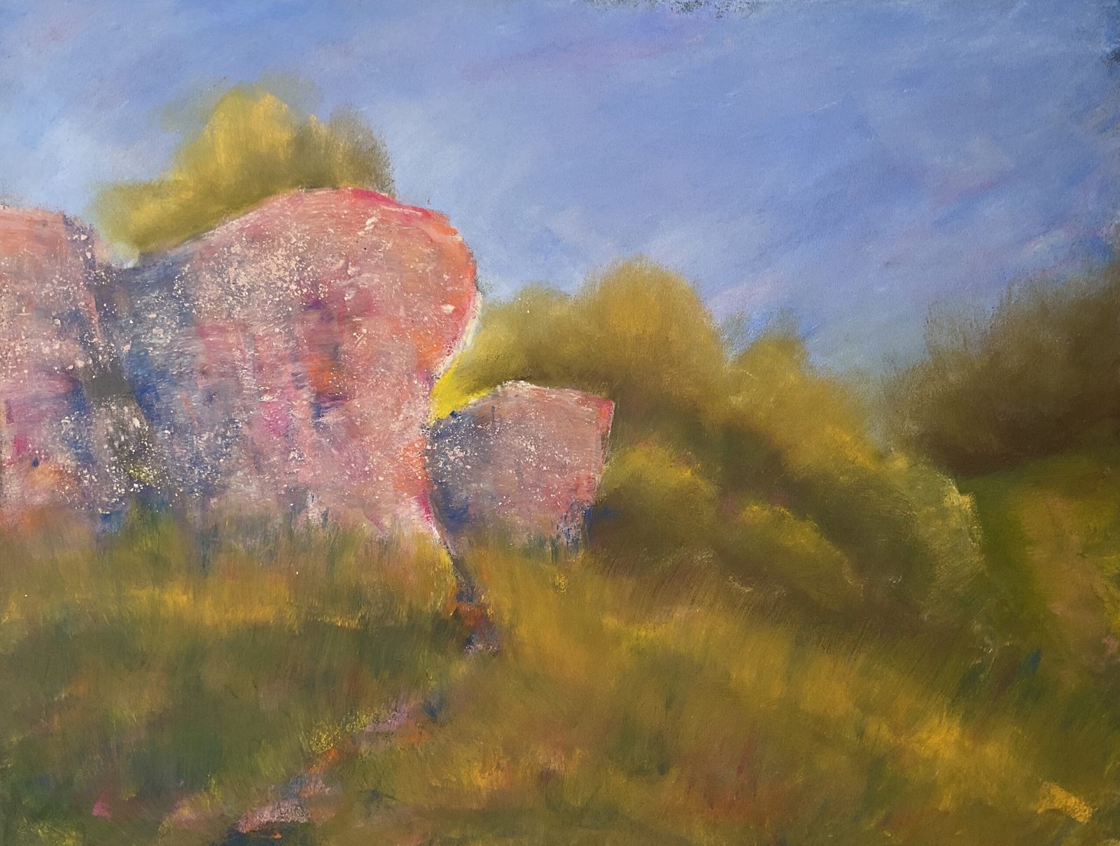
It’s a rest day in the chess, so I was back to the artwork today. And with Spring finally here, the plein air season has started. So I headed out to White Horse Wood Country Park. Being in the mood for something other than the natural world, I made my way over to Thurnham Castle and set myself up for the day.
I went with coloured pastels today, still looking to impress any visiting LAOTY judges. I didn’t take watercolours with me for an underpainting. Instead I took along some coloured pastelboard that I invested in earlier this week. Although it’s by the same manufacturer, Clairefontaine, as my usual white version, the surface seems much rougher than I’m used to, even on white pages. And the pastel doesn’t stick as well to the rough surface, with lots of pastelled areas lost all their pigment at various stages of the painting. This might make for some interesting paintings at some point but I’d rather have discovered and experimented with this at home in the studio than out on the road. Anyway, on to the painting.
I chose the dark blue paper. Of the four colours I had with me, it felt the most appropriate. I started by marking out the big shapes with the edges of some random pastels, then got to work layering colour. I started with the sky. This was where I first discovered the paper’s weak attractive force. I hadn’t been planning on blending colours but ended up having to blend the sky with polystyrene chips just to get the pigment to stay on the paper.
I developed the walls, background and foreground in parallel, keeping switching between them. I added whatever colours felt right at the time and had a lot of fun. I started by trying to stick to the rule of light colours first, then dark, but ended up adding so many layers of colour that all rules went out the window. I had the most fun with the walls, never once being tempted to paint them realistically, instead using fleshy tines as a general base and blues, purples, reds and oranges to adjust the temperature where it felt right to do so.
Stroke-wise, I only used edges of pastels in the walls to to swipe out areas until the end when I grated over and pressed in some light. coloured powder for texture. I didn’t blend the colours in the walls. For the background and foreground, though, I pressed harder with the pastels in an attempt to get some contrasting temperature. At some point, though, I realised that these areas were competing too hard with the walls for attention, so calmed them down by blending them with polystyrene chips. I had tried to create a pathway into the painting by including an area in the foreground with less dark blue shapes but after all the blending, this started to look like a genuine path rather than the subtle nuance that I intended.
In the final painting, I do like all the greenery. There’s a great three dimensional effect there. And I like the colours in the walls. But there’s something about the sharpness of the edges of the walls that makes them look as if they’ve been cut out of a magazine and stuck on. Or maybe it’s the complementary color that are doing this. Whatever it is, it means this isn’t my favourite painting (my plein airs rarely are) but it’s up for sale, with the price to be found here.
And I’m naming this one after another line from Country Home by Neil Young.

Leave a Reply