


Wednesday 3rd February, 8pm, Sky Arts. That's when I'll be appearing as a wildcard. Best…
I’m Thankful For My Country Home
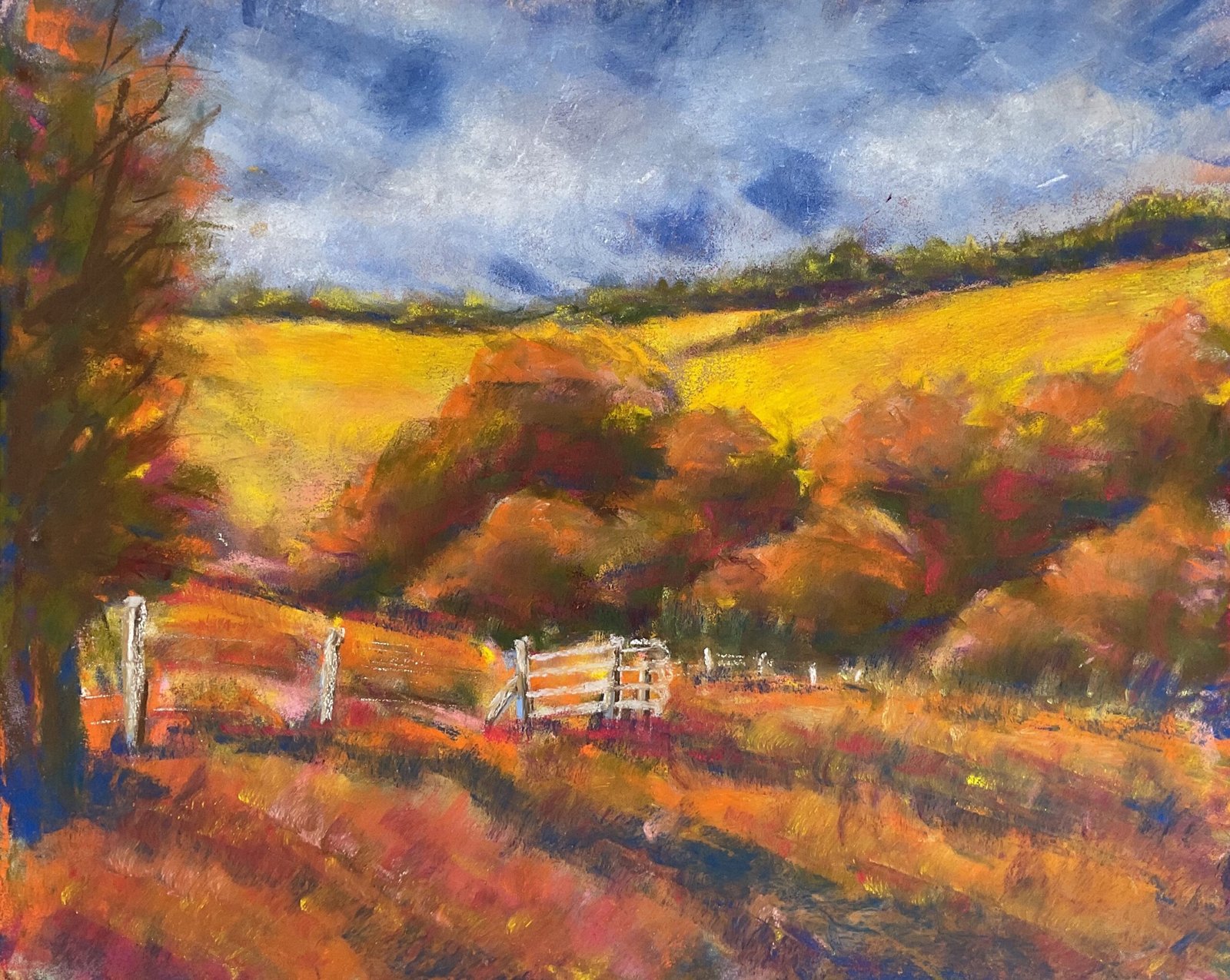
OK then, time to put into action some of the lessons I learned from that Jean Hirons book. It’s going to be a Queendown Warren landscape in soft pastel and I’m going to do three things differently to normal:
- I’ll be starting with a watercolour underpainting
- I’ll be blending colours a lot less than I normally do
- I’ll be starting with dark colours and adding lighter colours on top of them as I go on.
Let’s start with the watercolour underpainting. Here it is:
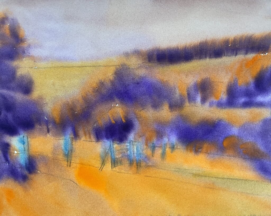
It’s a values based underpainting. I wanted purple in the dark tree areas and orange in the green grass, so went for my honey based watercolours as they already include an orange and a purple. I put everything down pretty loosely without a grid. I used the cerulean blue for the fence posts and a mixture of the orange and the purple for the sky. I was pretty loose applying the colours, not bothering with using a grid to get an accurate drawing.
The idea behind the underpainting is that soft pastels will never cover all the paper. Some of it will always show through, so why not make the colours showing through work for me? White showing through does nothing but the colours here will have a positive impact on the final painting. But this underpainting has also given me ideas for future paintings. A landscape with purple trees and orange grass might work well in watercolour. And the colour of the sky would work well in such a painting. I also like the looseness of the underpainting. I can imagine adding more watercolour layers to this one and starting to pick out details. I need to start a watercolour landscape like this at some point.
Once the underpainting was dry, I started work with the soft pastels, working from the back to the front, starting each shape with dark colours before moving on to lighter ones. I did as little smoothing as possible: just some light finger pitterpattern smoothing in the sky and in the tree on the left. I tended to add the colours that sang to me as I went down the painting rather than trying to arch those in my source photo. And then as I got near the end, I noticed the blue, green, yellow, orange top to bottom colour progression that I’d created, so added more reds in the foreground. And I finished by adding blues and oranges in various places so that they weren’t restricted to one area of the painting. That’s probably more apposite to the blues in the final painting as I went a bit over the top with the oranges, not for the first time. And that was me done.
This painting feels like a huge step forward. It looks like a painting from a textbook. I don’t know for certain which of my three methodology changes this is down to. But it feels to me like painting light over dark might be what’s making those yellow hills sing. The lack of blending may also be helping. I can’t see any of the underpainting showing through the pastel but I can feel its influence in making me more adventurous with the colours. And all those blues amid the oranges in the trees and grass are bordering on genius. Yes, I’m more than happy with this one. It’s up for sale, with the price to be found here.
This one is the first of many to be named after lines from Country House by Neil Young, my newest source of painting names.

Leave a Reply