


I wasn’t very good at painting and not that committed to improving. I would have…
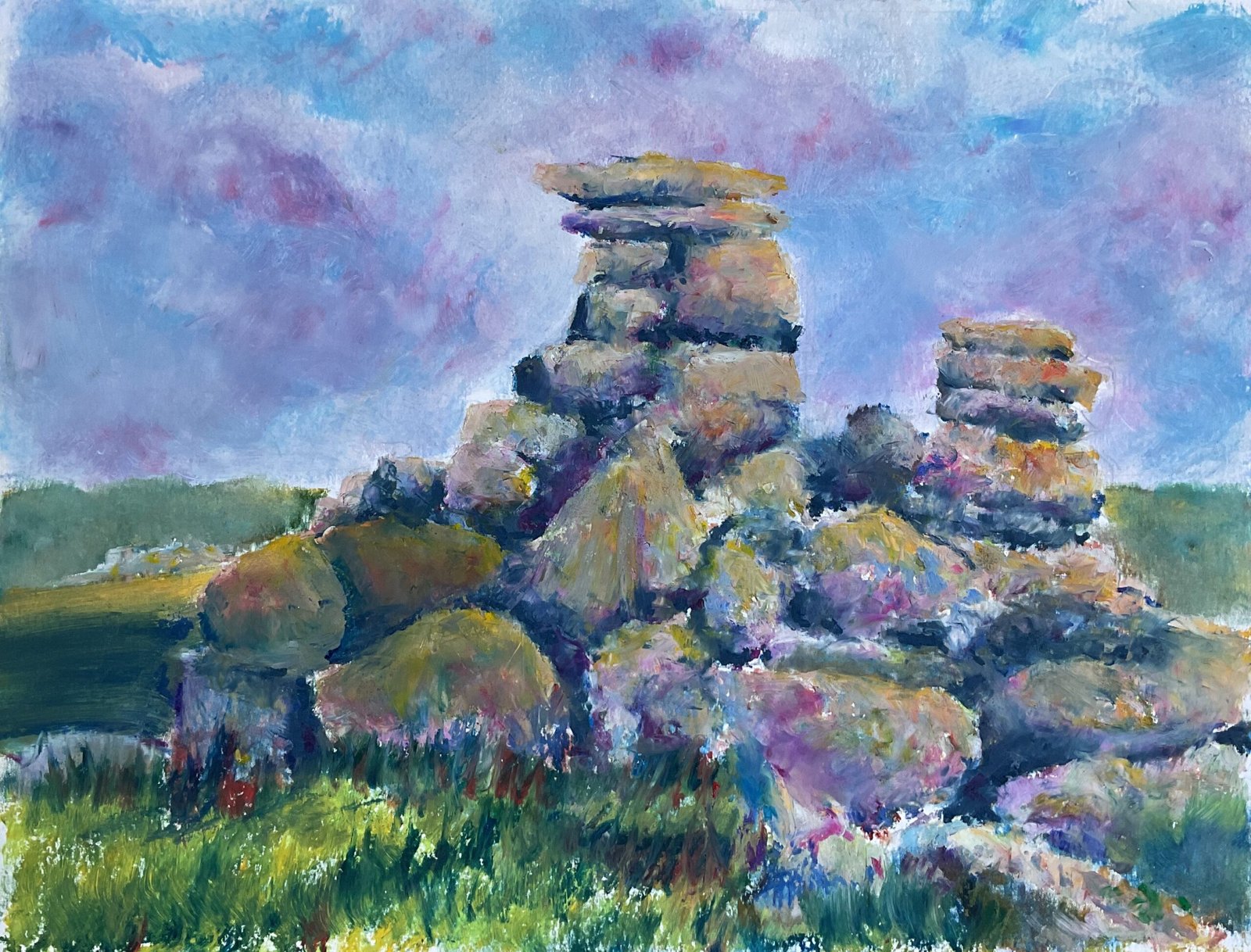
Great Staple Tor
LAOTY closes to entries on Monday, so let’s make the first landscape the judges see on this website a good one. It’s still cold enough for oil pastels and my favourite oil pastel landscape subjects are piles of rocks. A bit of internet searching last night got me to this one on top of Great Staple Tor in Devon, a cracking subject.
I put down a pencil outline first, then filled the sky with colour and blended it with polystyrene chips. Then I did the same with the grassy background. While I was careful to not make pastel marks in the rocks, I was happy for my blended colours to overlap onto them as they’d be covered up later.
I was keen to get my lights and darks right today, so when it came to the rocks, my first step was to use the Notanizer app to identify the darks. I filled these all in with Prussian blue, dropped in some browns/reds/greens for variety and blended them with colour shapers. This gave me “something off which to hang everything else”.
And then it was on to the fun bit: the rocks. I dotted in lots of interesting colours: mainly flesh colours but also primaries, greens and a little orange and purple. I added on some white to keep colours light and blended everything with the colour shapers. After that I lose track of exactly what I did. I added several layers of colour, always going for what felt right. At one point everything was looking a bit too red, so I added greens. My darks were looking a bit too blue, so I added more colours to these, including greys and indigo. I tried to blend the darks into the lighter areas with the colour shapers. Sometimes I blended the colours; at other times I left it impasto, three dimensional and sticking out of the paper.
Once I was happy with the colours in the rocks, I added the foreground grassy area. Not much to say about that: I got what I wanted pretty quickly without needing to tinker.
Then I took a step back. I kind of liked the painting but could see that it was lacking a focal point, with everything blended and slightly out of focus. So I tinkered some more. I went over most of the rocks again, blending the shadows with colour shapers and everything else with random dabs of the fingers – just dabs, no pushing paint around. And I tried to get the top rocks more into focus by adding more colour, blending with colour shapers and trying to get hard edges everywhere. I thought about leaving the top rocks impasto but decided this would make them look too dissimilar to the rocks at the bottom. And that was me done.
And it’s another decent painting, this one. The sky might be my best one yet with the oil pastels. The rocks aren’t as flesh coloured as I was intending and some of them have deviated in shape from my source photo but neither of those are a problem. They look great. This one’s up for sale, with the price to be found here.
All in just under three hours, so LAOTY won’t be a problem if I’m picked. Bring it on!
Leave a Reply