


I wandered around the village for a while looking for a subject for my third…
Foxy Lady
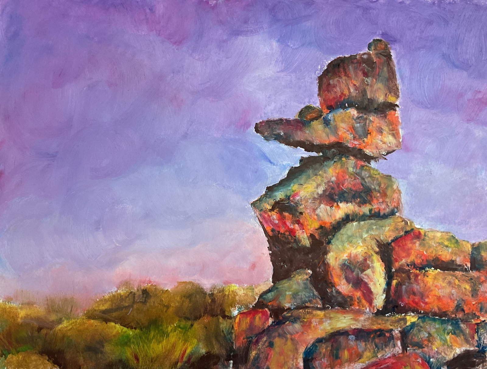
And now the Artist Of The Year run up starts. I need to building up my collection of watercolour portraits and pastel landscapes for PAOTY and LAOTY respectively. I started with an oil pastel landscape today. This is a pile of rocks at the Giants’ Playground in Namibia that looks like a dog or Wile E. Coyote.
My three objectives underlying this painting were to:
- have a good time with bright, impressionistic yellows and oranges in the rocks
- create some complementary colour vibration, contrasting the orange/yellow rocks against a blue/violet sky
- vary my blending techniques, and hence my edges, blending the sky and background with polystyrene chips and the main rock formation with colour shapers.
Process-wise, I put down a pencil outline using a grid, then put in the sky colours and blended them. Then I worked on the rocks, starting with the dark areas, then throwing in yellows, oranges, reds, violet grey, the odd earthy yellow and white wherever I could see them in my source photo or wherever I thought they might look good. After blending these, I moved on to the background, which I filled out with more boring, less saturated, earthy colours and a little green and yellow wherever I wanted grassy clumps. And I blended out the background (and created grasses) with the polystyrene chips.
Then I took a step back. I thought the darks in the main set of rocks were looking too hard edge and too unsaturated compared to all the oranges and yellows on show. So I decided to add some Prussian blue around the darks and to create some new dark areas. When I came to blend in the blue, though, it unsurprisingly turned my yellows green and upset the yellow/purple contrast I’d created. So I added in some more yellow, orange and white and blended these in gently with a colour shaper. And then I stooped, thinking that any more tinkering would only make things worse. And that was me done.
And I do like the way this one turned out. The rocks look more like a duck than a dog but that’s fine. There’s a tiny white pinprick in the shadows between the two biggest rocks in the head that looks like an eye highlight, which is a happy accident. I have the crazy colours and the edge variation that I wanted. And, while I don’t gave the blue/orange and yellow/purple contrasts that I wanted between the sky and the rocks, there are some yellow/purple contrasts between the sky and the background and lots of red/green contrasts everywhere. This is a painting to wave in front of people while telling then that all of its redeeming points were deliberate on my part. This one is up for sale, with the price to be found here.
Leave a Reply