


I have lots of different excuses for getting new art instruction books. I get books…
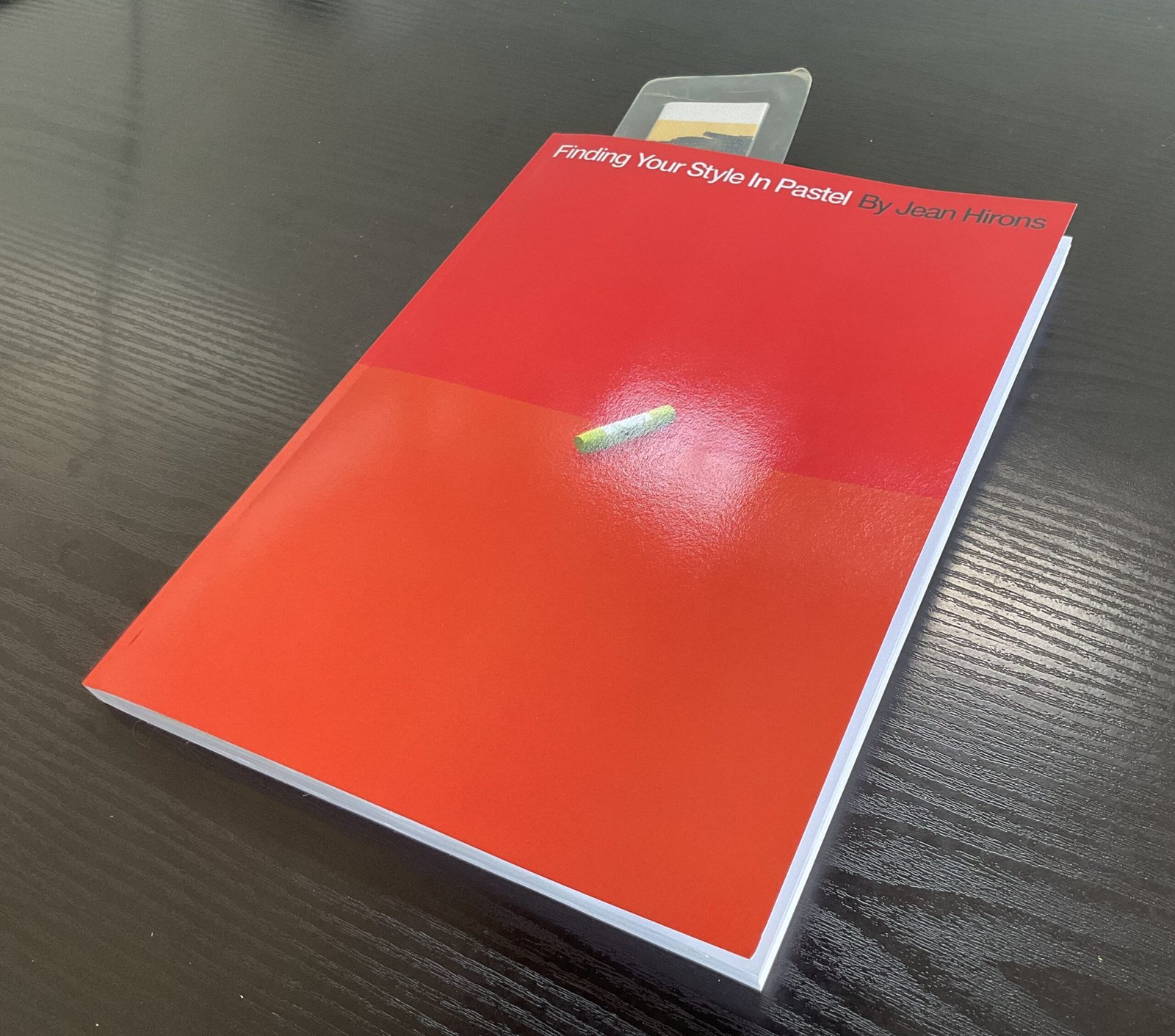
Finding Your Style In Pastel, Jean Hirons- Book Review
Time for a book review. This one’s been at the top of my wishlist for a while now and I was reading an online review of it in which the reviewer said that it was self published and that self published books tend to disappear from shop windows once the initial order has all sold out. I’ve no idea whether any of that is true but I did buy the book after reading the review. And, with my LAOTY application focused on pastels and still open, it would do me some good to learn more about pastels, especially from a book that I understood to be targeted at experienced pastel artists rather than beginners.
Right, onto the book. It’s. 200 page long paperback. It has 13 chapters, plus an intro and some appendices. Very early in the book, Jean says that this is about pastels, not about oil pastels. Ah, OK, so it’s about what I call soft pastels then? No, AA,, it’s not. You need to read the book, starting with…
Chapter 1, which is an introduction to pastels. And straight away I’m learning something. What I call soft pastels can be divided up into hard, intermediate and soft pastels. I like Jean’s approach to this already. Rather than just going through a big list of manufacturers and talking about each one individually, she starts with a taxonomy of pastels: three categories that they can be divided between. She talks a little bit about individual brands but most of her discussion is about the three types of pastel and their different attributes. Apparently some artists use pastels of all three different types (and Jean tells us why) but I have no plans to make my collection any bigger. A bit of internet research reveals my Jackson’s pastels to genuinely fall into the soft pastel category and Jean tells me it’s fine to just work with softs, so that’s all good.
Then we have a chapter on different surfaces to paint on. Jean starts by telling us about four types of surface and gives advice common to all the surfaces within each type. Then she goes onto talk about the pros and cons about every different surface within each of those four groups. Pastelmat is covered (and classified as a smooth surface). Reading what Jean has to say about pastelmat, I’m happy to stick with it. And throughout the rest of the book, whenever Jean talks about pastel painting styles, she keeps telling us how well they work with different types of pastel or different surfaces. It meant that I could see everything in this book through a Jacksons soft pastels/pastelmat lens and understand which styles would work well for me. Brilliant. These two chapters on materials are actually really useful in setting up the rest of the book. They’re definitely not wasted paper.
Then we have the all important chapter on mark making. Using the side of the pastel for big sweeps or using point or edge for lines that could be crisscrossed or one directional or whatever. There’s stuff on blending: both whether to blend and how to blend. Jean mentions polystyrene chips as potential blending tools, which has upset me because I thought they were my idea and my gift to the world of artists. And there was stuff on layering, where I was shocked to discover that pastels work best going from dark to light. Apparently if you work from light to dark, you can create mud. Why has nobody told me this before?
Then we have a chapter on the use of toned paper and on putting down underpaintings. The discussion on underpaintings covers the use of two or three different possible media. I’ve been using white pastelmat without underpaintings but this chapter opened my eyes to potential changes in style. And I do see this as a style discussion and not as a digression into the world of mixed media. I may well check out toned pastelmat and will definitely be experimenting with underpaintings on white pastelmat. Enough advice is given for me to know that this will work with my choice of pastel, underpainting medium and surface.
Then we really start getting into style with a discussion of “the look”. We read all about vignettes, the linear look, the textured look, the blended look, the oil paint look, the bold stroke look, the mixed media look and three looks to avoid. And again, I can’t keep saying this enough, but we keep getting told about how our choices of pastel and surface affect our chances of success in replicating each of these looks.
That was apparently just the basics. We then have three chapters on composition. First up is a general chapter on composition, with lots that we’ve all read about before but also some bits specific to pastels. And I liked how Jean said that paintings don’t need a centre of interest. About how there are two types of painting: centre of interest paintings and big shape paintings. My landscapes are generally about big shapes and often lack clear centres of interest, so this felt to me like something to celebrate. And it’s another taxonomy, dividing paintings into two types; there will be times in this book when Jean’s advice depends on which type of painting we’re dealing with.
Then it’s a chapter on values. Nothing much new but the importance of values can never be understated. And there’s some interesting stuff in there on paintings in high keys or low keys, as opposed to paintings with a wide range of values.
The third composition chapter is on edges. Hard vs soft edges. How edges are part of an artist’s style, how it’s easier to get hard edges on different surfaces or with different pastels, where edges should be softened, how to harden or soften edges.
And then the rest of the bulk of the book is taken up by five chapters on colour. First is a chapter on colour theory. The usual stuff about colours having the three dimensions of hue, value and saturation. But what about temperature? Well, that’s not a feature of individual colours but only works in a relative way, comparing two adjacent colours on a painting. Again, why have I not been told this before? And we also have some compositional stuff on colour dominance and colour contrasts, each of which works with hue, value, saturation and temperature. And some stuff on how contrasts can be smooth transitions rather than abrupt, discontinuous steps.
Then it’s choices of colours. We can use all the colours in our collections or we can go for restricted colour schemes: monotone, analogous, complementary, split complementary, …. The usual stuff. But we’re reading a book about developing our own styles, so this is important.
Then it’s back to toned surfaces and underpaintings. But now we’re talking about how to choose the colours. We have lots of options and their pros and cons are all listed.
Then there’s a really interesting chapter on three approaches to colour. We can try replicating what’s in front of us, or we can take what’s in front of us and tweak it to something more interesting or we can just make up something that creates a mood. We’re told when we might want to try each approach and are given lots of tips to go with each approach.
And then we have a final chapter with some troubleshooting tips and three short, four step demos. The demos are pretty good at reinforcing some of the messages in the book and this is because each demo is accompanied by a list of all the style and composition decisions that were made during the creation of the painting.
Style-wise, this book was great. I liked how Jean likes to start each chapter with statements like “there are x different ways we can choose to do this”. It gave everything a structure, like a PowerPoint presentation. I also liked how she kept telling us how different styles might work out with different pastels, surfaces, composition types, colour schemes, etc.: style isn’t about making lots of independent choices, it’s about making a set of choices that all hang together. And Jean also keeps telling us that we don’t have to copy everything she does: it’s up to us to develop our own styles.
As is to be expected in a book about style, this one is illustrated with the work of loads of different artists, all of whom get a decent sized writeup in an appendix. That’s classy.
I think we can tell where this one’s going. It’s packed with ideas and tips. It’s all about developing a style in pastel, so passes the Snakes On A Plane test. It’s well organised and easy to follow with its taxonomies and breakdowns. It links everything together so that someone like me who’s already made their choice of which pastels and paper to use, can understand what style suits them. And I feel like a veil has lifted: before this book I was flailing around in the dark, not knowing where my pastel paintings were going, but now I have a map and I can’t wait to get started on the rest of my journey. I’ve not felt this excited after reading an art book for years. This one scores an easy five palettes. Buy it now!
🎨🎨🎨🎨🎨
You can find this book and more reviews of it at Amazon UK, here. As an Amazon Associate, I earn commission from qualifying purchases but this costs absolutely nothing extra to you.
Leave a Reply