


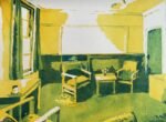
Back to Christ's College tidy for another indoor landscape. This is a room in…
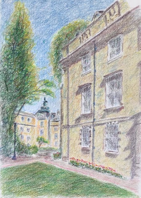
Towards Third Court, Christ’s College, Cambridge
About a week ago, when I painted Garrow Farm in coloured pencils, I discovered the joy of jamming along to music with coloured pencils and just letting them make me to all sorts of weird places. That day I was playing some Widespread Panic and enjoying some long explorative guitar solos. I promised myself that I’d give the coloured pencil jamming another go sometime soon but to the Grateful Dead. And that’s where I spent today. I started with a 1974 concert but wasn’t really getting it, so switched to May 1977 and that was me away. The music finished before I did, so I switched over to the Tedeschi Trucks Band for more guitar soling and coloured pencil jamming.
For today’s subject, I’m back again to my old college in Cambridge. The photo that I used as a source was one that I took on a recent trip, looking for paintable scenes. I picked this one out today because I thought I could jam with loads of different colours on the building on the right.
For my initial drawing today, I stared with a grid but also measured all sorts of distances really accurately, zooming in on the image on the iPad so that everything exactly matched the size on my paper. Once I’d got the building, lawn and window outlines down I switched over to drawing by hand. After rubbing out the the grid lines and embossing some window frames to preserve whites, I was ready to start with the colour.
The most boring bit is the sky, where I only used eight blues, variegating them into each other. I started with four cool blues with the darkest at the top and lightest at the bottom, then did the same with four warm blues but in slanted bands rather than horizontal ones.
For the rest of the painting, I started everywhere with the complement of the local colour in a very light layer. So purple on most of the buildings and red in the tree and on the grass. Then I added a second layer based on the local colour, just to keep me on track.
For the Third Court buildings at the back, the lamp post, the flower bed and the pathways, I didn’t do any jamming, just adding several layers of colour, gradually tweaking colours towards what I wanted them to be.
But for the rest of the painting (trees, foreground building and lawn) I was jamming. I used all sorts of colours, although for the trees and lawn I used mainly greens, along with some blues and yellows and the odd red or brown. And for the trees I tried to keep the yellowest colours in the edges and the darkest ones in the middle. For the building, though, I used all sorts of colours. Rather than colouring in areas with small ellipses, I was letting the pencil run all over the place, going wherever the music took me. I painted the building windows separately from the brickwork, putting in little areas of different colours.
A couple of times with the building (once halfway through and once at the end) I dragged the colour back towards reality with a unifying layer of dark Naples ochre, still allowing all the jammy colours underneath to show through. And two or three three times I went over all the buildings adding shadows, which were important for making the day look sunny.
Finally, when I was feeling happy with things and the music was drawing to an end, I went in with the finishing touches. A white burnishing layer in the sky, cream in Third Court and ivory in the foreground and on the paths. The trees and lawn were smoothed out with a paper stump. And that was me done.
And I like it. If there is a focal point, it’s that weird cage like room on the roof of the building at the back. There’s a bit more detail there and all the one point perspective lines on the foreground building are pointing towards it. Although the eye is also drawn toward the foreground building with all its colour jams. And I was relieved to get a bit of distinction between the colour of the foreground building and those at the back. The tree behind the building is good too, and there’s the usual fuzziness to things with the tooth of the paper making its presence felt. Where I’m less happy is with the scribbly foreground window pane borders and an unimaginative tree shape on the left. But there are lots of positives about this one. It’s up for sale.
Leave a Reply