


Next up is Clare College, and this is a view looking out from Memorial Court…
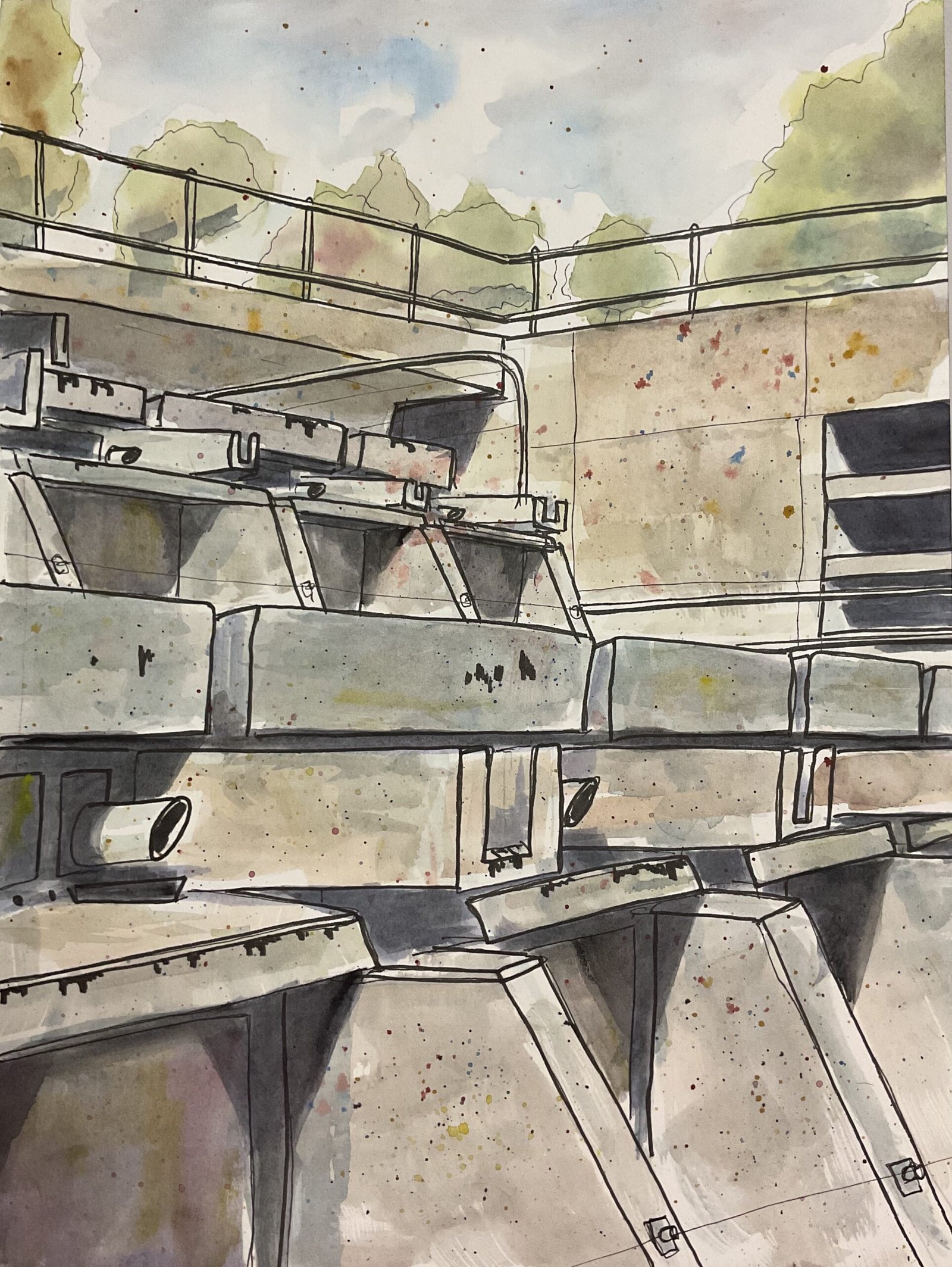
New Court In Fineliner And Artgraf
I was hunting around on YouTube the other day for demonstrations of people using Artgraf blocks. What I really wanted to see was people drawing with the blocks and then wetting the marks afterwards, like I do. And you know what? I couldn’t find anything. Everyone seems to be happy just using the blocks like watercolour pans. So I thought I’d have a go myself – it’s something I’d not tried until now.
It seems to be mainly urban sketchers painting this way and they like to play it loose, like I do with my dash & splash paintings. So I chose an ugly concrete structure in Christ’s College and put down outlines with fineliners. The combination of concrete and already having outlines down on the paper meant that I could be pretty free and easy with both the choice of colours and not having to colour shapes exactly to the edges. I also liked all the shadows on view and thought that by including these shadows I’d make the painting look brighter.
Anyway, to start with I put down a pencil grid and then put down accurate pencil outlines using a ruler. This took ages but I could still have spent three times and long on it: after a while I started putting down lines and shapes by triangulation rather than by measuring them out accurately.
After that came the inking stage. I started with quite. Fine pen, going over all outlines. I them moved on to thicker pens to put in the more important edges and those that were closest to the viewer. I used a brush pen to add shadows along the bottom of handrails and in those vents things and then some ugly looking drippy marks down the fronts of some of the concrete slabs. Finally I added some random textural spits to the concrete using pens of all sorts of different thicknesses. Once this was all done, I rubbed out all the pencil, which isn’t something I normally get to do and which felt liberating.
One thing that doing a painting this way has in common with my usual technique with the Artgraf blocks is that there’s a lot of serious work to get through at the start followed by an all too short fun stage. Because adding colour to this one was much quicker than pitting down the pencils and inks.
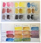
I”d already decided that the best colours for a neutral concretely look were blue, sanguine and ochre, so they were the main colours today and this is in the key of orange cool. Looking at other orange cool paintings, this definitely sits in that room with them. Magenta, yellow, sepia dark brown and black were also used in places. After seeing some Artgraf demonstrations I kept my colours really watery and even wet the paper before applying them. The sky and trees came out perfectly first time using my main three primaries and a tiny bit of sepia in the trees. I then moved on to the concrete, starting with variegated neutral mixes of my main three primaries. I spattered on some primaries afterwards, earlier than normal but this meant they just blended in and made the concrete look even more interesting. Next I mixed a dark neutral colour for the shadows and the windows and applied this.
And then I moved on to finishing touches. By putting on such a thin first layer, I’d allowed myself the luxury of being able to add more layers. So I added another couple of layers to the shadows, including dark brown and later black in my mixes. I needed the shadows to be dark. I added more layers to the concrete wherever the first layer was looking too light. And for the windows, I went with a light neutral colour but dropped in all the primaries (including magenta and yellow) to make things interesting.
Finally I spattered on some magenta, blue and yellow. And that was me done.
This was an interesting exercise. I’d forgotten how much fun it could be painting on top of fineliner outlines and not having to worry about filling in shapes accurately. This was actually more fun than my dash and splashes because this hot pressed paper is better than the hot pressed that I’d been using for those paintings. As for using the Artgrafs as pans, I didn’t find them that different to watercolours. Being a scientist at heart, I think I need to use watercolours with markers on this paper to have something to properly compare to.
What about the final result though? I think it’s fine. The sky and trees are great and I like the weird colours appearing in the concrete and in the windows. Looking at some of those brush marks in the concrete at the bottom, there’s energy and freedom and that’s not just because I’m not colouring up to the edges. If anything, what I’m least happy about is the linework: I’m wondering whether I should have kept the lines thinner so that they support the colours rather than compete against them. Maybe next time.
This was sold to a friend who made my day by pointing out that this looks like a platoon of tanks.
Leave a Reply