


Before I start talking art, a bit of news. I retired on Tuesday. Eighteen months…
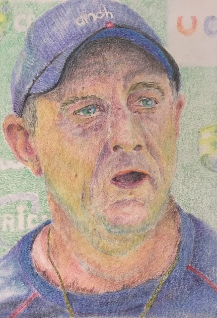
Graham Thorpe
I’ve been in action with coloured pencils again. This one took me three days. It let me use some of the ideas that I picked up from the Karen Hull book. The subject is former England cricketer Graham Thorpe. Nothing much has been heard of Graham since he was rushed to hospital in the middle of 2022 with a serious illness. I hope he’s on the road to recovery.
After putting down some initial shapes using a grid, I got to work on the eyes in great detail, magnifying my source photo to help me. In particular there are highlights in there and some coloured marks on the white of the eye that try to make the ball look spherical. I then started on the rest of the face by putting in all the weird colours I could see in the source photo. There were greens, blues, reds, oranges, purples, pretty well everything. I also did some work on the ears and mouth. When I stopped at the end of day one, the painting looked like this:

This was actually looking pretty good, but I was never seriously tempted to stop.
On day two, I started work on the cap and t-shirt. Somewhere in one of the books I read that the more levels of blue that you mix, the better. So while the t-shirt started as several different blues in different places, this was later topped up with separate layers of pthalo, helio reddish and Prussian blues. The cap started off with thin blue lines drawn in places but these were later covered in various different layers of blue. I put in a background, only two layers of colour as I didn’t want it to compete with the face.
Which brings me on to the important bit, the face. After putting on more impressionistic colours in the face and the first of them in the neck, I put on a single layer of beige red. I was keeping the layers quite light: no pressing or burnishing. After the beige red went on, I stopped for the day.
That was day three. The face was a bit too soft and light compared to the background and I wanted it to stand out more. And I know the solution to this now: just add more layers of colour. So I put on more layers of impressionistic colours everywhere. And then I added a layer of flesh tones. But this time I restricted the beige red to the lightest areas and used cinnamon and coral in darker areas. After this, the face was standing out enough for me to be ready to apply the finishing touches.
And those finishing touches were all about blending, with three types of blending applied:
– no blending in the background which I wanted to remain blurry and understated
– blending and burnishing the eyes and lips with a burnishing pen, flattening the tooth of the paper and giving the colours a slight shine
– blending everything else with paper stumps for a more matted look (and not flattening the tooth, leaving more capacity for colour if required), trying to sculpt the 3D shapes at the same time.
And that was me done as I was happy with what I ended up with. Better coloured pencil artists might well continue adding more colour until the paper was completely full and, after smoothing, would end up with something that looked more like it had been created with paint than with coloured pencil. But I like stopping at this stage when some of the tooth of the paper still shows through – this paper, produced by Seawhites of Brighton, really works for me. And I do really like what I ended up with here. The shiny eyes, the subtle (for me) impressionistic colours in the face and a great ear. Even the cap and t-shirt are fascinating when viewed up really close.
Graham’s up for sale. To see the price, click here.
<Edit: August 2024 and some very sad news has come through. Rest in peace Thorpey.>
Leave a Reply