


With the whole day available for painting today, I've finally completed a watercolour in the…
Edinburgh Castle
It looks as if the weather’s about to warm up again and that I’ll be out doing some more plein air soft pastel painting very soon bit I thought I’d do another painting with the MGraham palette while I had it out. These paints stay wet a long time, so it feels like I should be using them two or three times in a row each time to take advantage of this.
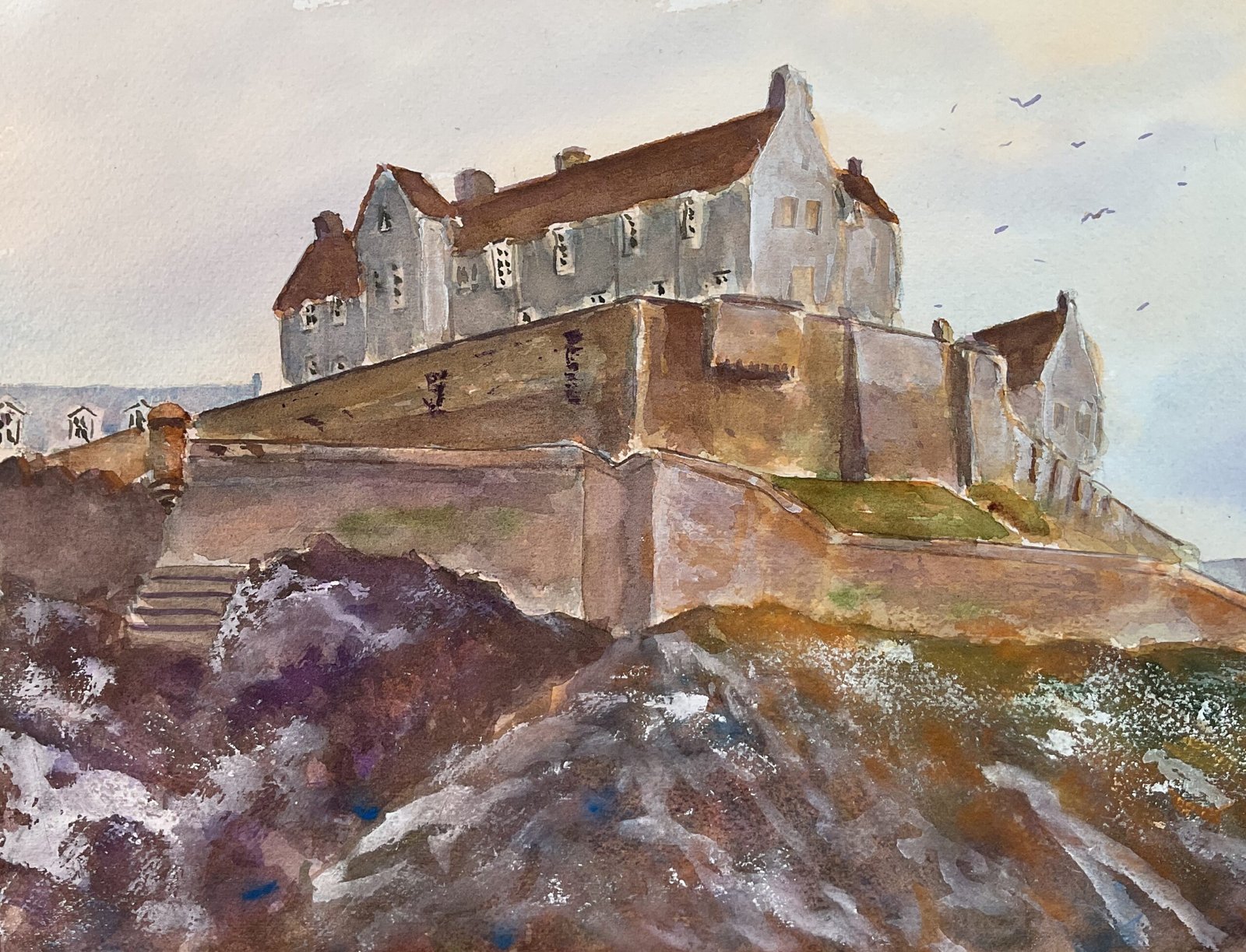
Today’s subject matter was Edinburgh Castle, with a view that I thought I could light up like Michael Reardon. So after putting down a pencil outline, I painted on a very soft underpainting using the blue, the purple and the orange in the sky and all six colour in the castle and hillside. After that my plan was to work from the back to the front with multiple layers in each plane. I think this was an error and that I should have worked layer by layer, from back to front in each layer. There are two ways to cut a lasagne into squares and I picked the wrong way and ended up with the different planes not looking as if they belonged together.
It meant that when I stopped painting and took a step back, I could see lots of problems and that I did a lot of fiddling trying to correct them. One of these was the different layers not looking as if they belonged together: I had a decent stab at correcting this by adding more layers to the two castle walls.
I had less luck with the other issue, which was the differences between the highlighted and shadowed walls on the building at the top. I messed about with these for ages, adding more layers in an an attempt end up with two colours that worked. At times I had two colours that didn’t look like the same colour under two different light conditions. At other times I was finding that the lit up walls were darker than the shadowed ones: it turns out that adding ago orange to a mixture doesn’t make it lighter. Eventually I went for the nuclear option, which was to lighten the sunlit walls first with titanium white and then with white gouache. When the walls looked too white, I added more colour over the top. It didn’t really work.
And while I had the white gouache out, I couldn’t resist adding some texture to the hillside with dry brush marks and by dabbing on paint on with screwed up Easter egg wrappers. Some bits look OK and it all looks more textured than snowy, which was good. And, after adding a few birds, that was me done.
I really don’t like this one and won’t be putting it up for sale unless it gets huge amounts of praise on LinkedIn and Facebook. The sky is pretty book, there re some interesting colour effects in the outside wall and I like the rocky textures on the left and on the right. But I don’t like:
- the white gouache on the sunlit sides of the main building
- the dodgy draftmanship
- the middle bit of hillside: not just its texture but the symmetric triangular shape
- the Green grassy patch between the two external walls, a colour that’s not repeated anywhere else on the painting
- (worst of all) the coloured in feeling of it all
Move along please, nothing to see here.


Leave a Reply