A new month and new boundaries to push, new ideas to explore. I've been having…

ZZ Top
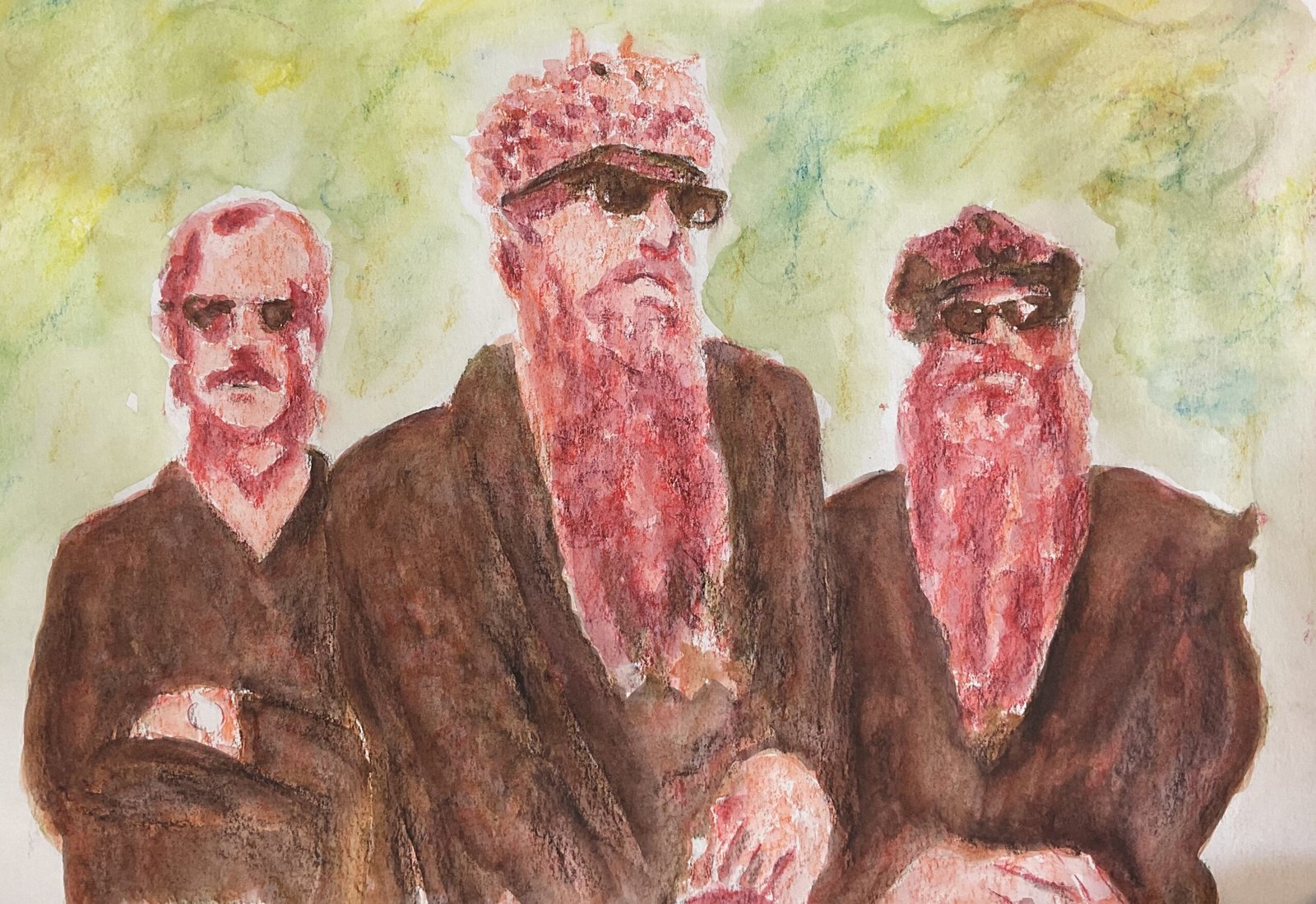
Today’s was a bit of flop. I wanted to have another go at a three layer Inktense pencil band portrait and decided to have a go at ZZ Top. I wanted to use different colours to yesterday with a more fleshy looking first colour and, after a bit of experimentation, found that tangerine, poppy red and leaf green made for an interesting threesome.
But they turned out not to be. Here’s what they ended up looking like:
The darkest colour must be the ugliest, muddiest looking brown I’ve ever seen. And everything is looking too red. It’s just horrible. So I attempted a rescue job. What I did was to:
– go over the darks in bark, in an attempt to just get a dark colour that was a lot less red. Maybe I should have use indigo instead. And when I put in this dark colour I ignored all the patterns on the jackets where I’d tried to leave the red showing and just painted over them. I also tried to give the impression with my brushstrokes of arms being there.
– go over the middle values with Shiraz, just to make them stand out a bit better from the light values
– all and wet a few random background marks in sun yellow, poppy red, bright blue and mustard just to get some different colours in there.
And after all that it’s better but still a flop. I might have to just stick to yesterday’s triad of colours if I want to do this again. And steer away from source photos with big, dark shapes. If there’s anything positive about this one it’s the reflections in the sunglasses. And I guess the likenesses are ok too.


Leave a Reply