


It didn’t look too cold outside today so I was out of excuses. It was…
You Can Hear Them Singing Out Their Telegraph Code
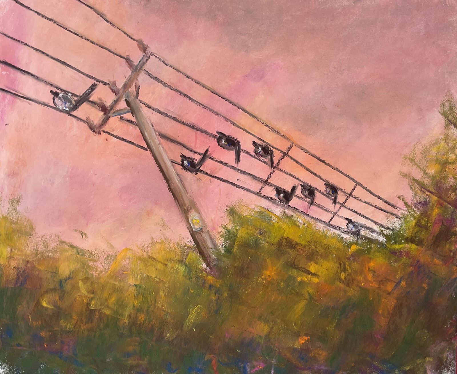
It’s a landscape with the soft pastels today, and it’s just the sort of landscape I enjoy painting with this medium. There’s lots of sky, a big mass of greenery, a telegraph pole and some birds.
It’s based on a telegraph pole just outside Hartlip, on the way to Queendown Warren. The one big change I’ve made is to put in five wires rather than three because I wanted them to look like a musical stave and the birds like notes. All so that I can tick off another line in Telegraph Road while also bringing in abstraction and subtexts. Like are the whiter birds meant to be minims? And if someone okays the music that they see in the painting, what will happen?
Well, let me tell you, I did spend some time on musical planning. I looked up the chords to Telegraph Road and found C7 and F chords against this line of the song. I then looked up how to create those notes on a guitar. Then what those individual notes in the chord actually were (none of then flats or sharps, so that’s easier. Does it mean we’re in the C major key?). Then I loaded up a simple piano app on the iPad and tried to put those notes in an order that sounded right. I’m not convinced I’ve got it right or even that I have the right time signature but I do feel more artistically coherent after putting in the effort.
I started by carefully measuring out the pole and wires and putting down pencil marks. Then I put in the sky, adding thin layers of whatever colours I was in the mood for and smoothing them out first with the edge of a white pastel and afterwards with my fingers. There was still just enough pencil showing underneath the first layer for me to be able to go back over those initial marks with more pencil.
Then I added the telegraph pole, the wires and the birds. The wires are in a very dark brown rather than black and I think I’ve applied them too thickly but still think this is better than using charcoal pencils, which seem to struggle when used on top of soft pastels. Re the birds, yes, the whiter ones are minims and the darker ones crotchets. I started by putting them all in with the same dark brown I’d used for the wires, being careful to include beaks and to make the tails look like bird tails. I added colour afterwards, creating a black with three primary colours, dabbing in the odd primary on both white and black birds and greying out the wings in the white birds.
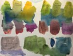
Finally I added the greenery, again using whatever colours I fancied using. I could probably have stopped earlier, leaving scratchy marks but couldn’t resist blending the lower marks with my finger and then adding more scratchy marks on top. At this point, the tooth of the paper was starting to feel full, so I resisted the temptation to do any more blending and stopped there. That was me done.
The final result is pretty good and worth putting up for sale. The price can be found here. The sky is highlight for me but those wires still look a little heavy. The green shape at the bottom is too similar in height from left to right for my tastes but when it’s framed, a lot of the bottom will be cropped off, leaving it more noticeably upward sloping.
Leave a Reply