


And here it is, the first of a series of paintings based on my home…
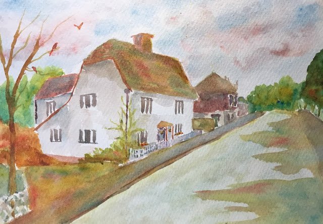
Wisteria Cottage, Hartlip
Still on the Hartlip landscapes and today it’s Wisteria Cottage. Not that I can see much wisteria there if any.
The main three colours today were cerulean blue, rose dore and transparent yellow, so this is in the key of green warm. For once, the name of the colour key is one that fits with the mood of the painting. There were also limited appearances for quinacridone magenta (in the darks: cool red plus cool yellow plus cool blue), cadmium red and yellow in the flowers and titanium white on the fences. There’s also a bit of cadmium red in the birds, as it’s good to repeat colours in other places.
This may well be the first time that cerulean blue has played such a big role in a painting and it did me proud today, with lots of unexpected granulation effects popping up. It also made for some great greens, every bit as vibrant as those I’d have got from Prussian blue. In fact the colours in the background trees and in the shadows across the road are the bits I like best about this one.
As usual, I have a couple of regrets. One is the ivy on the near corner of the cottage. I was never going to get it to work and the green doesn’t really belong against the grey white of the house behind it. I’d have been better off leaving the ivy out. The other regret is the perspective. I worked closely from the photo, which had been taken so close up that the two vanishing points were far too close to the house, resulting in some quite exaggerated angles. The vanishing point in the right kind of works, making the painting look almost one point perspective around it and succeeding in not dragging the eye out of the picture (which it may have done had the sides of the road been converging to a point outside the bounds of the paining) but the one on the left is too close. I really should have moved this vanishing point out to infinity, resulting in a one point perspective shot. It’s not as if I don’t have a grade A at O level Technical Drawing.
And, while the sun shines out of this one and these paintings are proving popular in the village, that one point perspective is a bit too harsh and t(e road shape a bit too big and boring, so this one isn’t going in the shop window.
Leave a Reply