And for my second painting today, I thought I'd just throw everything on the paper…

Winter Is Coming
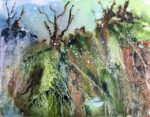
I thought I’d have another go at turning an abstract underpainting into something recognisable. This time, though, I made three changes. The first change was that I only used a spattering of masking fluid with no big masked shapes after the shapes didn’t work out well last time. The second change was to the colours. Lemon yellow and the pthalo blue with another name didn’t really fit with the other colours, so were both left out. Cerulean blue and Winsor yellow came in as replacements to join Winsor orange, Winsor red, permanent rose and French ultramarine. Sap green and olive green were given bigger parts to play than last time. I think there may have been a little bit of Winsor violet in there too. The third change was in the randomness of the colours. This time I put lots of greens along one of the longer sides in the hope that I could end up with something looking like a landscape. Finally I added some lines on both sides in ivory black using a flat brush that could turn into trees. Then I applied the salt and French stick wrapper and left it to dry. Here’s what I ended up with:
I was pretty pleased with that underpainting. There were plenty of textures there and it was already looking like a landscape. Those black trees had pretty well disappeared, which I was secretly happy with. The plan was that on day two, I just needed to harden some foreground horizon edges and add some interest in the form of trees, people, animals or buildings. With a tree probably covering up that vertical black line on the right.
So I hardened my horizon, added a couple of trees and added a wolf or dog. To do this I mainly used sap green, French ultramarine, Winsor orange and permanent rose, although I did start with some olive green bits in places. I kept the Greenland-shaped watermark in the middle at the bottom, turning it into whatever you’d call a golf bunker away from the golf course. In glazing over the foreground, I tried to put in interesting gradations and to stick with the red and green areas while adding blue, yellow and a neutral grey in places to liven it up.
And then I looked at the painting. Something still wasn’t right. The masked spatters were looking like falling snow and the scene was feeling cold, so I thought I’d add some snow. There’s no way a pan of (semi-transparent) Chinese white was going to do the trick, so I went for (opaque) titanium white. I used it straight from the tube to maximise opacity. At first just added it to tree branches and to high spots. It took a couple of applications to work as the first dried to a grey. And then I experimented in two ways. The first way was to use a wet rigger brush to drag the pure white highlights downwards. This created some great grey snow. The second was the dry brush technique, where I loaded up with undiluted white paint and dragged the brush sideways along the paper, so it only touched the peaks of the rough paper surface. That also worked well.
I’m pretty happy with it. Now that it’s dried, I can see that the horizons on the left are a bit too white, with the white graduating too abruptly into the green underneath, as if the horizon’s been drawn on with a thick white pen. Otherwise OK though and would look good on anybody’s wall. It was sold to an Edinburgh-based entrepreneur.


Leave a Reply