


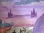
29 May 2014 Now this us more like it. It's based on a photo that…
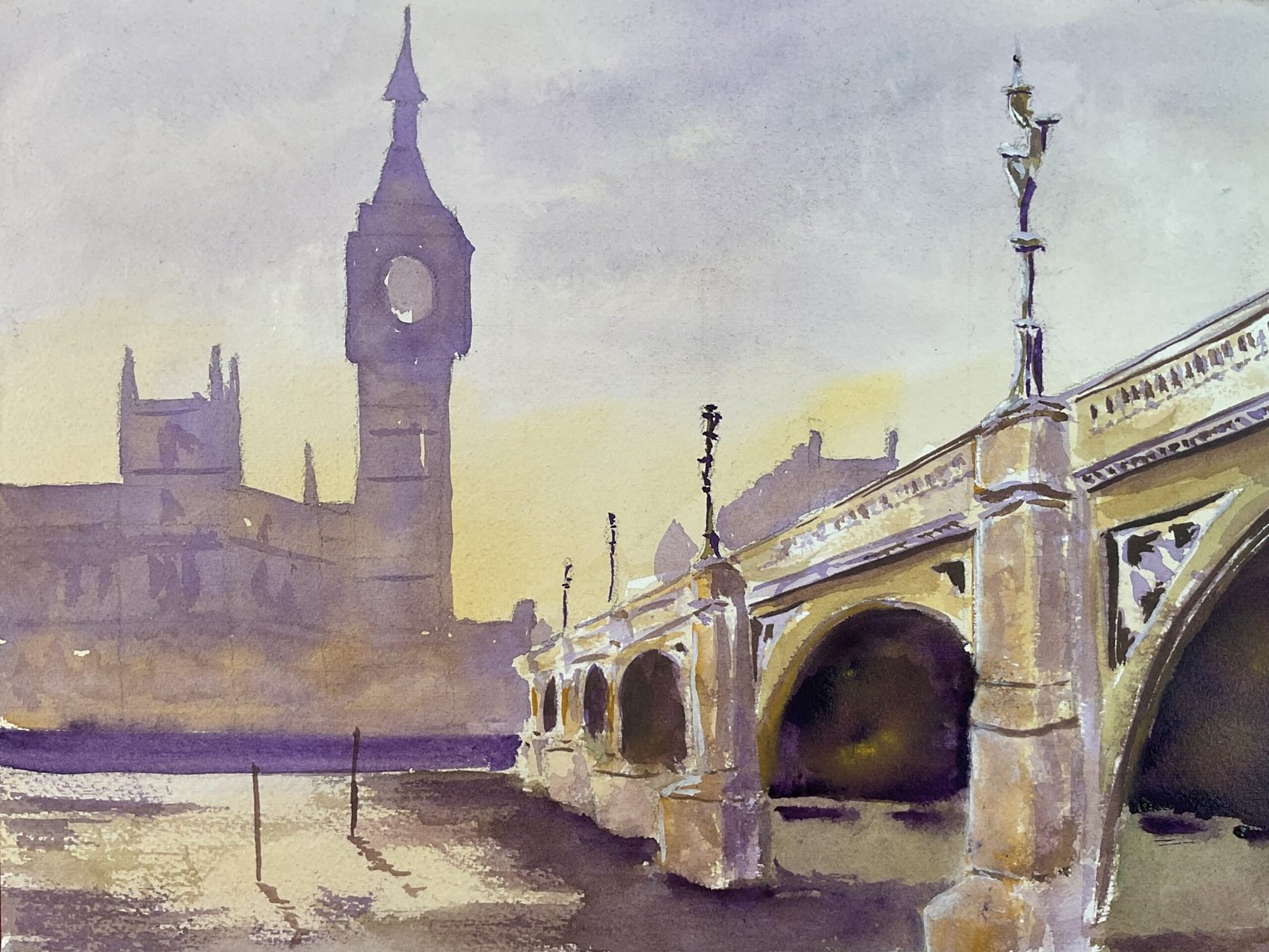
Westminster Bridge
Well it didn’t take me long to have a go at painting something Michael Reardon style. This view of Westminster Bridge was perfect for such an exercise. I don’t have a tube of orange watercolour paint anywhere but I realised at some point that my M Graham palette includes a purple and a yellow. Just the ticket. In fact that also solves the problem of where in my palette to find room for an orange: I have five M Graham paints in a palette box for six colours and he been wondering whether to fill that empty slot with a yellow or a red and my mind’s now made up. I reckon some azo orange would pair well with the cerulean blue, so that’s now on my shopping list.
Anyway, on to the painting. I put down a rough pencil outline, then a very thin underpainting in violet and yellow ochre. And when that was dry I added the background buildings in a slightly thicker violet and dropped in some of the yellow to keep things interesting. Especially along the bottom where I wanted to give the impression of the glow from street lamps. I added a thicker purple rectangle along the bottom to push the buildings further anway and some wet into wet architectural details. At this point, everything was pretty well perfect.
I them moved on to the bridge and started adding extra layers to create dark shadows to create some 3D forms, still mainly with the purple and yellow but also a bit of the other three colours (green/blue/brown). Michael Reardon would probably have achieved everything in a single wash but it took me a few layers to get enough contrasts between the shadowed and lit planes. Whenever I added another layer, I would dry brush some of the colour into the water to create texture. At some point in this process, I lost sight of the need (stressed by Michael in his book) to have the darkest dark next to the lightest light at the centre of interest. The problem was that I was using the darkest dark all over the place to add detail to the bridge. So I mixed the darkest colour I could and put this under the arches, dropping in some other colours to keep them interesting. Then I added some highlights in white gouache, mainly down the left side of the closest pillar, so at least there’s a black and white vaguely next to each other where you can see the arch behind it. And that’s where I stopped.
It’s an interesting painting and it’s up for sale with the price to be found here. The sky and background buildings are great but the bridge could be better. There,s huge potential here, though, for future paintings, and I can’t wait to get hold of some azo yellow to use with the M Graham cerulean blue to paint some more buildings in this style. Maybe some more Cambridge buildings. Who knows?
Leave a Reply