


This book keeps popping up on my Amazon recommendations. When I took a look inside,…
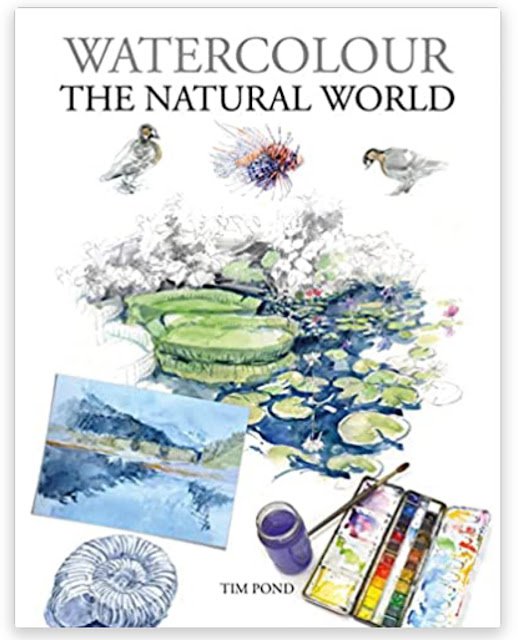
Watercolour The Natural World: Tim Pond – Book Review
This should be interesting. A book on painting the natural world, featuring lots of different flora and fauna in lots of different habitats. It’s a 144 page paperback with those bent in cover flaps that mean the corners won’t get dog eared. It looks really good just flicking through and I suspect it would make a great present for any watercolour artist who hasn’t set up a wishlist. But is it any good?
Structure-wise we have about 30 pages of general watercolour advice on equipment, brushstrokes, perspective, colour, values, etc. Then there’s about 10 pages setting the scene for the rest of the book, waxing lyrical about the wonders of nature. And then there’s the meat of the book with about 100 pages divided up into habitats and talking about the flora and fauna in those habitats with some stuff about painting them.
My spider sense started tingling in that first 30 pages. First lot of the advice was pretty basic. This was a theme that popped up throughout the book – did you know that the easiest way to find the centre of a square or rectangle is to join the opposite corners with straight lines and see where they cross? But what really bit my hackles up was some of the bad advice in there. Tim suggests practising watercolour painting on cartridge paper. Cartridge paper! He recommends artist use a set of 24 colours because the more colours you have the more mixing time you save. Apparently with a set of 64 colours you risk losing coherence between the colours on the painting. Absolute rubbish! You start losing coherence at six or seven colours. And there’s no excuse for recommending the use of alizarin crimson in 2022. Is there anyone reading this book that doesn’t already know it’s a fugitive colour? Less controversial but still jolting was his overuse of black and his willingness to mix white with other colours.
Some of Tim’s explanations were a bit too narrow for my liking:
– his explanation of copying a photo using a grid is restricted to copying 12x12cm photos onto 12x12cm paintings and only with 2×2 grids. I’m sure readers will be smart enough to figure how to extend this to different sizes, magnification/shrinking and different numbers of cells but Tim’s instructional style suggests his is the only way
– and apparently an underpainting can only have one colour.
I’ve clearly been stretching some boundaries.
The middle section was a bit waffly and totally at odds with Tim’s claim to have “endeavoured to ensure that every page in this book is packed with handy tips, techniques and critical concepts”.
And then there were the last 100 pages. They were packed with Tim’s paintings but I found these to be a bit too sketchy to be inspirational. Most of the information in these pages were just David Attenborough-style tidbits, just one for each animal alongside a sketchy painting. For animals described in more detail, we had drawings of their skeletons and sometimes muscle systems but with nothing about how this might help us paint that particular animal. Every skeleton was annotated with “Knowing the bones can give your drawing structure and the feeling that the legs are supporting weight”. Every one!
There were quite a few short demonstrations (typically four steps) but I wasn’t impressed by these. They were instructional rather than demonstrative (“do this rather than “I did this”) which always grinds my gears. And the instructions were pretty useless. I’d rather have seen two or three steps spent on how to draw the animal (and to divide it into shapes) than have step 1 draw the animal, step 2 add a French ultramarine underpainting, step 3 add more colour, step 4 add dark details. It was the same four steps time and time again, with nothing animal-specific. And there were a couple of demonstrations where I’m pretty sure it wasn’t the same painting in every step.
Amid all these factoids and demonstrations there was the occasional animal-specific tip but these were far too rare and deeply buried for my liking. They were too easy to miss.
There was also some stuff in there about temperate regions like the one I live in. For these regions, Tim didn’t just talk about flora and fauna but also about the four seasons. But there’s not much useful there. There are paragraphs headed the spring/summer/autumn/winter palette but when you read these, they just talk about things like “the dark blue and jade green of the summer sea, washing up on a yellow sandy beach, vivid oranges, poppy reds” with nothing about which watercolours in the palette might be able to replicate those colours.
What about writing style though? Well Tim clearly has a passion for the natural world. This comes through loud and clear in his reluctance to talk about painting. I do wonder, though, how much of this he’s making up after reading him describing New Zealand as an island.
And, finally, something I’ve never commented on before when reviewing books: writing ability. Thinking back through the book, I was shocked by:
– Tim not knowing the plural of hippopotamus
– his explanation of the difference between biomes and ecosystems, which made no sense and left me none the wiser
– substituting “however” for “but” as if they’re synonyms, which they’re not. One’s an adverb; the other’s a conjunction
– clunky sounding sentences resulting from using the same word more than once
– clunky sounding sentences resulting from using the words in the wrong order. I can’t find where it’s is but there’s something like “Some animals can do this, such as the …” when “Some animals such as the … can do this” would have sounded much better
– a bit of clunkiness that I can actually find: “Geese are divided into two main groups: the grey geese… and the black geese…”. Come on! Either leave out “the” in two places or replace geese with goose in two places
Maybe this is the all the editor’s fault rather than Tim’s but I felt as if I was holding a shoddy product.
It’s a tough call over whether to give this book one palette or two. It’s badly written and badly edited. It contains bad advice. It misses some great opportunities to teach the reader something. Ok, it looks good on the shelf and has lots of interesting factoids. If there was some inspirational artwork in it, that might make me veer towards two palettes, but there isn’t and I’m just left feeling annoyed and that I’ve let down the people that bought me this book by putting it on my wishlist. It’s a one paletter.
🎨
Oh, and I’ve removed Tim’s other book from my wishlist, the one on drawing and painting animals. There are reviews on Amazon that describe it as a natural history book and, after reading this one, I’m inclined to believe them. For painting animals generally, I’d recommend the Jean Haines book and, for how to draw and paint particular animals, the Jack Hamm book.
You can find this book and more reviews of it at Amazon UK here. As an Amazon Associate, I earn commission from qualifying purchases but this costs absolutely nothing extra to you.
Leave a Reply