


This book keeps popping up on my Amazon recommendations. When I took a look inside,…
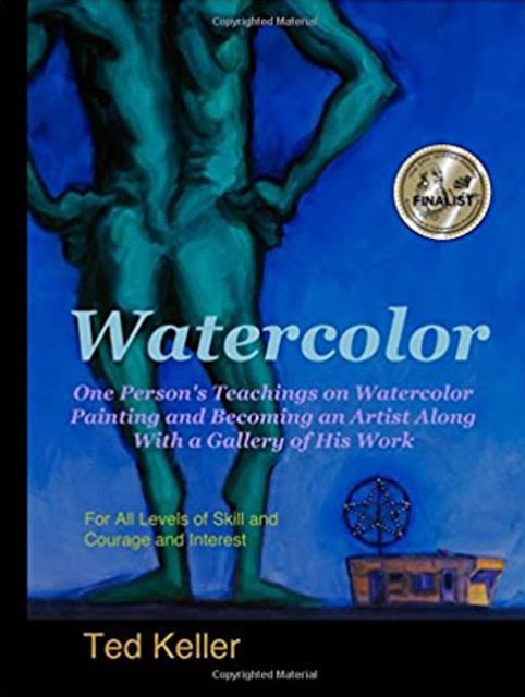
Watercolor: Ted Keller – Book Review
I thought I’d treat myself to an art book after going through a lot this last month and decided to go for the Ted Keller book. It’s been floating around the middle of my wishlist for a while, behind those that I know will be useful and above those that I suspect that, while being interesting, might not teach me much. The wish list looks a bit more well ordered after buying this book.
It’s a paperback and only 136 pages long and its price has been pretty static at £17.99 for years. So it’s expensive looking. Maybe it’s self published. People looking at my wishlist might have been out off by the price per page, so I think this was only ever going to be one that I bought myself. Another reason for me to treat myself to this one.
Looking inside the book, from page 85 onwards is a gallery of Ted’s work, so there’s only 84 pages of tips and instructions. I was aware if this when buying the book. It has a high inspiration:education ratio but I was interested in Ted’s style of painting, so it wasn’t a problem that a lot of my payment went towards inspiration.
Let’s talk about the inspiration thing while we’re on the subject. Ted admits himself he has a cartoony style and often exaggerates size proportions but I still like looking at his work. He seems to apply the paint quite thickly, making his work look more like acrylics than watercolour. He likes to paint thick outlines around his shapes. But, most importantly, he’s just as mad with the impressionistic colours as I am. If you like to go bonkers with the impressionistic colours, you could do worse than looking at some of Ted’s work.
Then there’s the rest of the book with the tips and techniques. Ted’s style in this part of the book was very machine gunny. There’s no wasted wishy washy bit at the beginning about the joy of watercolour with photos of Ted in his garden surrounded by flowers. No, this is all very concise and bullet pointy. Bang, bang, bang. It’s like reading the notes I’ve made on other people’s books. I didn’t pick up many new ideas from Ted in reading this section: most of the ideas were ones I’d picked up from other books, good ideas that they were. There is something in there, though, on selling paintings via galleries that I’ve not seen in any other books and that might come in useful in future.
Oh, and there was a demonstration of a painting (a portrait of Abraham Lincoln) in about ten steps but with very little commentary and with a lot of work involved in step one. I think the main point Ted was wanting to make was about not liking a couple of bits in the original painting and lifting out loads of paint before redoing those areas. Each to their own but this feels like the sort of thing that would ruin one of my paintings.
Then there’s writing style. Those first 85 pages are, like I said, machine gunny but there’s definitely some personality that comes through. Ted’s opinionated. There are techniques that work for him and there are things like perspective and composition rules that he’s not that interested in. I quite like that. This is all about Ted’s style and Ted does make the point that we shouldn’t just copy him and that we need to develop any identify our own signature styles. He comes across as less dogmatic and grumpy than Joseph Stoddard, another artist who’s book was very much about their own style. I can see why Ted’s such a popular teacher.
I do wonder, though, whether Ted actually enjoyed writing the book. 85 pages of meaty bullet points with no sauce to bind it together, with the rest of the book made up of a gallery of his work. It’s as if he knew he had lots to say but just wrote it down as quickly as possible and then found he had space to fill. At one point he says his next book will be on faces. No sign of that book yet, eight years later. Yeah, I’m thinking great teacher, not such a great writer.
And then we come to the rating. There are useful tips in there (albeit tips that I’d seen in other places) and some inspiration to be taken from looking through Ted’s work. If the book had cost me a tenner, I might be thinking differently but I think, according to my rating criteria, this is the archetypal two palette book (but three stars on Amazon). While I don’t regret buying it, it’s not one that I’d be looking to replace if my house burnt down. And the price per page definitely counts against it.
🎨🎨
You can find this book and more reviews of it at Amazon UK here. As an Amazon Associate, I earn commission from qualifying purchases but this costs absolutely nothing extra to you.
Leave a Reply