


I'm back to the coloured pencils today after a day off to check out potential…
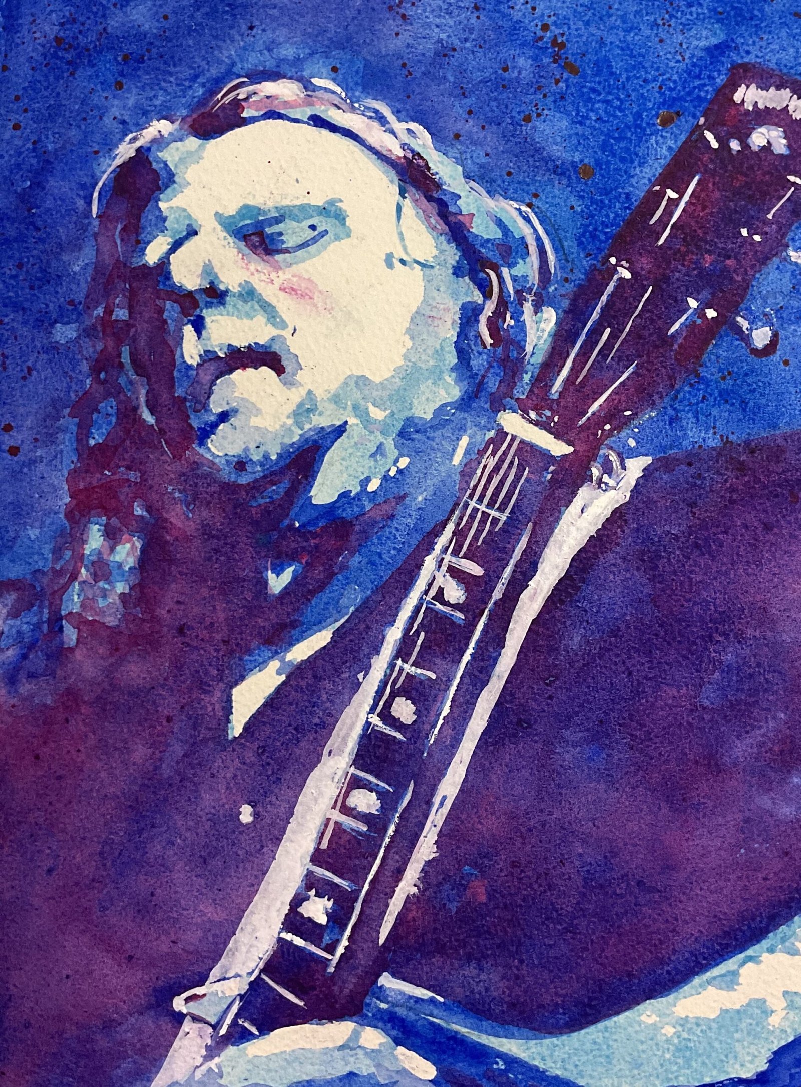
Warren Haynes In Watercolour
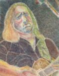
The closing date for Portrait Artist Of The Year is on 5 February, ten days away. I’ve already submitted my entry but this is the time of her when I should be filling my blog with the sort paintings that judges will be looking for when they come calling. And that means watercolour portraits. I want to put a few more triple portraits up there but was pushed for time today so just went for a single three layer portrait. For subject matter, I went for Warren Haynes of Gov’t Mule and once of The Allman Brothers Band. I’ve had go at Warren before, in coloured pencil, and failed miserably, so I have unfinished business here.
I went for my blue three layer colour scheme today because (i) it’s the one of the four schemes using my regular palette that doesn’t feature in the three-scheme traffic light set that is going to see a lot of action, so is going to look a bit underused, and (ii) Warren can play the blues. So that’s cerulean blue in the first layer, French ultramarine in the second and quinacridone magenta in the third. You’ll see later that white gouache joins the team too.
Most of the painting followed the usual process. A pencil outline using a grid, whites reserved with masking fluid, left to dry, first layer down, left to dry, second layer down, left to dry, third layer down. With the blues in the first two layers both being big time granulators, I encouraged granulation in those first two layers by dropping in water, dryish paint and granulation medium. The granulation medium caused the paper to bow a bit, so I need to be more careful in future; maybe the down the edges with making tape. Oh, and I spattered a bit of the magenta over the background just for kicks.
Once those three layers were down, I could see two problems with my blue three layer scheme. One was that my preferred masking fluid is a very similar colour to the cerulean blue in the first layer, so it was difficult to see where there was masking fluid that needed to be removed at the end. The second was that the French ultramarine is a little too dark to work as a second layer: it’s hard to distinguish between the medium and dark areas in my final painting. Maybe the blue three layer scheme will be saved up for paintings where only blue will do.
I did more tinkering at the end of this process than usual. For a start I noticed that some of my light and medium shapes were too small, so I made them bigger by adding cerulean blue and French ultramarine. I also wasn’t happy with how the fret bars on the guitar didn’t show up well against the neck. So I deviated from my usual strategy trusting the process and the Art Assist App. I reached for the white gouache and went over the fret bars. And, because this change on its own brought too much attention to the fret bars, I also added some strings, highlights on tuning knobs, some hairs on Warren’s head and the guitar strap. In retrospect the guitar strap was taking things a bit too far and should have been left as cerulean blue or left out of the painting completely.
Still, I’ve managed a decent likeness of Warren this time round. While I’m not happy with the guitar strap, similarity of the two darkest values or (I guess) the accidental strip of red on the face from some premature masking fluid rubbing, these aren’t things that jump out of a painting that’s very much focused on the face.
Warren’s up for sale. To see the price, click here.
Leave a Reply