


I wasn’t very good at painting and not that committed to improving. I would have…
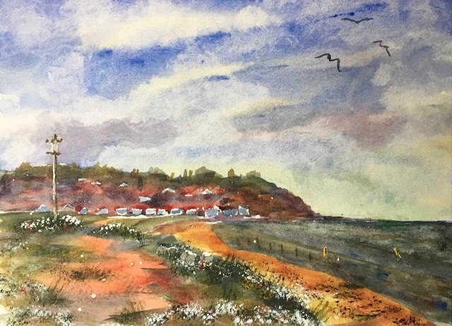
Warden Point
I was back on the road again today and thought I’d head to Leysdown On Sea on the Isle of Sheppey to see what I could find to paint. After wandering around for a bit I found a spot at the Northern end of the beach with an interesting view of warden Point. The bonus attraction of this point was the wall at the back of the beach which was at just the right height for painting on and saved me using the easel on what was a moderately windy day.
I used four main colours today. With so much sand around, raw sienna was an easy choice for my yellow. After looking at the greens that my blue options could give me, I settled on French ultramarine. Finally I picked rose dore as my red: I wanted a warm red and I slightly preferred the oranges that rose dore produced to those from Winsor red. My fourth main colour was viridian, chosen because, when mixed with the red, it could give some neutral sea tones. So this was in the key of triadic right. There were guest appearances later for green apatite genuine and the four opaques: cadmium red, cadmium yellow, titanium white and sepia.
I had a lot of fun painting this one and. There was a lot of interest from the passing bank holiday crowds, which always helps by slowing me down and making me wait for paint to dry before throwing more on.
I started by planning my composition. My plan wasn’t much more than to have a big sky and to try not to add detail in the distance but to keep the foreground in focus. I should have come up with a value plan too but forgot. Then I put down some rough pencil outlines and reserved some whites and did a little spattering with masking fluid.
The first shape to go down was the sky. I used all four of my colours here but with a lot more blue than normal, matching the actual sky for once. I used a bit more raw sienna and viridian at the bottom where I wanted the sky colour to be cooler. I deliberately made the sky darker behind the lamp in an attempt to have a big contrast around the centre of interest. Rather than leaving the sun to dry, I dabbed at it with kitchen paper – I’m finding that this adds weird, interesting textures.
Next was the sea. It was all very muddy looking today and in two colours, maybe with the boundary between then being the low tide point. Anyway, for the furthest shape I used a neutral made from the red and green, then introduced a bit of blue to the mix for the nearer shape. And I sprinkled on some salt. In fact I included Epsom salt as this should have produced rectanglular textural shapes that could have looked like wavelets. But when I used a brush to make sure the Epsom salt crystals were parallel to the shore, it messed around with my sea colours. I ended up adding a second glaze on top and doing some dabbing with kitchen paper. Still, it didn’t end up too bad.
Then all of the land shapes were painted in about three washes. The first was a random looking one with my red, blue and yellow, trying only vaguely to get greens where there was grass, yellows and oranges where there was sand, neutrals for cliffs and reds for roofs. The second and third washers were more considered, trying to get the shapes and colours more accurately. The third wash over the distant hillside was a neutral, bluish grey as I wanted to neutralise and cool the colours there to create distance and to lose some focus. With the beach and the foreground, I tried to add a bit of dimension with hills on the beach and grassy intrusions on the path.
Then off came the masking fluid. I put some neutral colour mixed from my three primaries into the lantern and some concrete bits in the grass to make them them dimensional. I use a flat brush to add some dark posts in the sea and to put some cadmium yellow into the two that I’d reserved as white. And I added a very watery blue to the white houses in the distance.
Next, time to create some foreground interest. I reached for my current favourite weapons, the Merlin brush and the green apatite genuine. After testing the thickness of the paint on the back, I added lots of grass and foliage to the foreground and the beach with a mixture of stabbing and swishing. I then stabbed in some cadmium red, cadmium yellow and lots of cadmium white to create flowers and some sepia on the path and the beach for stones.
Finally, I added three birds in the top right to balance everything on the left and at the bottom. Again, they were in a neutral colour mixed from my three primaries. I’d been watching the seagulls while waiting for paint to dry, and had decided that the simple shapes you see here would be fine.
The best things about this painting are the sky textures, the (inaccurate!) red colour if the path in the foreground and all the foreground foliage. I’m less happy about the colour of the beach, which doesn’t seem to harmonise with the rest of the painting, and the value of the sea, which (while accurate!) would look better were it much lighter. Maybe I should have made all the posts in the sea white, to make them stand out better, rather than using neutral colours and cadmium yellow. Overall, though, this feels acceptable and was getting a lot of positive feedback. It’s going up for sale.
Leave a Reply