


Back to the artwork after a few days off, and this is looking like an…
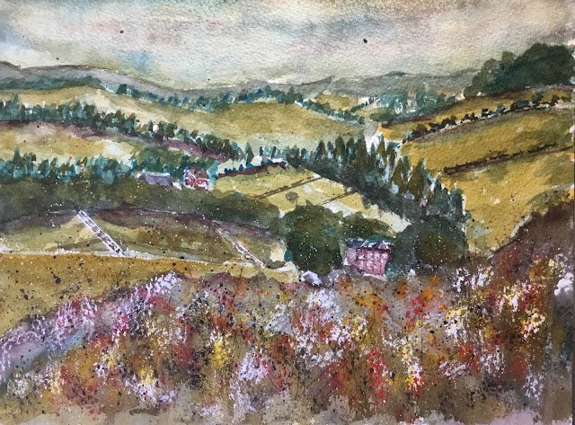
View From Highest Point, Queendown Warren
Another plein air painting day today. I’m back in Queendown Warren again, but to keep things interesting I’m using watercolour rather than oil pastel and looking out across the valley rather than hanging around in the woods. The views here are amazing but what makes a great view out of the window doesn’t always make a great painting. And, at least for me, these views across the valley are just a bit lacking in interesting shapes. Still, they’re a convenient as a painting subject as I’m currently walking from home to the far end of the Warren and back six times most weeks. Maybe when I’ve lost more weight (43 pounds down, 26 pounds to go until I reach my university rowing weight), and am feeling up to going for short runs rather than long walks, I’ll have more time in my day and be able to go back to painting other local scenes.
Anyway, today I thought I’d paint in the key of green warm with Winsor blue (green shade), raw sienna and Winsor red. The blue is a new palette member and has been itching to make its full debut. I picked raw sienna as, of all my three transparent yellows, it was the one most able to dampen down what is a highly saturated blue. For the red I wanted something warm because I was more interested in oranges than purples and I chose Winsor ahead of rose dore after looking through much notes at what oranges and neutrals those two reds could give me with much choices of blue and yellow.
I was also wanting to try something new today. After some feedback from Liron Yanconsky, I wanted to try painting with low saturation colours. So I mixed up a neutral colour from my three primaries (mimicking Liron’s dirty palette) and used this as a base for all of my colours. So if, for example, I needed a yellow, I’d mix raw sienna into the neutral colour until I reached something worth using. That was the plan.
I forgot to bring the iPad out with me, so was unable to plan my painting with cropping and gridding. Instead I did everything by eye, putting down some rough, inaccurate shapes in pencil to guide me. I protected some bits of buildings and fences with masking fluid. And then I was ready to go.
I started with an underpainting, including the sky. The blue is too intense on its own to use in the sky, so I tried to put in some grey clouds and to have a bit of raw sienna along the horizon. I wasn’t happy with what ended up as quite a dark looking sky and tried to dab out some white clouds, all to no avail as my red and blue were both stainers. I should have worked this out in the planning stage rather than allowing myself to be blindsided. Anyway, I worked down the paper with an underpainting. Another problem with a scene like this is that it doesn’t allow me to go as crazy with the underpainting as I do when painting buildings. Or maybe it does and I was just suppressing my creativity.
After this, it was all about adding two or three more layers of colour and, at least in theory, adding more detail. For some of the tree lines, I used my watercolour test paper as a mask for the bottom of the tree line along the edges of fields, which seemed to work. I filled out so many of those tree lines with coniferous trees, though, that it made everything a bit samey.
After the second layer had been added, I realised that my choice of three colours wasn’t working. Or maybe the weather had changed and the sun had come out. Because the actual view looked a lot sunnier than what I had down on the paper. At this point I introduced Indian yellow to the team in an attempt to warm things up. So my painting’s no longer in the key of green warm. Because there’s probably just as much raw sienna in there as Indian yellow, I can’t really call it orange cool either. This just isn’t a three colour painting. Anyway, I tried to brighten up the sky first, which obviously it towards green. And then I introduced Indian yellow to the sunniest fields and on the left of some of the tree shapes. I got a marginal improvement.
And then there’s the big shape at the bottom, which was supposed to be three separate tree shapes but which I approached planlessly and ended up filling with neutral colour. Scraping out trees with a credit card didn’t get me anywhere interesting, so instead I stabbed in dry paint with the Merlin brush, using Indian yellow and my four opaques: cadmium yellow, cadmium red, sepia and titanium white. As a finishing touch (and one that I always apply to failed paintings but occasionally to successes) I spattered on all four opaque colours. And then I packed up in disgust.
Because this painting was a failure. A big failure. I didn’t think about what colours to use, staining properties, putting down a decent drawing, what I was going to do about the foreground… it’s one big long list of mistakes brought about through laziness. If I paint another view across this valley, I’ll be using the Shire supergranulators. I want to forget this one quickly and produce something better so it doesn’t get to sit at the top of my blog for too long.
Leave a Reply