So after that last painting I followed a footpath that I’m sure didn’t exist back in my day into Fenn Ditton to grab a lunchtime pint at The Plough, a pub with a great garden extending down to the river. It’s a bit too far into the Bumps course, though, for patrons to be able to see much interesting action in anything but the top men’s division, so my plan was always to make my way further down the river to find myself a good spot to both paint and spectate. And I found the perfect spot at First Post Corner. Being on the outside of a corner, it has good views down two straits. And it’s also just the right distance into the race to be a bumping hotspot. Indeed, when I won my oar at the 1986 May Bumps, three of our bumps (including the one on day four) came on this corner, right in front of the professional photographers and the boozed up spectators.
My spot today was just a few feet away from the river and a right next to a private party. Loads of people on both sides of the party divide to talk to about painting and rowing, so no opportunity to ruin the painting by working on it while it was wet. A special hello to my favourite fan of the day, preschooler Ted who had plenty of questions and was up for conversation. If you’re reading this, Ted, then (i) you’re pretty gifted for someone your age, and (ii) I can put your mind at rest by telling you I did go for another beer afterwards at The Plough and I did put my used bottles in the bin that I found on my way there.
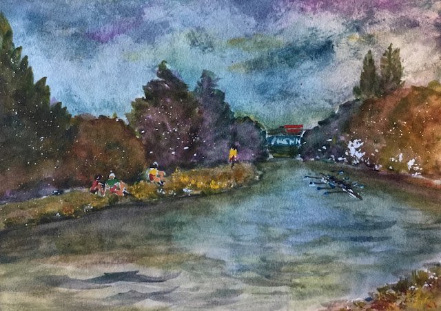
For this painting, I picked the view towards the Motorway Bridge (strictly speaking the A45) because a painting needs a focal point and there were no landmarks looking the other way. I stuck with Mayan blue genuine and Indian yellow but switched my red to quinacridone magenta just to be different. So this was in the key of triadic left. Cadmium red, cadmium yellow, Winsor blue green shade, cerulean blue and titanium white all played small roles too.
I put down an initial drawing in pencil, including three carefully observed spectators, a carefully observed cyclist and what was a lazy eight, with their oars not quite in sync. I masked out all these people and the Newnham graffiti on the bridge and spattered on some masking spots.
And then I just worked from back to front again, one big shape at a time: sky, trees, bank, other bank, river. The trees caused me the most trouble. I wanted to distinguish between all the different trees and to make the furthest away recede by making them bluer. But I used too much neutralising red again – maybe I was suffering from forgetting to bring along scrap paper to test colours on. So the trees on the right are looking a bit too rocky. I had a lot of tinkery attempts at the river, trying to combine observed reflections with choppy brushmarks and I think I got there. The opposite bank, though, isn’t really right. Maybe Indian just wasn’t the right yellow to use today. Oh, and for the Motorway Bridge, I decided I needed to use cerulean blue to get closer to the actual colour.
Before removing the masking fluid, I stepped back and looked at the painting. Someone came by for a chat at this point and could see my point when I told him the river didn’t match the sky and that the trees, while all coming from the same three colours, were looking out of harmony, like some kid had wanted to use every single colour in the box. So I told him I’d be adding a thin layer of blue river the river to match the sky more closely and a thin layer of red over the trees to get them into harmony. I think he was a little shocked over my plans for the red glaze. But I added them both and things definitely improved.
Then it was off with the masking fluid and time to fill in the shapes underneath. For the blades on the oars and for the rowers’ vests I wanted colours reminiscent of Christ’s so picked out Winsor blue green shade. For the spectators, I combined this blue with cadmium red and cadmium yellow. I wanted to use different colours because I didn’t want the spectators to blend into the background. I also mixed a green, a black and a fleshy colour from these three and then used them to fill in all my empty shapes, starting with red against green and yellow against purple and then adding whatever colours were necessary to keep things in balance. I’d been keeping in reserve all afternoon the possibility of putting a lorry onto the bridge and my final action was to add a red lorry as red felt like the colour at the top of this painting’s wishlist. And that was me done.
Everything I said about the previous painting applies to this one too, especially the point about being too dark. It’s such a typical Artistic Actuary plein air painting. I need to think more about planning and controlling values when I’m out and about and maybe need to hold back on trying to exactly replicate what I can see. But why is this only a problem when I’m out and about and not when I’m in the studio? I have no idea!
<It’s the next day and I’m wondering whether it’s using red to neutralise the greens that’s the problem. Maybe I should neutralise them with raw sienna or burnt sienna instead? At least for greens made from this blue/yellow combination?>


Leave a Reply