


With the whole day available for painting today, I've finally completed a watercolour in the…
View From Ardtornish Castle
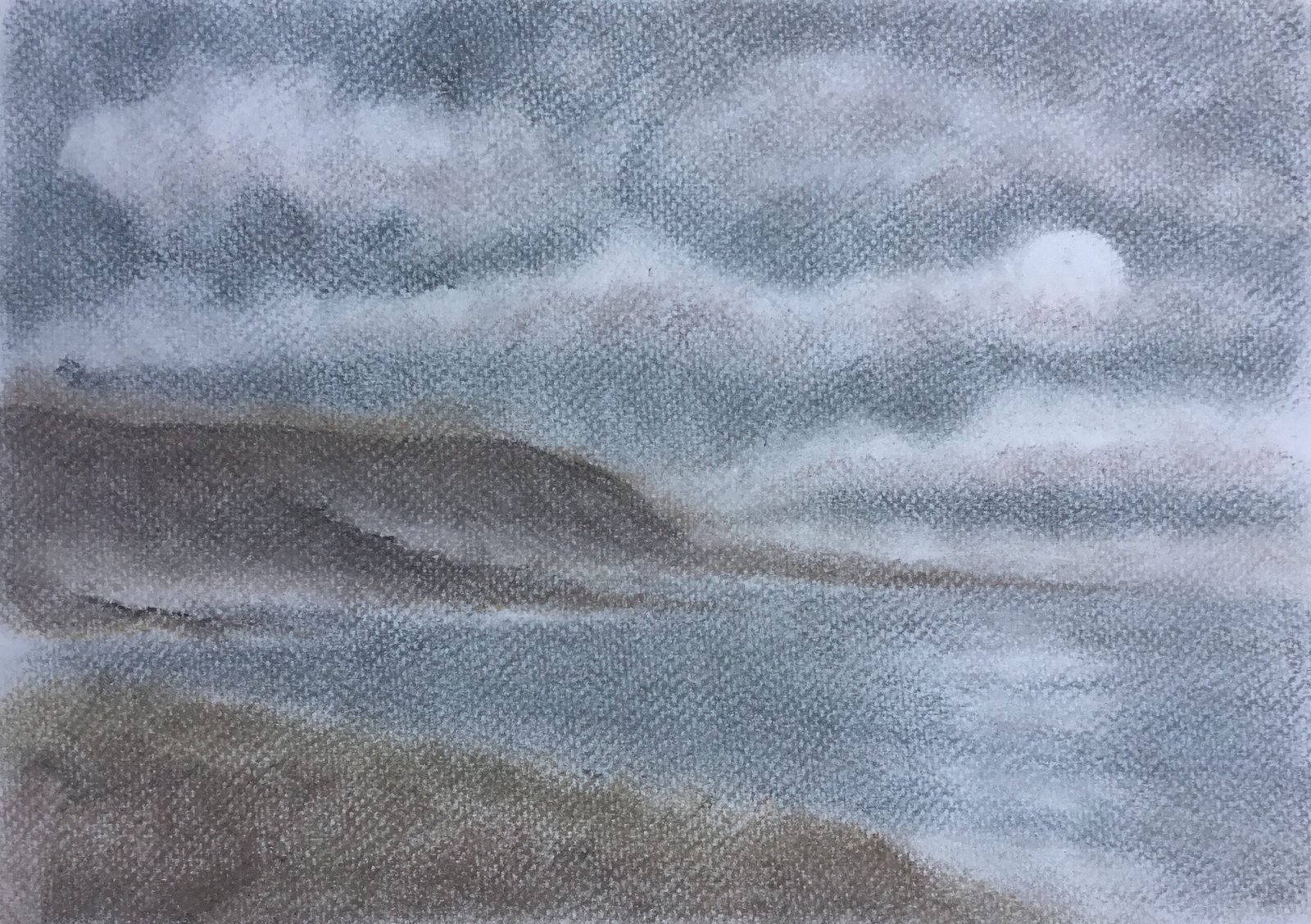
An old mate from Uni, Howard, was recently on holiday in the Scottish Highlands and Islands and posted loads of photos on Facebook. The one on which this painting was based was a pretty simple one, with just four shapes with different values. It was just asking for the charcoal treatment and it got it today. I varied slightly from the original photo by adding a large moon in the sky, the moon’s reflection, some clouds partly covering the moon and a bit of fog drifting along the far shore.
After coming away from the last charcoal painting with the feeling that I’d put on too much colour because the XL blocks were too highly pigmented, I thought I’d do this one entirely with charcoal pencils, trying to teach myself to build up dark values slowly. I’m also giving the tinted paper a go for the first time: blue seemed the most appropriate colour, matching the sea, the cold and Scotland.
For most of the painting I worked the four shapes individually from top to bottom, coming back at the end to make small changes to all of them. The sky was built up from greys and blues, with some purples and oranges in the clouds. The clouds were really easy to create: I just left white spaces, put in the odd bit of orange or purple and blurred the edges. The peninsula at the back was built up from greys, greens and purples with some oranges along the top and bottom. I deliberately made the top edge soft, made up of oranges and purples. The sea then used the same colours as the sky but with some white in places for moon reflections and foam in the waves. And then the foreground used the same colours as the peninsula but with more green in the mix.
And then I came to the finishing touches. I started by putting an extra layer of colour in each shape and using fingers and kitchen paper to rub it in with energetic sweeps that I wanted to show up in the final painting. The sky was to have spirally swirls sweeping out from the centre of the painting but these didn’t really come through. The downward sloping cliff-like lines in the far peninsula did work really well though. The lines in the sea are all straight, converging in the little bay on the left hand edge of the painting. And the foreground has grassy upward sloping textures in it.
The other final adjustment I made was the one I’m most proud of. I went into the far peninsula and added hard edges along the two closest rocky promontories and blended them downwards, leaving the hard edges along the top. This brought out the fog behind them, adding to the atmosphere. And having one bit of the painting in focus and the rest out of focus is always good.
So that was me done. I feel like I’m slowly getting there. This one’s up for sale. To see the price, click here.
Leave a Reply