


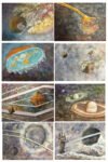
So here they are all together, The Planets series of paintings. Eat your heart out,…
Venus And The Petrova Line
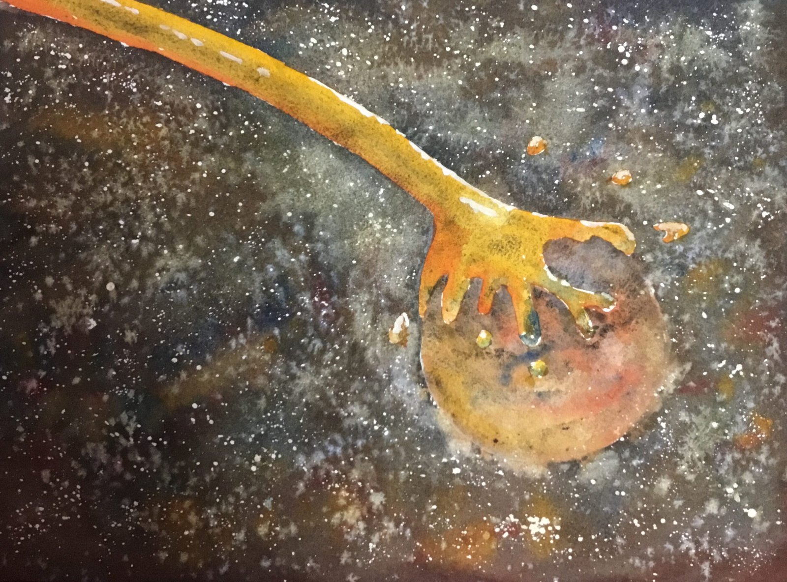
I’m back on the planets again and today it’s Venus. It took me a long time to come up with an idea about how to make a painting of Venus a bit offbeat. But I was reading Project Hail Mary by Andy Weir (the guy who wrote The Martian) and Venus came into the plot at some point when scientists spotted the “Petrova line” of fast moving radioactive particles connecting the sun to Venus. If you want to know more, you’ll have to read the book. If you enjoyed The Martian, you’ll probably enjoy this one too.they both have that Apollo 13 vibe of having problems to solve miles away from Earth with access to limited tools and materials.
For colours I chose Indian yellow and Winsor red for their fieriness and French ultramarine because I didn’t trust the Winsor blue green shade to not dominate. I also used hematite violet genuine to add some bittiness. If I classify this as a warm red, I can claim this painting to be in the key of orange warm: warm versions of all three primaries. Titanium white and white gouache made cameo appearances towards the end.
Today I masked out the edges of the Petrova line itself and the big drip shapes near where it touches Venus. I didn’t mask the edge of Venus as I trusted myself to paint the starry background around it. And I spattered stars over the background: lots more stars than usual.
For the starry background, I started with a variegated but neutral mix of all three primaries with bits of individual primaries dropped in in places. I went over everything in the same style as it was drying, so there are actually a couple of layers there. I sprinkled on what I thought was a tiny bit of salt at the end, mainly around Venus and the Petrova line but was clearly more heavy handed than I thought.
Then it was on to the planet, where I used all three primaries, along with the hematite violet whose bittiness is intended to portray whatever constitutes the mattering the Petrova line. It took three or four layers of paint and some dabbing with kitchen paper to get right but I eventually got to something looking spherical with clouds along longitudinal lines. Titanium white was used here at some point to lighten the left side of the planet to help it stand out against the sky – just the usual titanium white trick of painting over a watery wash and dabbing it off with kitchen paper.
Finally, it was on to the Petrova line and the drops after removing loads of masking fluid. I started with a mix of Indian yellow and hematite violet along the middle of the line and generally everywhere away from the edges. This colour had to be carefully mixed to allow both the fieriness of the yellow and the bittiness of the violet to show through. Once this was down, I filled out the up facing edges with pure Indian yellow and the down facing edges with an orange that was heavy on the Winsor red. In a few places that felt like they should be more shady, I used the blue instead. And after rubbing off all the masking fluid spatters from the sky, that was me done.
And, while what I’ve ended up with isn’t a masterpiece, it’s interesting enough to earn its place in the series. I like how it’s unclear whether the Petrova line is a stream of matter or an arm with a hand on the end. If you want to know what it is, read the book. I also like how the salt and some spillages of planet paintings space have created some sort of cloud around the planet, adding more mystery. Not one for the shop window though. And that’s about all I have to say really. Two more planets to go now: Earth and Saturn.

Leave a Reply