


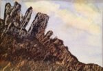
30 October 2013 Here are some rocks. The painting is based on a photo of…
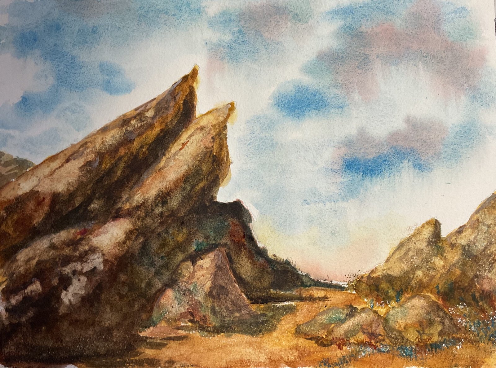
Vasquez Rocks
Today I’m back to old ways, not just painting a landscape but also allowing colours to mix on the paper and in the palette rather than just painting in monotone glazes. I’d forgotten how much fun this could be and how much less time it takes. For subject matter, I googled around and found Vasquez rocks in Southern California. These may possibly have featured in three episodes of Star Trek TOS: Friday’s Child, Shore Leave and Arena.
I went with a warm green colour scheme, choosing cerulean blue and raw sienna for their earthiness and granulation and Winsor red because it seemed to form a more appropriate triad with those other two colours than the other candidate reds. I also used burnt sienna and viridian to bring in some interesting tones (notably darks) and hematite violet genuine to get some rocky texture. I’m sure people also remember that the hematite violet needs to be used up before I can start using the potters pink. With burnt sienna being a warm red and viridian being a green, these still leave the painting in the key of warm green.
After putting down a rough pencil outline without a grid, I rubbed a candle along the foreground to get some texture and then I was ready to go. I wet the sky area and dropped in cerulean blue in places. It started granulating straight away and also leaving big white cloudy shapes. I added some of the red int9 the sky in the top right to help balance the painting and some of the red and raw sienna down near the horizon for a bit of variety.
The rest of the painting was a case of starting with an underpainting and then adding layer after layer of whatever colours I thought might look good. Throughout all of this I was paying attention to the need to have shadows in the right places. Maybe too much attention: I probably should have waited until much later before darkening those areas. The big shadowy area ended up causing me lots of problems tha5 could easily have been avoided but I got there in the end.
The top facing sides of my rocks were looking darker than I’d have liked, so I applied the titanium white trick, painting some of the white, diluting it in the paper and then dabbing it off. This technique worked well today. And that was me done.
I’ve ended up with what can only be described as an interesting painting. Because there are interesting colours in the rocks (especially in the shadows) and in the sky. Compositionally it works well with its balance, its focal point, the pathway to the focal point and the strong upward sloping diagonals. This one’s up for sale. To see the price, click here.
Leave a Reply