Today's effort is Purple Rain. I was thinking of doing some sort of blizzard scene…

Valdeinfierno In Purple And Orange
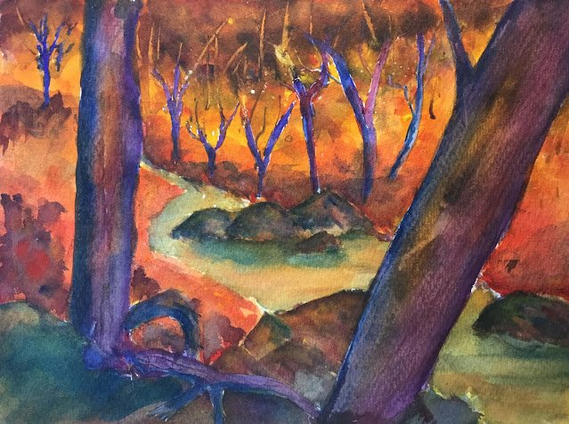
That last painting, The Thin Ice, felt like a flop to me but got lots of likes on Facebook and on DeviantArt. The only good thing it had going for it (at least in my eyes) was the complementary contract of purple against orange. So all week I’ve been planning to build on that with this painting. It’s the second time I’ve based a painting on a photo taken in Valdeinfierno but this time, it’s only loosely based on the photo. I started with a scene from the photo but my plan was to use very different colours.
I started with a value and colour plan for the first time in years. The colour plan was to have trees in blue and violet against a yellow and orange background, with the stream being a neutral colour and the rocks green to neutral. I used so many colours in this one that I can’t claim it to be in a single colour key. Maybe a mix of orange cool in the background and purple warm on the trees? If people can write music that switches between keys, why can’t I do the same with a painting?
After masking out some trees, the first step was to paint in the orange/yellow background. I used Winsor orange, a Indian yellow, Winsor yellow, transparent yellow, Winsor red, rose dore and a little permanent rose. No holding back there. There were also some white spots from masking fluid as patters and some cadmium red, cadmium yellow and sepia spatters. All of these spatters were eventually covered up by reworking though.
Then I did the rocks and the stream. The rocks took several attempts. They’re mainly French ultramarine, Winsor orange and permanent rose, although I added some Prussian blue towards the end, which gave a nice green sheen in places. The stream started as a neutral made of permanent rose, French ultramarine and Winsor orange but veering more towards green. I added some more Winsor orange in places to reflect the (orange) sky and some more French ultramarine below the rocks. You can see how I’ve been quite smart and made it more green at the top to contrast against the orange bank and more orange/brown at the bottom to contrast against the blueish bank. And the closest bit of foreground, I made more blue, less orangey.
Then I rubbed off the masking fluid and started on the trees. My original plan was to do these in a variegated mix of French ultramarine, Winsor violet and permanent rose. But then I also added in some Winsor orange for an extra bit of orange /purple contrast (partly inspired by how good the orange looked against the blue masking fluid after painting over the masking fluid earlier). I must have done three coats on each tree in an attempt to get them darker but was eventually satisfied. Some scraping with a credit card added a bit of texture and a bit of Prussian blue at the end made the left sides of the two big trunks and some of the background trunks more shadowy.
I was left with a bit of a problem, though, in that the background trees were standing out too harshly against the orange underpainting, so I had to put on some more layers. I started by making the orange more variegated by adding Winsor red and rose dore at the bottom and blending them upwards into the orange. That wasn’t enough, so I added some purple foliage behind the big tree on the left, some blue and purple shadows under the tree in top left and some blue and purple shadows all along the far bank, under the trees. At the same time as this, I added the Prussian blue shadows to the trees and rocks that I’ve already mentioned, and some Prussian blue shadow in the bottom left which has resulted in some interesting greens.
And that still left a second problem at the top of the painting. Why did the trees just stop? I ended up adding dabs of blue and purple along the top to look like a dark leafy canopy. And then I was done. It felt like I’d done enough fiddling around already and at wasn’t going to risk more.
I rate the final painting a success, even if it doesn’t look like the painting I planned. There’s texture, variegation and orange in the big trunks than I was planning but they look all the better for it. And the electric orange background that I was expecting to cover most of the painting is restricted to just a capital gamma shaped band (horizontal line about 1/3rd of the way down and vertical band 1/3rd 9f the way in from the left. But that gamma lay works. If I’d planned it I’d be called a genius, and quite rightly too. My only disappointment (and it’s a small one) is that the rocks in the middle are quite biting shapes, unlike t(e ones in the photo that were flat topped. Then again, I don’t want those rocks to steal the show. The stars of this painting are the purples and the oranges.
It was sold within a couple of days. Quite a collection building up there.


Leave a Reply