As I said in the last post, I felt like I could do a second…

Unidentified Scottish Hills
There’s good news and bad news on the painting front. First the bad news. I won’t be appearing on the next series of Landscape Artist Of The Year; my main application and wildcard application were both rejected. So what’s the good news? Well, I’ve put the gazebo on the decking, meaning that I have my own art studio in the garden until there’s wind or rain predicted, at which point the gazebo comes down. It means I can paint on sunny days without the problem of paint drying too quickly to do its magic.
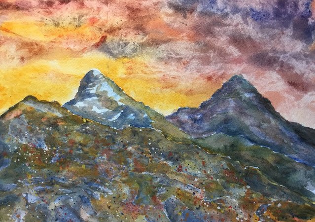
This year’s first painting in the outdoor studio is this Scottish scene. I don’t know where these hills are and Google image search is no help. Someone’s suggested that they might be part of the Cullins on the Isle of Skye and he may well be right.
I had two objectives today. One was to try to replicate the success of Glean a’Chroin but using my main colour palette, which doesn’t include the indigo and Winsor orange that starred in that painting. The other was to try to be a bit more accurate in my representation, drawing and painting the individual rocks in the foreground of my reference photo.
The main three colours today were rose dore, French ultramarine and Indian yellow, so this is in the key of orange warm. Because I wanted bright oranges and a warm blue to cover for the missing Winsor orange and indigo. There were other colours in there too though.
The sky started off as Indian yellow, into which I stroked bits of French ultramarine, rose dore and quinacridone magenta. I dabbed the paint with a paper towel when it was nearly dry to get the special effect in the final painting.
Then the hills. The two in the background used just my main three primaries, being careful to put green in places where there was green in the reference photo.
For the foreground, I started by painting the rocks in a variegated mixture of burnt sienna and French ultramarine – everyone’s favourite grey. When it was dry, I painted shadows on the rocks using a darker version of the same mix. Then I filled in all the grassy gaps with m6 three primaries – not green everywhere but a variegated mixture of all three.
But something wasn’t quite right – the painting wasn’t hanging together. So I did some glazing. First I painted a thin glaze of Prussian blue (a cool blue) over the distant hills. I dabbed the paint with a paper towel as it was almost dry so that the glaze didn’t dominate what was underneath. Then I did exactly the same thing for the foreground but using French ultramarine, a warm blue. But even the differing temperatures of the blues weren’t enough to distinguish the foreground from the background, so I added a thicker glaze of Indian yellow over the top edge of the foreground grill and at various places on the hillside. That seemed to solve the problem.
Finally, I did some spattering. Cobalt blue, titanium white, cadmium yellow and cadmium red in the foreground hill and some titanium white in the sky. Then it was time to stop.
There’s lots to like about this one, mainly in the colours. The sky and the furthest mountain are particularly good. The foreground spatters are nothing special close up but do add something when the painting is viewed from a distance. And I do need to start being more careful about not dripping paint onto the paper.
This one’s up for sale. To see the price, click here.


Leave a Reply