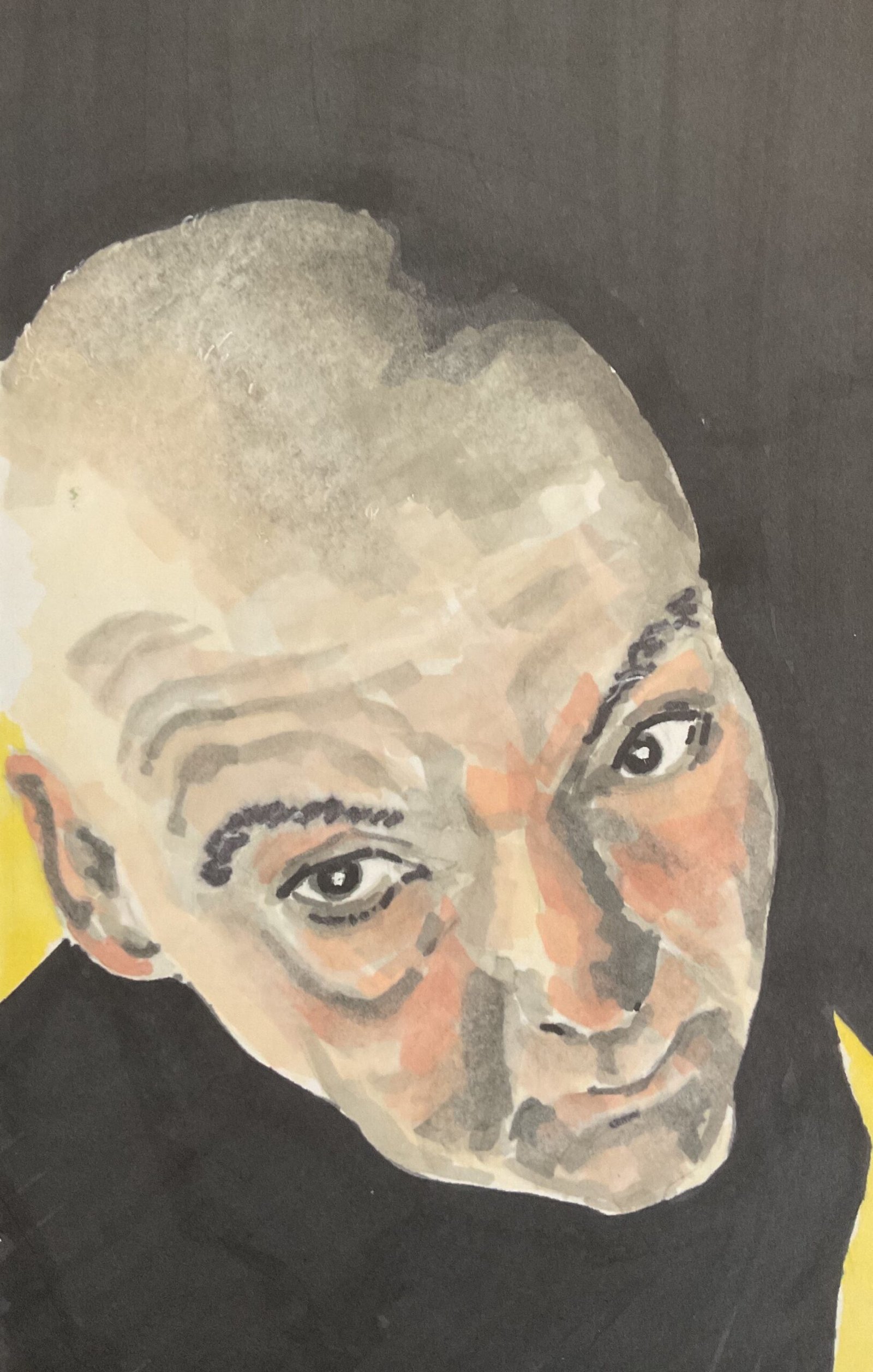
Here's the third in the under the desk collection. Today The main two colours were…

Under The Desk IV
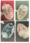
And that’s the Under The Desk collection completed. For the colour scheme I chose the grey markers, putting down some vague value shapes and then adding some loose random flesh colour marks over the top. I started with the darkest grey in the darkest areas but later replaced this with black and darkened all the values. I put some yellow in the background just to keep things interesting, making sure this portrait had something that the others didn’t.
The portrait is an interesting one, viewed from a higher angle than the others and having a foreshortened face. It’s a decent likeness I guess, but there’s something about it that reminds me of Sinead O’Connor.


Leave a Reply