


Well, I can tell you that I will definitely be entering for Portrait Artist Of…

Under The Desk I
Applications for Portrait Artist Of The Year need to be in by the end of January, so I thought I’d better make a start on the 2024 self portrait now rather than sleepwalking into panic mode nearer the time. I was in two minds about what medium to use this time round.
Should I use markers? These might go down well with judges who line to see different media. Marker drawings are quite quick, so if I was on the telly with these I’d probably come up with a setback three portraits from the front, left and right. For my submission, I’d anticipate this by submitting a collection rather than a single piece. To supplement this I’d include the Dads Army collection down as my second submission and I’d not yet decided what to submit as a third.
The alternative would be to go for a watercolour painting. If I can come up with a good watercolour self portrait. I’d include John Lydon and Roy Wood with my entry. But what to go for?
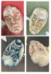
The first thing to do was to take some photos as source material. To get some dark shadows I had to crawl under my desk to get photos. I managed to get four decent shots and converted these to black and white and pushed the contrast to the extreme to turn them into decent sources – I need to see a range of values and don’t really care about colours. I noticed that two photos had my head tilting to the left and two had it tilting to the right. This have me the idea of doing four portraits and arranging them in a 2*2 grid with the lower two upside down and with the four heads forming a letter X. That would make an interesting work for the judges to look at at the start of the program.
So here’s the plan. I do the four portraits with markers, with different colour schemes. Four out of blue/black, green, red/pink, grey/black and brown/flesh. If they look any good, I’ll have a go at a watercolour anyway, knowing that I have a marker-based safety net. If they go badly, then at least I’ll have gotten in some practice at replicating what’s a much thinner face the it used to be. Sounds like a plan.
I decided to start with a blue and black painting, using the black marker and the three blues in my collection. I put down a pencil outline using a grid, rubbed out all the grid lines and then put in the background and the darkest bits of the eyes, nose and mouth using the black marker giving myself something to hang everything else off of, as I always say.
Next I added blues, starting with the darkest one in the darkest remaining shapes, then the medium blue and finally the light blue. Because values can be darkened but not lightened, I erred in the side of making shapes lighter rather than darker. That was the end of the first step.
The next step is to add more colour, darkening blues where necessary, in an attempt to draw out a likeness. So some of the dark blue areas ended up black, some of the middle blue areas dark, some of the light blue areas middle and some of the empty white areas light blue. At times the portrait was looking too blue, so I used some greys and flesh tones at times to mix things up. I also used the blender pen to try to soften some of the edges.
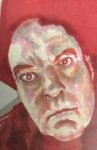
It became pretty clear as I was doing all this that this painting was going to be a write off, so I switched to an experimental mindset and tried to see how far I could push things, ending up with something very gothic looking. I’ve ended up using far too much of the dark blue colour. That letter Y on my right cheek is far too pronounced and would have been better in a middle blue, which would have blended better into a light blue behind it than the dark blue can blend into the middle. And to keep everything in formation, that means that all values should have been brought down a notch. Maybe I should even have used dark blue rather than black.
All of which means that I won’t be submitting a self portrait in markers to PAOTY. I’ll be coming up with a watercolour version instead, even if it takes me two or three attempts to get it right. Today’s portrait, though, was still a useful loosener. The likeness is there, especially around the eyes. And there’s a big early warning there about not being too heavy handed with the darker shapes that I see in my face.
Leave a Reply